Popover news
Guidelines Development
Guidelines
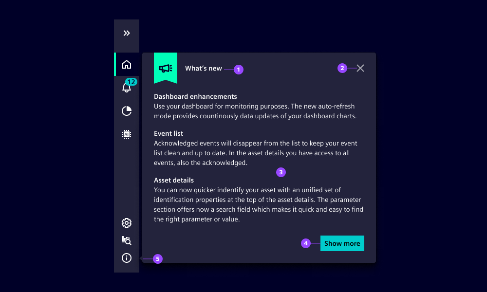
Use the popover news component to present news and information when the application starts like release notes, new app features or marketing-related information. For Siemens applications, provide the information within the About and legal overlay as well.

- (1) Header text
- (2) Close button
- (3) Content
- (4) "Show more" button takes users to another place in the app to learn more about the information given
- (5) Spike shows popover origin
Options
- label: Defines the header text of the popover news (1)|
- i18nShowMore: Adjusts the text of the "Show more" button (4) |
- offsetBottom: Adjusts the popover position. The spike (5) should point to the info icon.
Behavior
Unlike a modal, popover news does not prevent users from navigating and interacting with the content. It only overlays the content partially and appears once triggered by the app. As soon as the user closes the popover, it does not appear again until it is re-triggered. Therefore we recommend that the information should be additionally available in the About and legal overlay. The popover spike should always point to the information icon so users can find the information again. The offsetBottom option can be used to control its exact position.
Dos and Don’ts
- Do use popover news for "nice to know" information
- Don‘t use popover news for essential information a user must read, instead use a modal or a message bar
- Don‘t use popover news for system feedback or messages, instead use a modal or a toast message
Related patterns
Development
Examples
Basic
API
Properties
about-item-labelstringexpandedbooleanfalsei-1-8n-show-morestring'Show more'labelstringoffset-bottomnumber0showbooleanfalseEvents
voidMouseEvent