Card list
Since 1.6.0Guidelines Development
Guidelines
Card lists are UI controls that display a large number of cards or items of the same type in a lightweight, grouped manner. Users can hide and reveal the card list content by clicking on a control element. We typically use card lists on dashboards to show a huge amount of information in an organized and hierarchical way.
Card lists consist of a header section at the top and a content section below. The header section includes an icon button with a chevron on the left, followed by the card list's label. In the content section, items of the same type can be arranged in two different layout styles: stack and scroll.
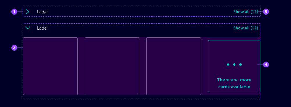
- Header section
- Content section
- "Show all" button
- "Show more" card
Types
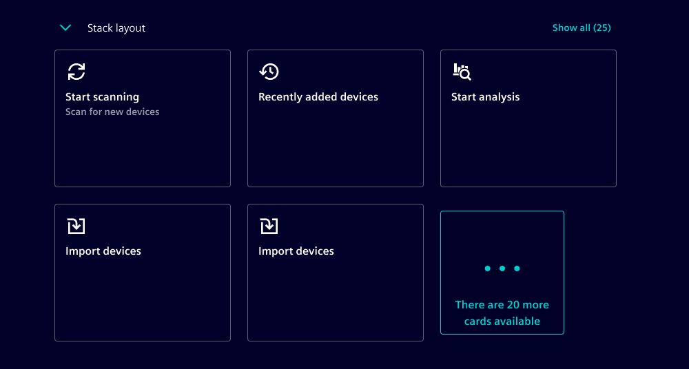
The stack card list style displays content items from left to right next to each other and wraps them into a new line when space runs out. This means the height of the section can dynamically change.
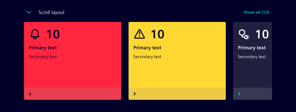
The scroll card list style displays the content items from left to right next to each other in a single row. When the space runs out, horizontal scrolling is enabled, indicated by a semi-transparent area on the left or right end of the content section.
Options
- Label: Card lists can include a label in the header section. The label is positioned right next to the chevron.
- Collapse: By default, the card list is expanded, but this can be customized to suit your specific needs.
- Max visible cards: By default, the card list displays a maximum of 12 items. If more items are available, a "Show more" card is displayed.
- Show all button: The header section can contain a button that triggers the action to show all card list items. Typically, these items are shown on a new page.
- String - Show all: By default, the button to display all items is labeled "Show all".
- Show all count: This represents the total number of card list items. This value is displayed on the "Show all" button.
- String - More cards: By default, the card used to indicate when there are more items available is labeled "There are more cards available".
Behavior in context
- Interaction: Users expand and collapse card list content by clicking on the icon button with the chevron in the header section. When the card list is expanded, content below the card list is pushed downwards.
- "Show all" button: Sometimes card lists only need to show the most important or most recent items. Clicking on the "Show all" button in the header section shows all items. Typically, these items are displayed on a new page.
- "Show more" card: The number of visible items inside a list can be limited to reduce the user's cognitive load. The "Show more" card indicates that more information is available. Selecting the card either displays the next chunk of items or shows all items on a new page, similar to the "Show all" button pattern.
Dos and Don'ts
- Do keep cards and items within card lists the same size
- Don't place different types of components within card lists
- Don't nest card lists within each other
Related patterns:
Development
Examples
API
Properties
collapsebooleanfalsehide-show-allbooleanfalsei-1-8n-more-cardsstring'There are more cards available'i-1-8n-show-allstring'Show all'labelstring | undefinedlist-style"scroll" | "stack"'stack'show-all-countnumber | undefinedsuppress-overflow-handlingbooleanfalseEvents
boolean{ nativeEvent: MouseEvent; }{ nativeEvent: MouseEvent; }