Blind
Guidelines Development
Guidelines
Blinds are UI controls that allow the users to hide or reveal content by clicking on a control element. Blinds can display a large amount of content in a compact space or present information in an organized and hierarchical way. Blinds reduce the user's cognitive load by removing clutter and less important information from an interface. We typically don't use blinds if the content is central to the user's task due to its reduced visibility and accessibility.
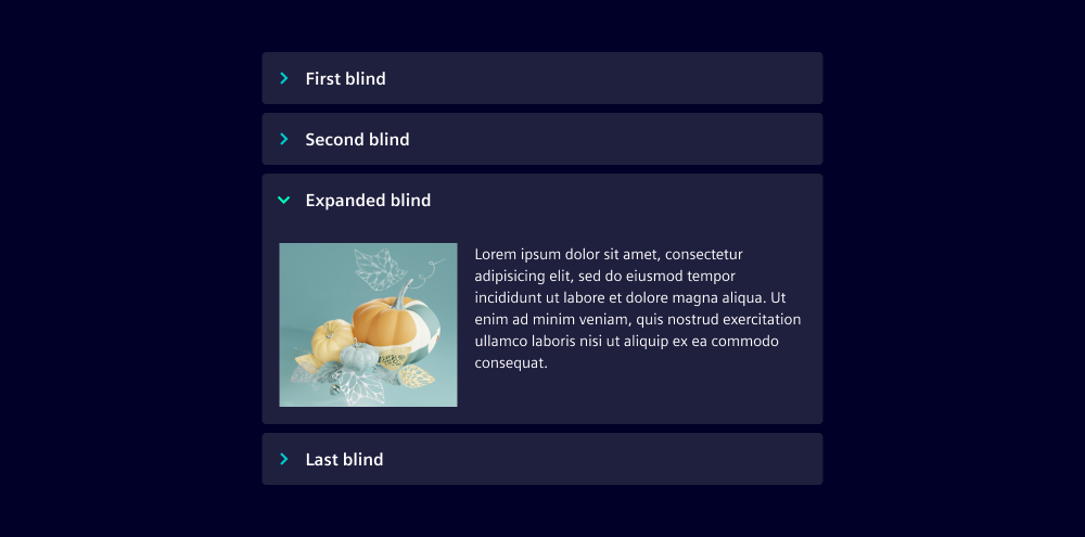
Blinds consist of a header section on the top and a content section below. The header section contains a chevron on the left followed by the blind's label. Within the content section, content can be placed freely.
- Header section
- Content section
Types
Multiple blinds can be placed below each other to create an accordion. The recommended distance between the blinds is 0.5rem. Typically, only one blind can be opened within an accordion but users can be allowed to open multiple blinds at a time.
Variants
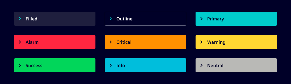
Multiple blind variants are available:
- Filled: Default variant
- Outline: Variant for lower visual emphasis
- Primary: Variant for high visual emphasis
- State-related variants: Alarm, critical, warning, success, info, neutral
Options
- Icon: Blinds can, but don't have to, include an icon in the header section. The icon is positioned before the blind label.
- Sublabel: A secondary label can be placed within the header section. The sublabel gives additional information about the blind's content.
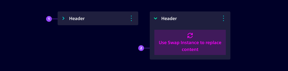
- Header action: The header section can contain an action area. We typically use the action area to include one or two buttons for actions directly related to the blind, e.g. to delete the blind or to navigate to additional content.
Behavior in context
The user expands and collapses the blind by pressing anywhere in the header section. When the blind is expanded, content below the blind is moved downwards.
States
For all blind variants, a default, hover, active and focused state is available.

Dos and Don'ts
- Do stay within the recommended number of blinds - between 3 and 7
- Don't use multi-line text in the header. The header section has a fixed height for single-line text entries
- Don't change the position of the chevron icon and the blind's label in the header
- Don't use a blind if there is only a single category to be displayed
- Don't use blinds to display hierarchically structured files or objects - rather use a tree for such cases
Related patterns:
Development
Examples
Header actions
Variants
API
Properties
collapsedbooleanfalseiconstring | undefinedlabelstring | undefinedsublabelstring | undefinedvariant"alarm" | "critical" | "filled" | "info" | "insight" | "neutral" | "notification" | "outline" | "primary" | "success" | "warning"'insight'Events
boolean