Checkbox
Guidelines Development
Guidelines
A checkbox is a small interactive box that allows the user to toggle between an affirmative or negative choice. Checkboxes are commonly used when there are multiple options that can be selected or to easily enable or disable a setting. They are often utilized in forms where users can choose multiple options, such as selecting items or categories that apply to a specific product or service.

- Checkbox
- Checkbox label
- Group label
- Group required indicator
- Group helper or feedback text
Options
- Checkbox label: See form field.
- Indeterminate checkbox: Indicates that only some items in a checkbox group are selected. We offer the indeterminate state, but the implementation when this state is active is the responsibility of each individual.
- Checkbox group: Group checkboxes to indicate that they are related. We typically use checkbox groups when multiple options need to be presented for selection, allowing users to choose any combination of the available choices. They are particularly useful in user interface design for forms, settings and preferences where multiple selections are possible.
- Group label: Add a label to the group of checkboxes to provide context to your users. We typically use short and descriptive labels to summarize the options in the group.
- Group helper text: See form field.
- Group feedback text: See form field.
Behavior in context
- Validation: See validation.
- Interaction: Clicking on the checkbox toggles the state between checked and unchecked.
- Grouping: Checkbox groups have only one label and helper text for the entire group. Grouped checkboxes are validated collectively, not individually.
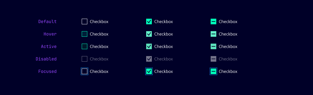
States
Dos and Don’ts
- Do use checkboxes when you have multiple options that can be selected
- Do group related checkboxes together to indicate their relationship
- Do use checkboxes in forms to allow users to select multiple options
- Don’t use a checkbox for binary choices (yes/no, true/false) - use a toggle switch instead
- Don’t use checkboxes for mutually exclusive options - use radio buttons instead
- Don’t use checkboxes for actions that have immediate consequences - use buttons or links instead
Development
Examples
Basic
Disabled
Group
Indeterminate group
Validation
API
Properties
Name
Description and specifications
checked
Checked state of the checkbox component
Attribute:
checkedType:
booleanDefault:
falsedisabled
Disabled state of the checkbox component
Attribute:
disabledType:
booleanDefault:
falseindeterminate
Indeterminate state of the checkbox component
Attribute:
indeterminateType:
booleanDefault:
falselabel
Label for the checkbox component
Attribute:
labelType:
string | undefinedname
Name of the checkbox component
Attribute:
nameType:
string | undefinedrequired
Required state of the checkbox component.
If true, checkbox needs to be checked to be valid
Attribute:
requiredType:
booleanDefault:
falsevalue
Value of the checkbox component
Attribute:
valueType:
stringDefault:
'on'Events
Name
Description and specifications
checkedChange
Event emitted when the checked state of the checkbox changes
Detail:
booleanvalueChange
Event emitted when the value of the checkbox changes
Detail:
string