Category filter
Guidelines Development
Guidelines
The category filter component enhances data navigation and user experience. We typically use a category filter to efficiently navigate large data sets, allowing users to quickly narrow their search by selecting predefined categories. It’s particularly useful in scenarios with complex data. The filter also enhances user experience by providing autocomplete suggestions and customizable filter conditions.

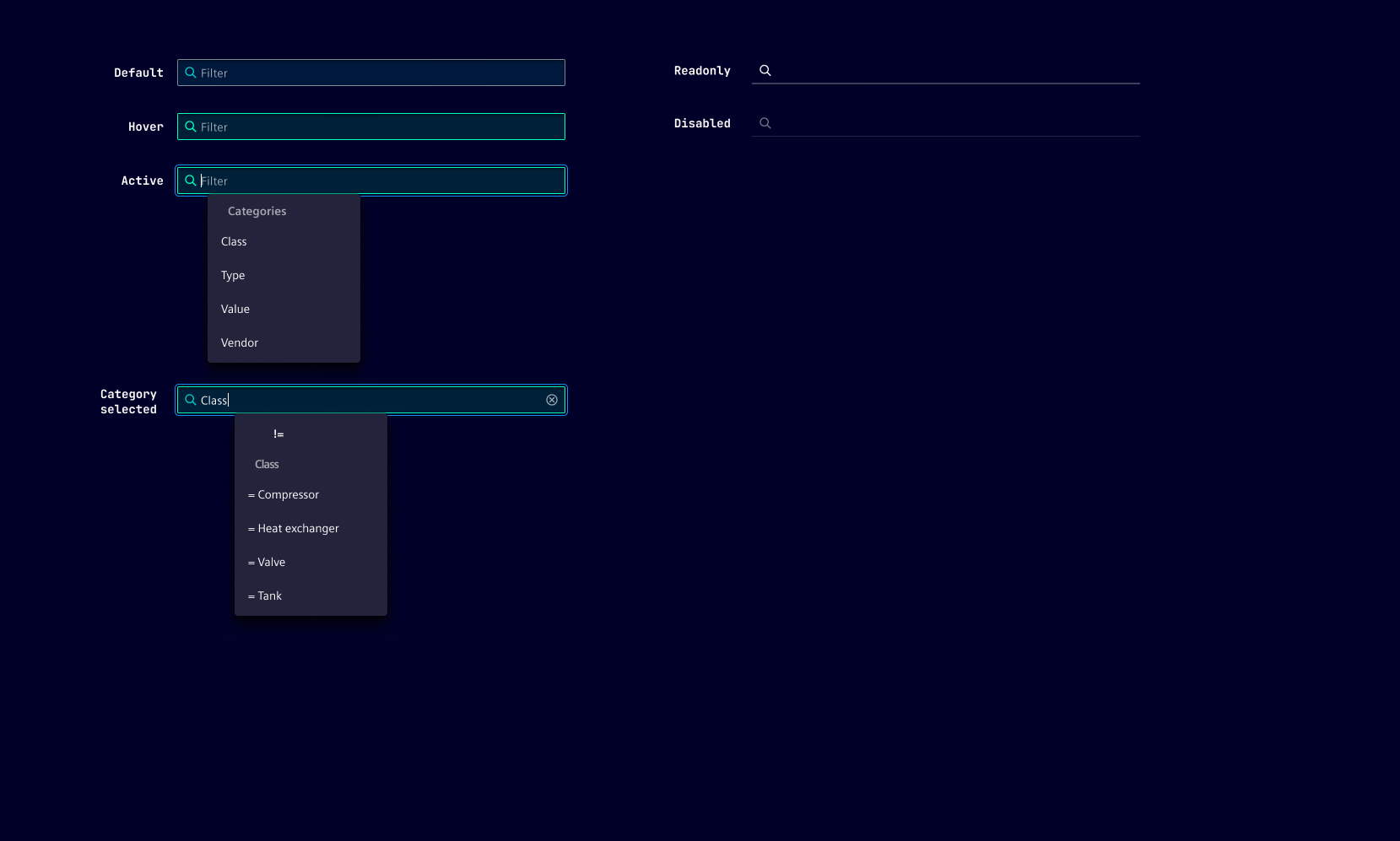
- Container
- Search icon
- Input chip
- Clear button
Options
- Categories: Select these predefined groups to narrow down searches or browsing. The categories are customizable and should be defined based on the specific needs of your application or website.
- Suggestions: These are potential search terms that appear as users begin to type in the input field. The aim is to assist users by predicting their intended search or category, thereby speeding up the input process and reducing potential errors.
- Non-selectable categories: This option is useful in scenarios where the user should not be able to select certain categories. This could be due to categories that are irrelevant in the current context, restricted through user permissions or dependent on other conditions.
- Repeat categories: Allows users to select the same category more than once. This can be useful when users want to apply different filter conditions to the same category.
- Placeholder: Use to provide guidance or context to users when the category filter is empty.
- Icon: The default icon is "search". Changing or hiding the icon within the category filter enhances the user experience and improves visual communication.
- Plain text: Provides the possibility to do a plain text search without choosing a specific category.
- Static operator: Use to restrict the filter condition to either equal (=) or not equal (!=). This is useful when it doesn't make sense, or is not applicable, to let the user decide between equal and not equal. By default, the filter condition is without restriction.
Behavior
- Default: The category filter is designed to adapt to the user’s needs and the context it’s used in. As soon as the user starts typing, the filter begins to apply, narrowing down the available options based on user input. This provides a dynamic and responsive user experience.
- Filter conditions: These are the operators that determine how the filter matches the user’s input against the available categories. Available are equals (=) and not equals (!=). These conditions provide flexibility and precision in filtering, allowing users to find exactly what they’re looking for.
- Display modes: The different modes are automatically detected by the component itself. If the user enters more than one row of search terms it automatically increases the size. When it comes to more then two lines of search terms it applies a scrollbar automatically.
- Autocomplete: When the user starts typing it can automatically suggest possible matches. This helps with speeding up the input process and reducing potential errors.
- Category selection: The behavior of category selection can vary. It can be configured as non-selectable, multi-selectable or single-selectable depending on the specific application needs and context.
- Without category selection: Use without category selection if user input alone is sufficient to filter the data, such as when the data is not well-organized into distinct categories, or if the categories are too numerous/complex.
- Visual feedback: When a category is selected, it’s highlighted and a chip is added to the input field. If a user chooses to delete a category, the chip is removed and the data is unfiltered, allowing for further filtering.
States
Category filter has six states: Default, hover, active, disabled, read-only and focused.
- Read-only: By setting the category filter to read-only, accidental data modifications or deletions can be prevented. This can be particularly useful when dealing with critical or sensitive information that should not be altered without proper authorization.
- Disabled: This state is typically applied when the element is not applicable to the current context or when certain conditions must be met before the category filter can be enabled.
Dos and Don’ts
- Do use if you have a large amount of content or products organized into different categories
- Do use when catering to a diverse user base with different interests or needs
- Do use if your content or products are organized into distinct categories or topics
- Do use to make it easier for users to refine their search queries and receive more targeted results
- Don’t use if your content is minimal or not organized into distinct categories
- Don’t use if it’s not the primary method of navigation
- Don’t use if it slows down the user experience
- Don’t use if your users are not familiar with the category names
Related patterns
Development
Examples
Basic
Without categories
API
Properties
Name
Description and specifications
categories
Configuration object hash used to populate the dropdown menu for type-ahead and quick selection functionality.
Each ID maps to an object with a label and an array of options to select from.
Type:
undefined | { [id: string]: { label: string; options: string[]; }; }disabled
If true the filter will be in disabled state
Attribute:
disabledType:
booleanDefault:
falsefilterState
A set of search criteria to populate the component with.
Type:
FilterState | undefinedhideIcon
Allows to hide the icon inside the text input.
Defaults to false
Attribute:
hide-iconType:
booleanDefault:
falsei18nPlainText
i18n
Attribute:
i-1-8n-plain-textType:
stringDefault:
'Filter by text'icon
The icon next to the actual text input
Defaults to 'search'
Attribute:
iconType:
stringDefault:
'search'labelCategories
i18n
Attribute:
label-categoriesType:
stringDefault:
'Categories'nonSelectableCategories
In certain use cases some categories may not be available for selection anymore.
To allow proper display of set filters with these categories this ID to label mapping can be populated.
Configuration object hash used to supply labels to the filter chips in the input field.
Each ID maps to a string representing the label to display.
Type:
undefined | { [id: string]: string; }Default:
{}placeholder
Placeholder text to be displayed in an empty input field.
Attribute:
placeholderType:
string | undefinedreadonly
If true the filter will be in readonly mode
Attribute:
readonlyType:
booleanDefault:
falserepeatCategories
If set to true, allows that a single category can be set more than once.
An already set category will not appear in the category dropdown if set to false.
Defaults to true
Attribute:
repeat-categoriesType:
booleanDefault:
truestaticOperator
Since 2.2.0
If set categories will always be filtered via the respective logical operator.
Toggling of the operator will not be available to the user.
Attribute:
static-operatorType:
LogicalFilterOperator.EQUAL | LogicalFilterOperator.NOT_EQUAL | undefinedsuggestions
A list of strings that will be supplied as type-ahead suggestions not tied to any categories.
Type:
string[] | undefinedEvents
Name
Description and specifications
categoryChanged
Event dispatched whenever a category gets selected in the dropdown
Detail:
stringfilterChanged
Event dispatched whenever the filter state changes.
Detail:
FilterStatefilterCleared
Event dispatched whenever the filter gets cleared.
Detail:
voidinputChanged
Event dispatched whenever the text input changes.
Detail:
InputState