Toast
Guidelines Development
Guidelines
Toasts are small pop-ups that provide simple feedback on a process. They are UI elements where an event causes a small text field to appear on screen. Toasts are informative, last for a few seconds only, and take up a very small part of the screen to avoid interrupting the workflow. They usually follow an action performed by the user and provide information about the success or failure of that action. We typically use toasts for immediate feedback or tips on actions that a user performs, e.g. successful deletion.

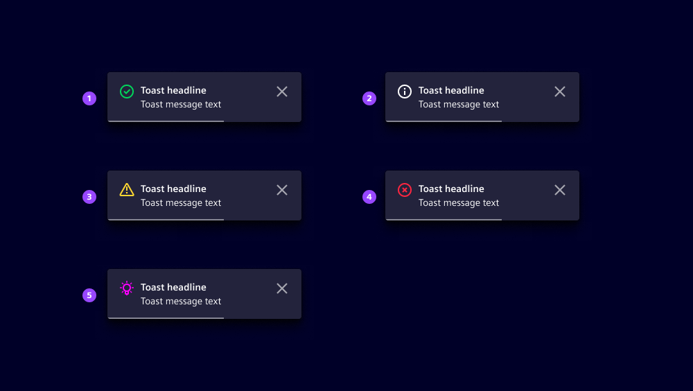
- Icon
- Button
- Progress bar
- Header
- Message
- Close action
Options
- Toast types: There are four preset toast types and one custom type:
- Info: Provides users with additional information about the performed action.
- Success: Informs users of a successfully performed action.
- Warning: Warns users of potential problems that could occur due to the action.
- Error: Notifies users that the action cannot be performed due to a specific problem.
- Custom: Adjust the icon and its color to customize your own toast messages.
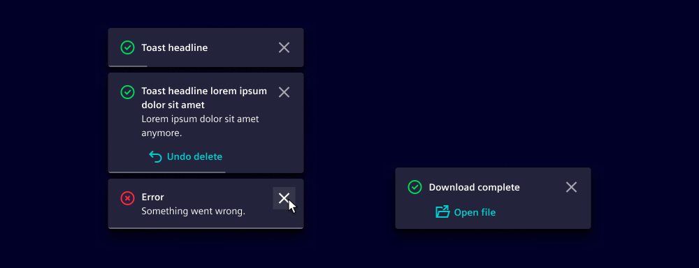
- Header: Add a header for the toast. Use short and concise words. We typically use 1 to 3 keywords, such as "Error occurred" or "Action completed".
- Message: Add a clear and concise message providing more detailed information about the toast event. We typically provide additional context or instructions related to the event, e.g. "Please check your email for further instructions" or "Your changes have been saved successfully".
- Button: Include a button to provide users with an option to take further action. We typically use a button to give the user an option to undo the action or to provide a link for further information.
- Position: Toasts are positioned either at the bottom or top right. The default position is bottom right. This position is configured globally, which means all toasts appear from the same position. We typically change the default position if the toast covers important workflow elements.
Behavior in context
- Auto closure: Toasts should only be displayed on the screen for a few seconds. A progress bar is displayed to visualize the time left until the toast disappears. We typically leave the toast on the screen from 3 to 8 seconds.
- Manual closure: Toasts can be closed manually at any time. It's also possible to suppress the automatic closing so that the user has to actively close the toast. We normally use a purely manual closure of the toast if the workflow is continued by using the toast, e.g. downloading files.
- Multiple toasts: Toasts are stacked on top of each other with the newest at the bottom.
- Modal vs. toast: When both the modal and the toast are triggered simultaneously, the toast appears below the modal. The toast is visible but blurred due to the transparent layer, and it eventually closes if not prevented by the auto-closing option.
Dos and Don’ts
- Do use toasts to provide contextual tips and shortcuts for users
- Do use toasts to instantly inform a user about the outcome of an action
- Do include shortcuts to undo an action immediately after it's taken
- Do stick with a consistent position for toasts within the same app and avoid interchanging their positions
- Don’t use toasts for high-priority or critical alerts that prevent the user from continuing their work (use a modal or a message bar instead)
- Don’t edit or reuse icons or icon colors from the four predefined toast types when creating custom toasts
Related patterns
Development
Examples
Basic
Custom toast message
Position
Since 1.5.0
API
- Angular
- React
- JavaScript
ToastService
| Name | Description | Signature |
| show | Show new toast | |
ToastConfig
| Name | Description | Type | Default |
|---|---|---|---|
| autoClose | Autoclose behavior | boolean | true |
| autoCloseDelay | Autoclose title after delay | number | 5000 |
| icon | Icon of toast | string | undefined |
| iconColor | Icon color of toast | string | undefined |
| message | Toast message | string | TempateRef<any> | undefined |
| title | Toast title | string | undefined |
| type | Toast type | "error" | "info" | "success" | "warning" | "info" |
ToastConfig
| Name | Description | Type | Default |
|---|---|---|---|
| autoClose | Autoclose behavior | boolean | true |
| autoCloseDelay | Autoclose title after delay | number | 5000 |
| icon | Icon of toast | string | undefined |
| iconColor | Icon color of toast | string | undefined |
| message | Toast message | string | React.ReactNode | undefined |
| type | Toast type | "error" | "info" | "success" | "warning" | "info" |
ToastConfig
| Name | Description | Type | Default |
|---|---|---|---|
| autoClose | Autoclose behavior | boolean | true |
| autoCloseDelay | Autoclose title after delay | number | 5000 |
| icon | Icon of toast | string | undefined |
| iconColor | Icon color of toast | string | undefined |
| message | Toast message | string | HTMLElement | undefined |
| title | Toast title | string | undefined |
| type | Toast type | "error" | "info" | "success" | "warning" | "info" |