Dropdown
Guidelines Development
Guidelines
Dropdown containers display a menu with additional items when users click on the trigger element, e.g. a dropdown button. Clicking on one of the items in the dropdown performs the action. We typically use dropdowns to allow users to select one option from a list.
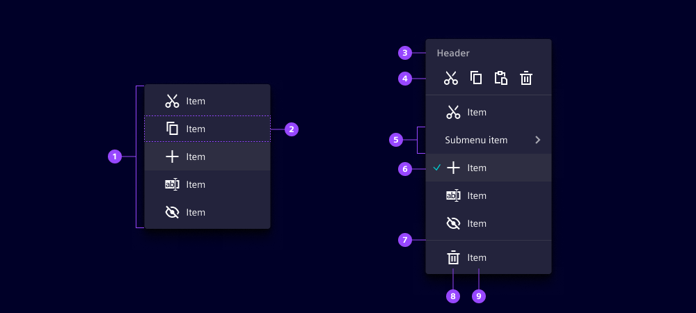
- Dropdown container
- Item
- Header
- Quick actions
- Submenu
- Checked
- Separator
- Icon
- Label
Options
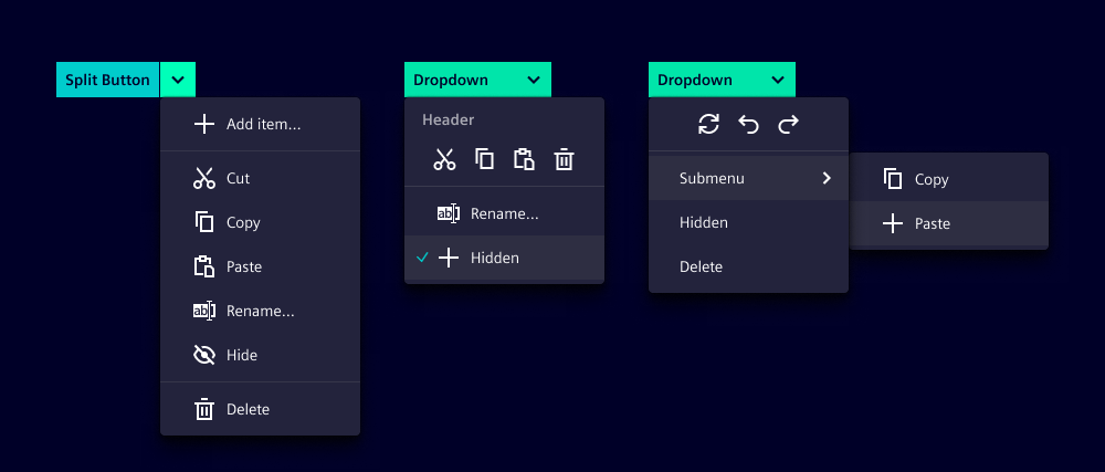
- Header: Add a header for the dropdown container. This allows users to better understand which elements are in the dropdown.
- Quick actions: Add a quick action bar. Add 3 to 5 actions/items to the quick actions. We typically use quick actions to access common functions such as cut, copy and paste.
- Checked: Mark selected items in the dropdown with a check mark. We typically use check marks when an item can be activated (e.g. for the dropdown "Sort by:" selection: name, modified date, create date).
- Submenu: Add a submenu for a multi-level dropdown. We typically use a submenu when there is a long item list and different systematic categorization within the items.
- Separator: Add a separator to visually divide items from each other. We normally use a separator to isolate individual elements from a cohesive item list.
- Icon: Icons can be displayed to support the label and make the item more easy to discover by the user. The icon should be widely known for representing the action or function among your users.
- Label: Set a label for the dropdown item. We typically use short labels including verbs.
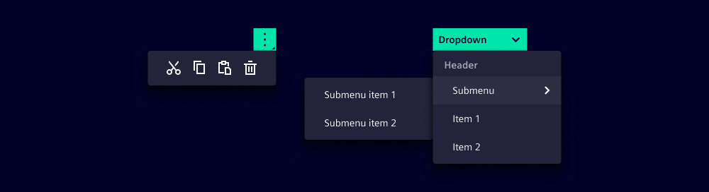
- Trigger: The trigger defines which element opens the dropdown. A trigger should also be defined for a dropdown submenu. We typically use a button as the trigger element.
- Anchor: An anchor defines where the dropdown is placed. When no anchor is defined the trigger element is used as the anchor.
- Close behavior: Defines whether a click inside and/or outside the dropdown closes the dropdown. A submenu is always closed together with the parent dropdown. Three Options are possible:
- Inside: clicking within the dropdown closes the dropdown.
- Outside: clicking outside the dropdown closes the dropdown.
- Both: clicking within and outside the dropdown closes the dropdown.
- False: dropdown will only close if it's parent gets closed.
- Placement: Place a dropdown at the top, bottom, left or right edge as well as at the beginning or end of the trigger/anchor element. The placement may be automatically adjusted in case it cannot be displayed correctly (detailed behavior described in the context section below). We typically use the default (bottom right) placement option to ensure consistency.
- Date selection: Use the component date dropdown to get a date selection in the dropdown.
Behavior in context
- Text truncation: The labels of the items and the header only consist of one line. A truncation only occurs if there is not enough space on the screen.
- Scrollbar: A dropdown is provided with a scrollbar when the dropdown takes up 50% of the screen.
- Placement: The position depends on the trigger/anchor element (e.g. a button). By default, the dropdown is displayed at the bottom right of the trigger element. When there is not enough space for the selected placement, it is corrected automatically. The placement of the submenu is always generated automatically.
- Quick actions: Quick actions only consist of icons, therefore, it is important to use icons that are understandable without a label or tooltip. A quick action bar can also be used without additional items in the dropdown.
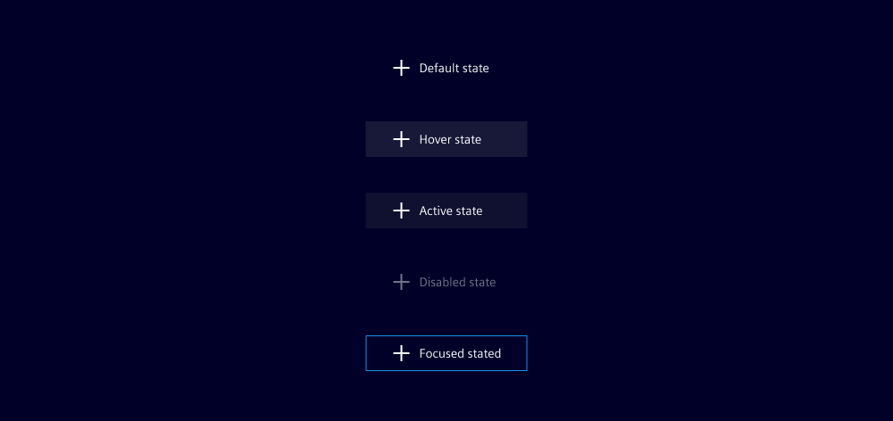
States
Dropdown items have five states: Default, hover, active, disabled and focused. When a submenu is in an active state, the submenu displays an additional dropdown with selectable options.
Dos and Don’ts
- Do structure dropdown items coherently with submenus, quick actions and separators
- Do use dropdowns to showcase related actions
- Do disable items that cannot be used at that moment
- Don’t use global navigation options in a dropdown
- Don’t use too many dropdown items - we recommend a maximum of seven
- Don’t insert the date picker or date time picker components into a dropdown (use date dropdown instead)
Related patterns
Development
Examples
Dropdown with icon
Dropdown with quick actions menu
Since 1.4.0Dropdown with submenu
API (ix-dropdown)
Properties
Name
Description and specifications
anchor
Define an anchor element
Attribute:
anchorType:
HTMLElement | Promise<HTMLElement> | string | undefinedcloseBehavior
Controls if the dropdown will be closed in response to a click event depending on the position of the event relative to the dropdown.
If the dropdown is a child of another one, it will be closed with the parent, regardless of its own close behavior.
Attribute:
close-behaviorType:
"both" | "inside" | "outside" | booleanDefault:
'both'header
An optional header shown at the top of the dropdown
Attribute:
headerType:
string | undefinedplacement
Placement of the dropdown
Attribute:
placementType:
"bottom-end" | "bottom-start" | "left-end" | "left-start" | "right-end" | "right-start" | "top-end" | "top-start"Default:
'bottom-start'positioningStrategy
Position strategy
Attribute:
positioning-strategyType:
"absolute" | "fixed"Default:
'fixed'show
Show dropdown
Attribute:
showType:
booleanDefault:
falsesuppressAutomaticPlacement
Since 2.0.0
Suppress the automatic placement of the dropdown.
Attribute:
suppress-automatic-placementType:
booleanDefault:
falsetrigger
Define an element that triggers the dropdown.
A trigger can either be a string that will be interpreted as id attribute or a DOM element.
Attribute:
triggerType:
HTMLElement | Promise<HTMLElement> | string | undefinedEvents
Name
Description and specifications
showChanged
Fire event after visibility of dropdown has changed
Detail:
booleanAPI (ix-dropdown-item)
Properties
Name
Description and specifications
checked
Whether the item is checked or not. If true a checkmark will mark the item as checked.
Attribute:
checkedType:
booleanDefault:
falsedisabled
Disable item and remove event listeners
Attribute:
disabledType:
booleanDefault:
falsehover
Display hover state
Attribute:
hoverType:
booleanDefault:
falseicon
Icon of dropdown item
Attribute:
iconType:
string | undefinedlabel
Label of dropdown item
Attribute:
labelType:
string | undefinedEvents
No events available for this component.