Panes
Guidelines Development
Guidelines
Panes are interactive components that allow users to access content that isn't constantly visible on the screen. Panes have a header and a content area. When collapsed, panes are either hidden or reduced to a bar. In our applications, we often include contextual information, options, trees and lists inside panes.
Panes help users focus on tasks as related controls are visually grouped and the main content has less information. They are also beneficial for compact and hierarchically organized content and provide a more dynamic layout.
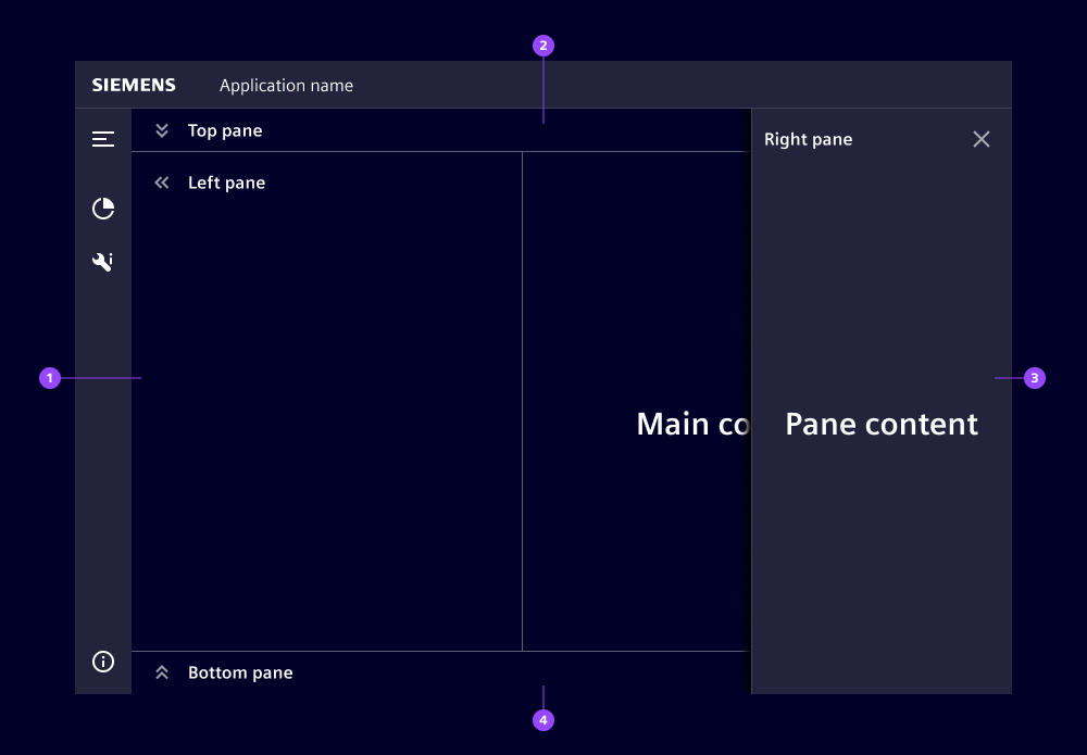
- Left pane, inline
- Top pane, inline
- Right pane, floating
- Bottom pane, inline
Options
- Heading: Set a headline for the pane (we normally use a short content description).
- Icon: Panes can display an icon in the pane header next to the title.
- Composition: Panes can be positioned on the left, top, right or bottom. We often use left panes for structuring components like trees or lists, and right panes for contextual information. Top and bottom panes are less common in our applications, but can help communicate a clear "top to bottom" hierarchy.
- Size: Sizes can be picked either as a fixed size (in pixels) or as a relative size (in percentage) depending on the intended layout. However, picking sizes only applies to medium and large screens as small screen panes are always displayed in full screen (see responsiveness below for more information). We usually choose a pane width and height that avoids the need for scrolling in our applications.
- Borderless: Panes can have borders to visually split them from other content areas. We typically use borderless panes when placed within layouts that already have other visual means to split areas.
- Hide on collapse: Define whether a pane is visible in its collapsed state. If it is visible, it has a bar appearance when collapsed that contains both the title and the expand button. We usually use inline panes with a collapsible option and floating panes without since they are triggered from a dedicated control like a button or a list item.
- Variant: When used within a layout, floating panes are placed above (z-axis) the main content but below the navigation menu and header. When expanded, they cover a part of the main content. Inline panes are placed on one level with the main content. When expanded, they move the main content and reduce its available space.
- Layout: Depending on which pane needs more focus, the top/bottom or left/right panes can use more space.
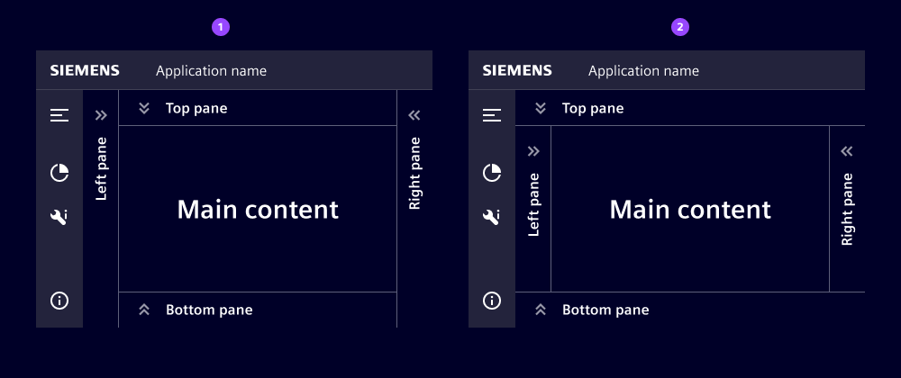
- Full height (left/right)
- Full width (top/bottom)
Behavior
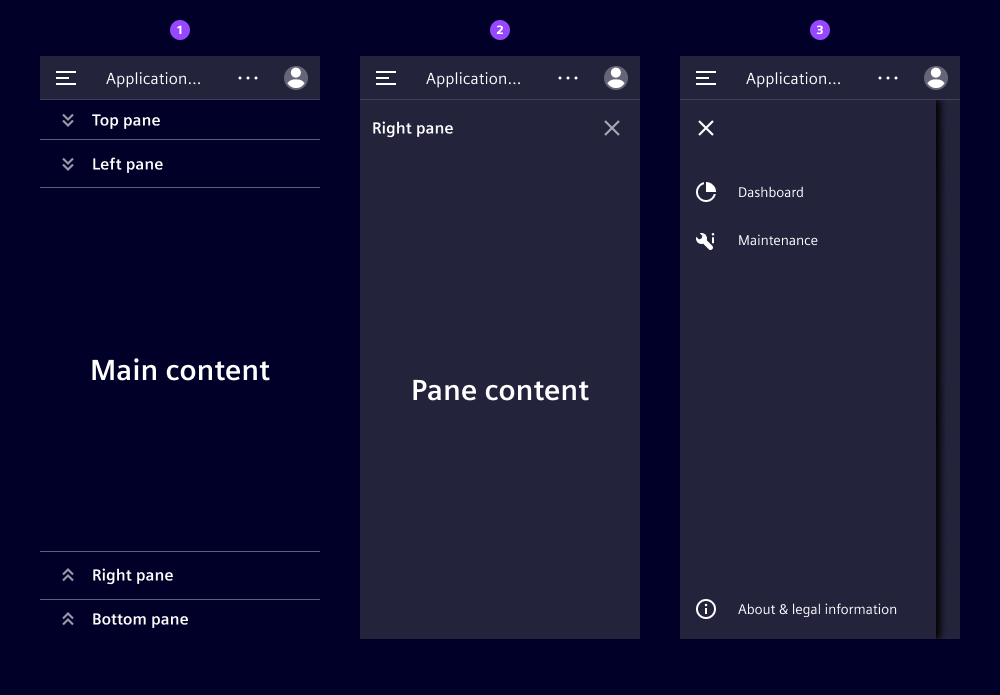
- Interaction: Users expand panes that are collapsible by pressing on the expand button. To expand panes with hidden collapsed state, users typically click on a button or another interactive component within the main content. They close these panes by either pressing on the button on the right side of the header or clicking outside the pane area. This removes the pane from their view.
- Overflow: When content extends the available space within the pane, scrollbars appear. Headers stay fixed at the top allowing users to scroll the content area. We like to avoid overfilling panes with content to remove the need for scrolling.
- Stacking: When users expand multiple panes within a pane layout, panes are stacked.
- Placement: We typically fit a pane layout within the complete content area of a page bounded by the application header on top and the navigation menu on the left.
- Responsiveness: On large and medium size screens, all panes have a maximum width or height of
50%of the available space. On small screens, all panes have full width and expand to full height, but the header and navigation menu remain visible. We show collapsed left and right panes on the top and bottom for a more efficient use of space.
- Inline panes in collapsed state
- Inline or floating pane in expanded state
- Opened navigation menu
States
Panes have two states: collapsed and expanded. The appearance of the states varies between variants and screen sizes.
Dos and Don'ts
- Do use panes to organize your content and guide your users' attention
- Do use panes to display different views within a single screen
- Do use panes to expand/collapse content or hide/reveal content
- Don't use panes for a small amount of content
- Don't use panes for content that should stay visible
Related patterns
Development
Example
Basic
Pane Layout
Since 2.1.0API (ix-pane)
Properties
Name
Description and specifications
borderless
Toggle the border of the pane.
Defaults to the borderless attribute of the pane layout. If used standalone it defaults to false.
Attribute:
borderlessType:
booleanDefault:
falsecomposition
Defines the position of the pane inside it's container.
Inside a pane layout this property will automatically be set to the name of slot the pane is assigned to.
Attribute:
compositionType:
"bottom" | "left" | "right" | "top"Default:
'top'expanded
State of the pane
Attribute:
expandedType:
booleanDefault:
falseheading
Title of the side panel
Attribute:
headingType:
string | undefinedhideOnCollapse
Define if the pane should have a collapsed state
Attribute:
hide-on-collapseType:
booleanDefault:
falseicon
Name of the icon
Attribute:
iconType:
string | undefinedsize
The maximum size of the sidebar, when it is expanded
Attribute:
sizeType:
"240px" | "320px" | "33%" | "360px" | "480px" | "50%" | "600px"Default:
'240px'variant
Variant of the side pane.
Defaults to the variant attribute of the pane layout. If used standalone it defaults to inline.
Attribute:
variantType:
"floating" | "inline"Default:
'inline'Events
Name
Description and specifications
borderlessChanged
This event is triggered when the variant of the pane is changed
Detail:
{ slot: string; borderless: boolean; }expandedChanged
This event is triggered when the pane either expands or contracts
Detail:
{ slot: string; expanded: boolean; }variantChanged
This event is triggered when the variant of the pane is changed
Detail:
{ slot: string; variant: "floating" | "inline"; }API (ix-pane-layout)
Properties
Name
Description and specifications
borderless
Set the default border state for all panes in the layout
Attribute:
borderlessType:
booleanDefault:
falselayout
Choose the layout of the panes.
When set to 'full-vertical' the vertical panes (left, right) will get the full height.
When set to 'full-horizontal' the horizontal panes (top, bottom) will get the full width.
Attribute:
layoutType:
"full-horizontal" | "full-vertical"Default:
'full-vertical'variant
Set the default variant for all panes in the layout
Attribute:
variantType:
"floating" | "inline"Default:
'inline'Events
No events available for this component.