Application header
Guidelines Development
Guidelines

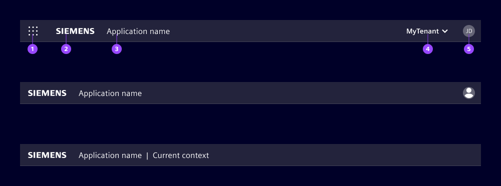
- Application switch (optional)
- Brand logo
- Application name
- Slot for additional elements (optional)
- Avatar (optional)
Application switch
Use the application switch (see application) to allow users to navigate across applications. When clicking the application switch (1), a modal with a list of available applications opens.
Brand logo
Provide the brand logo (2) as SVG. The logo must be monochromatic and cannot contain strokes as it is colored during runtime depending on your chosen theme. For Siemens applications, only the Siemens logo with the brand theme is allowed.
Application name
The application name (3) shows the official name of the application. It can be extended with additional information by using the pipe character "|" and 2 spaces before and after to separate both.
Slot

We use this slot to provide additional high-level information or actions and functions which may impact the application context, e.g. mode switching. Note that overflows are not handled automatically; at breakpoint sm the slot collapses and is only accessible via the overflow icon.
We typically use the slot for:
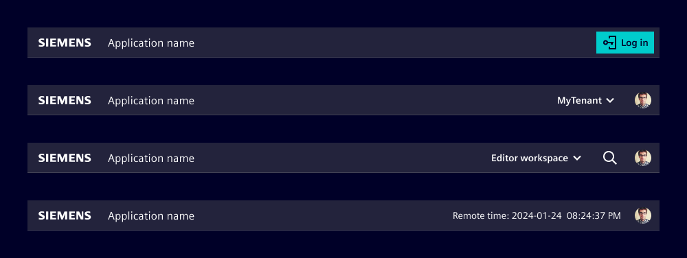
- Log in button, if the application runs without a logged in user
- Changing the top level data context like environment, workspace, tenant or similar
- Important contextual information users should be aware of (like local times in remote access use cases)
- Access to application-wide actions like global search
Avatar
With the new modular application frame we moved the avatar from the navigation menu to the application header. This ensures the avatar has security-relevant information available at all breakpoints. Nonetheless, if you still use the basic navigation or the map navigation, the avatar is still in the navigation menu for compatibility reasons.

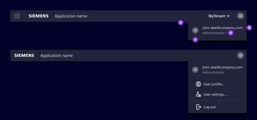
- Avatar dropdown
- User avatar
- Top text line
- Bottom text line
The avatar is an optional element and indicates the current logged in user. If your application doesn’t support different users or user profiles, don’t use the avatar.
Clicking the avatar opens a dropdown (6) with additional user information (7, 8, 9) and possibly other user related actions like log out, profile settings or user settings.

If your application can be used without being logged in to, you can offer access to a login process in different ways, for example:
- Show a log in button in the slot for additional elements and hide the avatar.
- Show the avatar with a placeholder image and show text in the user information section.
Options
If the application is hosted inside a framework that comes with its own header, you can omit the entire application header to avoid having two headers on top of each other. The framework’s header then provides the brand identity, the application name and other information.
Behavior
The header automatically adapts the breakpoints defined in the application.

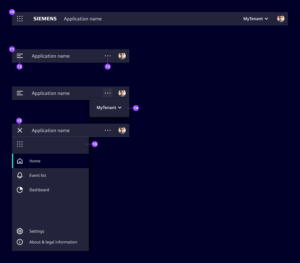
- Layout at breakpoint lg and md
- Layout at breakpoint (sm)
- Application menu icon
- Overflow icon to access the slot content (14)
- Slot content
- Close icon to close the application menu
- Application menu with the application switch icon at the top
At breakpoints "lg" and "md" the application header behaves identically. At breakpoint "sm" the layout changes in the following way:
- The application menu hides, displaying the application menu icon (12), a click opens the application menu (16).
- The application switch (if used) moves to the application menu (16).
- The brand logo disappears.
- The slot for additional elements (if used) moves to the overflow dropdown that opens on click on the overflow icon (13).
Dos and Don’ts
- Do align other slot usages for Siemens applications with our team to keep a consistent look and feel
- Do use the avatar dropdown for actions related to the current logged in user
- Don’t overload the slot with too many elements (overflows are not handled automatically)
- Don’t use the avatar if your application does not support user profiles
Development
The application-header can host custom content which will be displayed on the far right side of the header.
Examples
Basic
Avatar
Enhance the interactivity of your application-header by placing the avatar component as part of the content. This not only makes the avatar clickable, but also enables the addition of dropdown-item's directly within the avatar component.
API
Properties
namestring | undefinedshow-menuboolean | undefinedfalseSlots
Events
booleanvoid