Map Navigation
Guidelines Development
Guidelines
Map navigation is a combination of infrastructural components that form a layout structure to present map-like content (geographical maps, P&I diagrams or other plans). It is supported by a collapsible context panel and an overlay can temporarily present additional information. Map navigation does not offer all features the basic navigation offers.
The new application component released February 2024 is even more flexible, has a modular approach and introduces new features. Hence, we highly recommend using the new application frame.
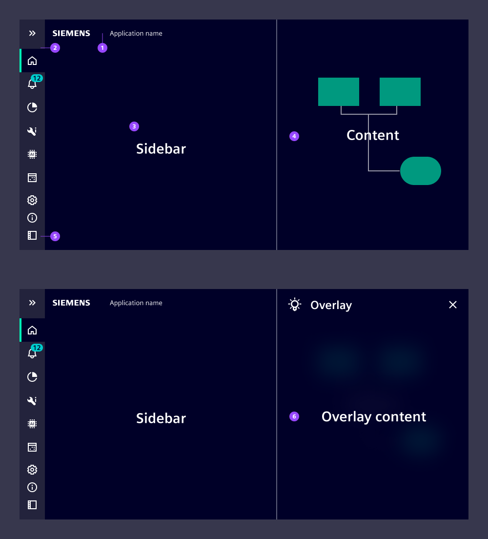
- App header: Included in the context pane
- Navigation menu
- Context pane: Hosts additional information and elements to control the map content
- Map content: Shows map-like content, P&I diagrams or other plans
- Context pane icon: Expands and collapses the context pane
- Overlay: Shows detailed information of selected objects
Application header
The application header (1) hosts the brand logo and the application name. As this space is limited, we recommend short application names without further information. The application header is placed inside the context panel which means it appears and disappears with the context pane.
Behavior
Map navigation does not adapt to breakpoints and should only be used on large screens (desktop size). The navigation menu provides a control at the bottom (5) to expand and collapse the context pane. The overlay’s (6) background appears semi-transparent with background blur to emphasize the overlay character.
Dos and Don’ts
- Don't use map navigation for typical main-detail use cases, instead use application frame
- Don't use map navigation if you want to support mobile use cases
Development
Examples
Basic
Custom overlay
API (ix-map-navigation)
Properties
application-namestring | undefinedhide-context-menubooleantruenavigation-titlestring | undefinedEvents
voidbooleanAPI (ix-map-navigation-overlay)
Properties
colorstring | undefinediconstring | undefinedicon-colorstring | undefinednamestring | undefinedEvents
any