Content header
Guidelines Development
Guidelines
The content header provides a brief overview of the content on a page. It helps our users understand what the page is about. We typically use it at the very top of the page to show a clear hierarchy of the page.
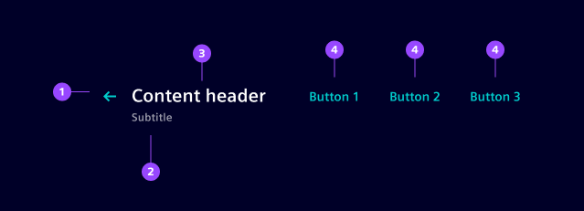
- Back button
- Content title
- Content subtitle
- Action buttons
Variants
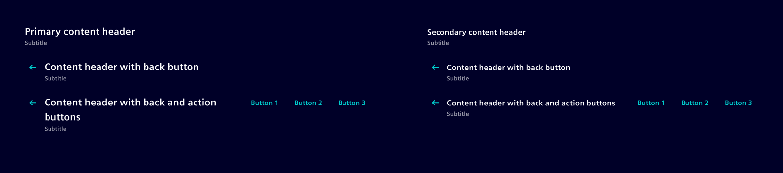
Our content header variants makes it easier to achieve a well-balanced visual hierarchy throughout the page.
- Primary: In our applications, we most often use the primary variant for main pages or primary sections.
- Secondary: We typically use this variant when we want to provide context or actions for a specific section of a page, such as when displaying detailed information related to a selected item from a list.
Options
- Back button: Enable if you want to provide a way for the user to navigate back.
- Header title: Set your page title here. Use a clear, short and descriptive wording.
- Header subtitle: Provide additional info for your content such as a descriptive sentence when required.
- Action buttons: Offer convenient shortcuts for actions that the user might need to perform frequently, for example "Add" or "Edit".
Behavior
- Interaction: The back button navigates usually one step back or behaves the same as the browser back. Action buttons typically navigate to another view.
- Alignment: Place the content header at the very top left corner related to the content position. Back button, title and subtitle are automatically aligned on the left side while the action buttons are aligned on the right side.
- Cluster action buttons: Action buttons are automatically aligned to the right. An example for the primary content header has the back button, title and subtitle at the left top corner of the whole page, and the action buttons at the right top corner of the page.
Dos and Don'ts
- Do use to provide quick access to common tasks for the whole content area
- Don't use a secondary content header as a page title
- Don't use more than one primary headline in one page
Related patterns
Development
Examples
Basic
No back button
API
Properties
Name
Description and specifications
hasBackButton
Display a back button
Attribute:
has-back-buttonType:
booleanDefault:
falseheaderSubtitle
Subtitle of Header
Attribute:
header-subtitleType:
string | undefinedDefault:
undefinedheaderTitle
Title of Header
Attribute:
header-titleType:
string | undefinedvariant
Variant of content header
Attribute:
variantType:
"primary" | "secondary"Default:
'primary'Events
Name
Description and specifications
backButtonClick
Triggered when back button is clicked
Detail:
void