Button
Guidelines Development
Guidelines
Buttons initiate actions, apply actions to selected objects and activate/deactivate functions. We typically use buttons to trigger an immediate action, and you can place them within dialogs, forms, modal windows and other containers.
- Button label
- Button icon
Variants
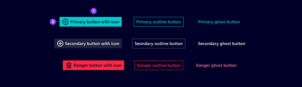
- Primary button: In our applications, we most often use the primary button variant.
- Secondary button: The secondary button variant has a grayscale appearance to distinguish it from the primary button.
- Danger button: We use the danger button variant to emphasize particularly dangerous, destructive or critical actions that cannot easily be undone. Consider this especially in confirmation dialogs.
Note: Please be aware that the terms primary and secondary are not used in accordance to common UX terminology for primary, secondary and ghost button.
Options
- Default: Use for the most important or most-likely next action within the user interface. These are typically actions that advance the user through a process, such as "Submit", "Save" or "Add". We use these sparingly and recommend only one per layout. These are typically called primary buttons in UX.
- Outline: Use for standard actions that need to be easily recognizable or for actions supporting the default (primary) action. These could include actions like "Cancel", "Reset" or "Advanced Options". These are typically called secondary buttons in UX.
- Ghost: Use for actions that are typically not part of the core user journey but serve specialized or conditional purposes. Tertiary buttons can represent actions such as "Advanced settings", "More options", "Help" or "Customize". They may also be used for conditional actions like "Change preferences" or "View details".
- Icon: Icons can also be displayed with button labels.
- Disabled: Buttons can be disabled (see also button states).
- Loading: A loading spinner is displayed on the button. The spinner replaces an icon when available.
- Type: A submit button is available. Submit buttons are typically used in forms and trigger a submit event. Apply this type to make a submit button more accessible.
Behavior in context
- Interaction: Buttons can be triggered by pressing anywhere within the button container. When buttons are focused, they can be triggered by pressing
Space. - Text truncation: Button labels are not truncated. All text on buttons is one line only.
- Ellipsis (…): Ellipsis can be used to indicate that an action requires further input or choice from the user, such as "Save as…" which opens a further list of file types to choose from. Ellipses is typically not used for actions with a subsequent confirmation dialog.
- Alignment: Buttons can be left-justified or right-justified or fully span a container’s width.
- Cluster buttons: Buttons can be clustered in groups based on their relationship. A cluster can contain a mixture of buttons, e.g. a combination of a primary button with two primary ghost buttons. We recommend a minimum distance of
0.5rembetween adjacent buttons, and we typically cluster buttons if actions/functions are related but not excluding each other. Otherwise, consider using abutton group. - Button width: Button width depends on its content. In addition, buttons have a default minimum width of 5rem to lay out common combinations such as "OK" and "Cancel" more harmoniously with equal widths. The minimum width is customizable to accommodate other combinations.
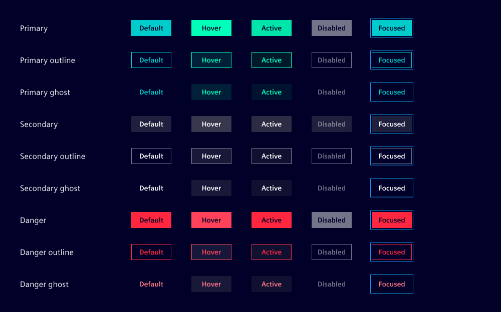
States
Buttons have six states: Default, hover, active, disabled, loading and focused. In a disabled state, buttons are visually displayed but don’t offer any user interaction.
Dos and Don’ts
- Do use short button labels to allow users to quickly scan, understand and remember them (follow our writing style guide for more support)
- Do use only one primary (default) button in one visual unit for a clear and singular focus on the main call to action
- Do use the danger button for destructive or critical actions like "delete" or "remove", especially in confirmation dialogs
- Do use a default margin between adjacent buttons of at least
0.5rem - Do adjust default and outline button width to label length or container width
- Don’t use the danger button excessively or repetitively in lists or tables
- Don’t extend your ghost button width beyond the label’s available width
- Don’t rely on standard buttons when many actions/functions are necessary (use dropdown, split or menu buttons or move some functionality to a panel or a dialog)
- Don’t use buttons for navigation
Related patterns
Development
Examples
Primary
Primary Outline
Will be used as Secondary in UX context
Primary Ghost
Will be used as Ghost in UX context
Secondary
Will be used as Grey button in UX context
Secondary Outline
Will be used as Grey secondary in UX context
Secondary Ghost
Will be used as Grey ghost in UX context
Danger
Danger Outline
Danger Ghost
Button group
Button with text and icon
Loading button
API
Properties
disabledbooleanfalseghostbooleanfalseiconstring | undefinedloadingbooleanfalseoutlinebooleanfalsetype"button" | "submit"'button'variant"danger" | "primary" | "secondary"'primary'Events
No events available for this component.