Chip
Guidelines Development
Guidelines
Chips are components used to display small pieces of information in a compact and visually appealing way. Typically chips contain a concise label and sometimes an icon, and they are clickable and closable.

- Container
- Label text
- Icon
- Close button
Variants
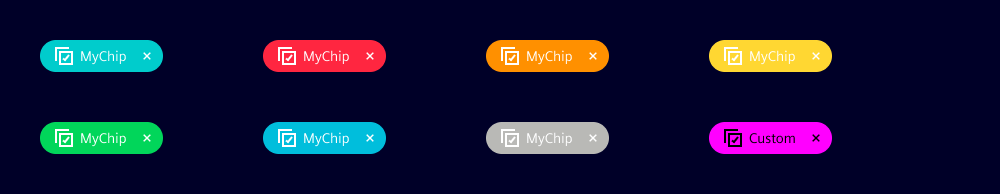
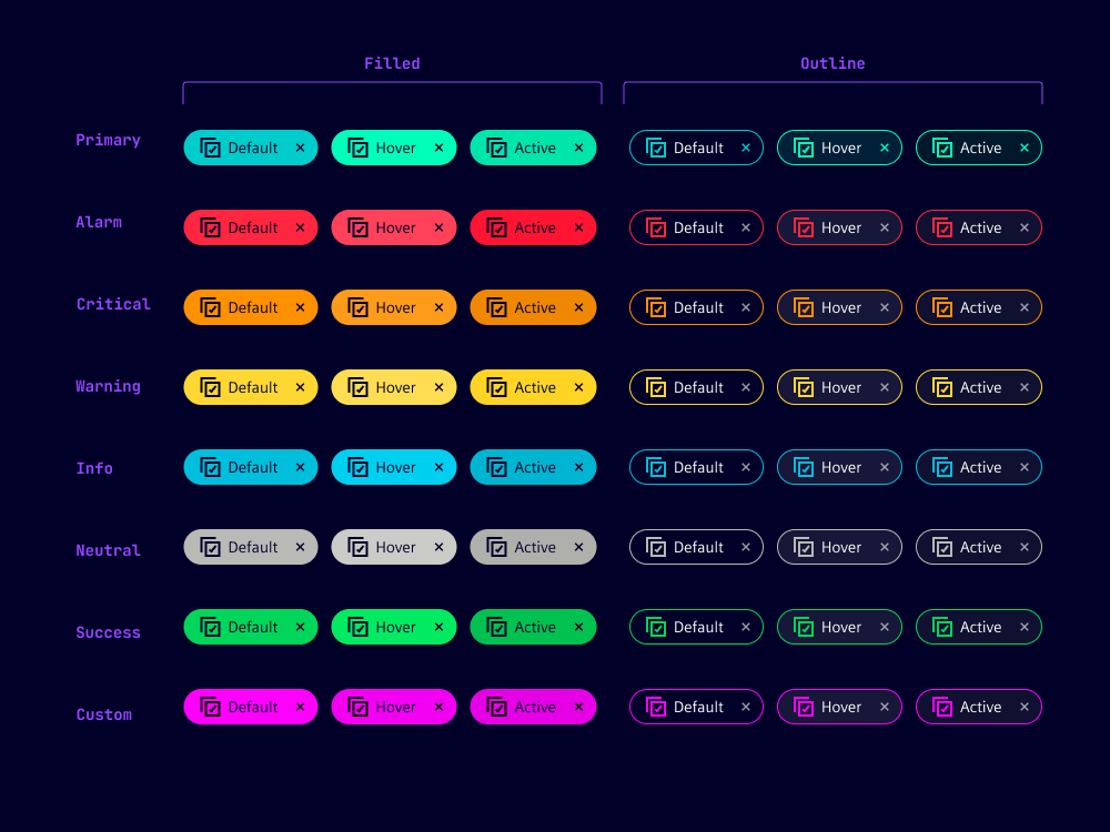
With our chip variants, you can apply different colors based on their purpose, importance or context. We use chip variants to show class, status and levels of importance. The custom variant is often used for chips that visualize a high number of different categories, but does not permit color specification for hover and active states.
Chip variants:
- Primary: For high visual emphasis
- State-related variants: Alarm, critical, warning, success, info and neutral
- Custom: For a customized background and label color
Options
- Active: Specifies chip interactivity. When set to false, user input such as mouse-over and keyboard navigation are disabled and the close button is not visible.
- Background: Use to set a custom background color when you require more flexibility in styling the chip. Only available for the custom chip variant.
- Outline: Use for lower visual emphasis.
- Closable: When set, the chip contains a close button that removes the entire chip when selected. This feature is only applicable to active chips so users can easily remove specific chips when necessary.
- Icon: Chips can include an icon within the element which is positioned before the chip's label.
- Color: Customize font and icon color for chip. This allows users to specify a unique font color in combination with a custom background color (only applicable when the variant is set to 'custom').
- Width: Typically content length determines chip width with a minimum width of '2rem'. Chip width can be set to a specific value.
Behavior
- Reactive: Chips react or change their appearance or behavior based on user actions. For example, updates occur as a response to system actions, providing real-time information about system changes or events.
- Multi-selection: Chips can visualize multi-selection and filter actions. This helps users to easily identify and understand their choices.
- Placement: We typically place chips inline with other objects to inform users about their state, within tables or grouped together to show selected options and filters. We do not place chips within input and filter components as these components have similar components already built-in.
- Dismiss: When users select close, chips are dismissed from the list or interface and are removed visually.
- Text truncation: When a width is set for chips, long labels are truncated to fit the available space.
States
Chips take a default, hover, focused or active state with a varying background color. For the custom chip variant, the specified colors for font and background are applied to all states.
Dos and Don'ts
- Do use chips to tag and categorize so users can easily organize and filter content
- Do ensure proper color contrast between chip background and text/icon with the custom variant to support readability
- Do consider chip spacing for easy tapping or selecting with mobiles and desktops
- Don't overuse chips as this leads to cluttered and overwhelming interfaces
- Don't use different styles for chips with the same or similar use
- Don't use chips without any interaction (we recommend pills instead)
Related patterns
Development
Examples
Basic
API
Properties
Name
Description and specifications
active
Determines if the chip is interactive. If false no user input (e.g. mouse states, keyboard navigation)
will be possible and also the close button will not be present.
Attribute:
activeType:
booleanDefault:
truebackground
Custom background color.
Only has an effect on chips with `variant='custom'`
Attribute:
backgroundType:
string | undefinedchipColor
Custom font and icon color.
Only has an effect on chips with `variant='custom'`
Attribute:
chip-colorType:
string | undefinedclosable
Show close icon
Attribute:
closableType:
booleanDefault:
falsecolor
Deprecated
since 2.1.0 use `chip-color`
Custom font and icon color.
Only has an effect on chips with `variant='custom'`
Attribute:
colorType:
string | undefinedicon
Show icon
Attribute:
iconType:
string | undefinedoutline
Show chip with outline style
Attribute:
outlineType:
booleanDefault:
falsevariant
Chip variant
Attribute:
variantType:
"alarm" | "critical" | "custom" | "info" | "neutral" | "primary" | "success" | "warning"Default:
'primary'Events
Name
Description and specifications
closeChip
Since 1.5.0
Fire event if close button is clicked
Detail:
any