Select
Guidelines Development
Guidelines
A select component allows users to choose from a list of options. It supports single or multiple selections and the editable variant allows users to add new items. We typically use select components in forms, filters and settings where users need to choose from predefined options.
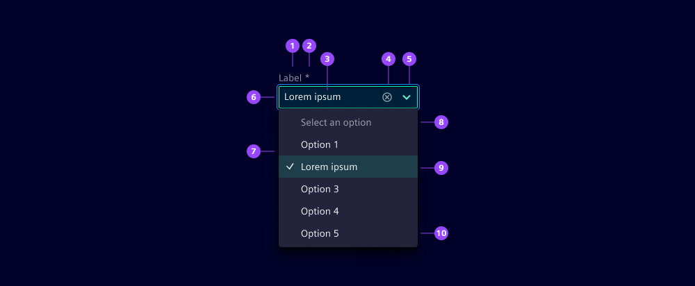
- Label
- Required indicator
- Placeholder
- Clear button
- Open dropdown button
- Container
- Dropdown list
- List header
- Selected list item
- Editable mode (add new items)
Options
- Label: See form field.
- Placeholder: Use a placeholder to provide information about what to enter or additional relevant context while the input field is empty. We typically use a placeholder when the label is not visible or we need to provide additional context.
- Helper text: See form field.
- Feedback text: See form field.
- Show clear button: Select components can have a dedicated button to easily clear the selection. Hide the button when offering users other ways to reset, e.g. a default item like "none", or if you aim for simplified keyboard accessibility.
- List header: Use a header to provide additional context or instructions about the items to help users understand the choices better.
- Hide list header: Hide the header of the dropdown list when not required.
- Information for no matches: Set a message to be displayed when no item matches the inserted text.
- Editable: When enabled, users can add new items to the list.
- Multiselect: Allow users to select multiple items from the list.
- Item label: Set a short and concise label for dropdown items.
- Selected item: Mark selected items in the dropdown with a check mark.
Behavior in context
- Validation: See validation.
- Interaction:
- Click or Enter key on button opens dropdown list.
- Typing in the input field filters the dropdown list.
- Arrow keys navigate within the dropdown list.
- Click or Enter selects a highlighted list item.
- Escape key closes dropdown list and returns to the originally selected value.
- Overflow:
- The text in an input field is truncated with the length of the container.
- On the multiselect, the selected items break into a second line and then show a scrollbar if it extends beyond two lines.
- The dropdown list is scrollable when the list exceeds the container height. Its width is defined by the longest item. The maximum width of the dropdown list is set to 100% by default. Use the properties
dropdownWidthanddropdownMaxWidthto customize the dimensions.
- Alignment: Selects are always aligned to the left, while right alignment is reserved exclusively for number inputs.
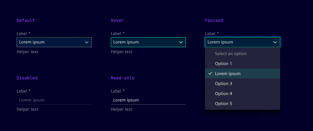
States
The select field has five states: default, hover, focused, disabled and read-only. In the disabled state, the input field is displayed without offering any user interaction.
Dos and Don’ts
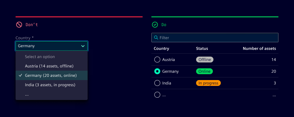
- Do consider performance when loading an extensive list of items
- Do use the select component when there is a finite list of items available to avoid manual input errors or duplicates
- Do sort items logically, e.g. alphabetically or numerically
- Don't use selects for binary choices, like yes and no, use radio buttons, checkboxes or toggles instead
- Don't use selects for navigational or search patterns, use category filters or search fields instead
- Don't combine several data attributes in an item label, use tables or event lists with a search functionality instead
Related patterns
Development
Examples
Basic
Editable
Multiselect
Validation
Since 2.6.0
API (ix-select)
Properties
Name
Description and specifications
allowClear
Show clear button
Attribute:
allow-clearType:
booleanDefault:
falsedisabled
If true the select will be in disabled state
Attribute:
disabledType:
booleanDefault:
falsedropdownMaxWidth
Since 2.7.0
The maximum width of the dropdown element with value and unit (e.g. "200px" or "12.5rem").
By default the maximum width of the dropdown element is set to 100%.
Attribute:
dropdown-max-widthType:
string | undefineddropdownWidth
Since 2.7.0
The width of the dropdown element with value and unit (e.g. "200px" or "12.5rem").
Attribute:
dropdown-widthType:
string | undefinededitable
Select is extendable
Attribute:
editableType:
booleanDefault:
falsehelperText
Since 2.6.0
Helper text for the select component
Attribute:
helper-textType:
string | undefinedhideListHeader
Since 1.5.0
Hide list header
Attribute:
hide-list-headerType:
booleanDefault:
falsei18nNoMatches
Since 1.5.0
Information inside of dropdown if no items where found with current filter text
Attribute:
i-1-8n-no-matchesType:
stringDefault:
'No matches'i18nPlaceholder
Input field placeholder
Attribute:
i-1-8n-placeholderType:
stringDefault:
'Select an option'i18nPlaceholderEditable
Input field placeholder for editable select
Attribute:
i-1-8n-placeholder-editableType:
stringDefault:
'Type of select option'i18nSelectListHeader
Select list header
Attribute:
i-1-8n-select-list-headerType:
stringDefault:
'Select an option'infoText
Since 2.6.0
Info text for the select component
Attribute:
info-textType:
string | undefinedinvalidText
Since 2.6.0
Error text for the select component
Attribute:
invalid-textType:
string | undefinedlabel
Since 2.6.0
Label for the select component
Attribute:
labelType:
string | undefinedmode
Selection mode
Attribute:
modeType:
"multiple" | "single"Default:
'single'name
Since 2.6.0
A string that represents the element's name attribute,
containing a name that identifies the element when submitting the form.
Attribute:
nameType:
string | undefinedreadonly
If true the select will be in readonly mode
Attribute:
readonlyType:
booleanDefault:
falserequired
Since 2.6.0
A Boolean attribute indicating that an option with a non-empty string value must be selected
Attribute:
requiredType:
booleanDefault:
falseselectedIndices
Deprecated
since 2.0.0. Use the `value` property instead.
Indices of selected items.
This corresponds to the value property of ix-select-items and therefor not necessarily the indices of the items in the list.
Attribute:
selected-indicesType:
string | string[] | undefinedshowTextAsTooltip
Since 2.6.0
Show helper, error, info, warning text as tooltip
Attribute:
show-text-as-tooltipType:
boolean | undefinedvalidText
Since 2.6.0
Valid text for the select component
Attribute:
valid-textType:
string | undefinedvalue
Since 2.0.0
Current selected value.
This corresponds to the value property of ix-select-items
Attribute:
valueType:
string | string[]Default:
[]warningText
Since 2.6.0
Warning text for the select component
Attribute:
warning-textType:
string | undefinedEvents
Name
Description and specifications
addItem
Item added to selection
Detail:
stringinputChange
Since 2.0.0
Event dispatched whenever the text input changes.
Detail:
stringitemSelectionChange
Deprecated
since 2.0.0. Use `valueChange` instead.
Item selection changed
Detail:
string[]ixBlur
Blur input
Detail:
voidvalueChange
Since 2.0.0
Value changed
Detail:
string | string[]Properties (ix-select-item)
Properties
Name
Description and specifications
label
Displayed name of the item
Attribute:
labelType:
string | undefinedselected
Flag indicating whether the item is selected
Attribute:
selectedType:
booleanDefault:
falsevalue
Deprecated
will be changed to type string with next major release (3.0.0)
The value of the item.
Important: The select component uses string values to handle selection and will call toString() on this value.
Therefor a string should be passed to value to prevent unexpected behavior.
Attribute:
valueType:
anyEvents
Name
Description and specifications
itemClick
Item clicked
Detail:
string