Validation
Guidelines Development
Guidelines
Form validation gives users feedback on their input to ensure accurate, consistent data is submitted. When requirements are not met or data is incorrect, it’s rejected.

Key aspects:
- Data accuracy: Collect precise information for informed decisions.
- Security: Prevent malicious submissions.
- User experience: Improve by guiding users and saving time.
Options
- Tooltip and feedback: See form field.
- Validation options:
- On value change (validate during input)
- On blur (validate on leaving a field)
- On blur of a certain part of the form (validate on leaving a certain part of the form)
- On click on submit button (validate after users press the submit button)
On value change
This option provides instant feedback to the user as they type, making it suitable for checking character rules.
Examples: As the user types a password, it instantly shows whether the password meets the required length or contains special characters. With an e-mail address, it validates when the email format is correct.
On blur
With this option, validation occurs after the user finishes inputting and leaves the control. It provides immediate feedback and is commonly used for checking required inputs, specific data patterns and comparing input with server data.
Example: When the user enters an email address and moves to the next field, it validates when the email format is correct.
On click on submit button
This option validates all relevant user input for completeness and plausibility after the user presses the submit button. It's useful for checking data before sending it to the server and for final validation on the server side.
Example: When the user fills out a registration form and clicks the submit button, it validates when all required fields are completed and if the data is valid.
On blur of a certain part of the form
This option validates multiple input controls when users leave a specific part of the form. It provides feedback on the plausibility of multiple dependent inputs.
Example: When the user completes the shipping address section of an e-commerce checkout form and moves to the payment section, it validates if the shipping address is complete and valid.
Behavior in context
- Validation: A validation occurs when a user interacts with a form field, such as submitting a form or moving to the next field.
- Override behavior: When multiple validation states are present, only the message with the highest priority state is shown. The order of priority, from lowest to highest, is: valid, info, warning and invalid.
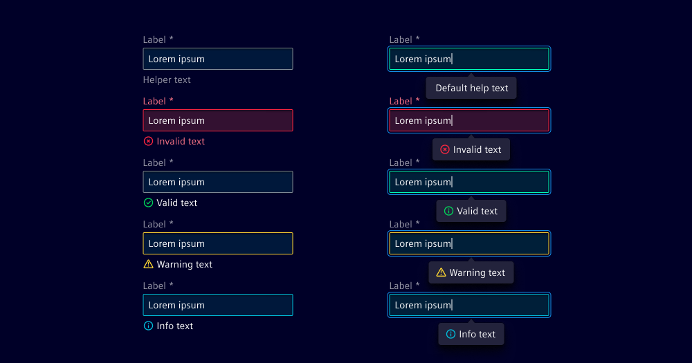
States
- Default: The initial state of a form field, often before any user interaction or validation.
- Example: Helper text with password strength requirements.
- Valid: Indicates that the user input meets all validation criteria and is acceptable.
- Example: User enters a password that meets all the criteria for a strong password.
- Info: Provides additional context or guidance to the user.
- Example: User changes a field that has a dependency to another field or is not saved yet.
- Warning: A non-critical issue or suggestion related to the input.
- Examples: User enters a weak password, or a rotation speed that is beyond a safety threshold.
- Invalid: Indicates that the user input does not meet the specified requirements.
- Examples: User enters an email address without the "@" symbol or misses a required input.
Dos and Don’ts
- Do use short and helpful copy for validation
- Do include all relevant information in the validation message, including context
- Don’t show valid feedback on components, only in the input help component
Related patterns
Development
This section details the technical implementation of validation in form components, utilizing component attributes along with corresponding CSS classes to represent various validation states.
Validation text
- helperText (optional): Text displayed below the field component to provide additional information.
- infoText (optional): Informational text for the field component.
- warningText (optional): Warning text for the field component.
- invalidText (optional): Error text for the field component.
- validText (optional): Valid text for the field component.
- showTextAsTooltip (optional): Determines whether to display helper, info, warning, error, and valid text as tooltips.
Validation states
To change the validation representation, you have to apply the corresponding classes to the component.
ix-valid: To show component as valid (Priority 1)ix-info: To show component as info (Priority 2)ix-warning: To show component as warning (Priority 3)ix-invalid: To show component as invalid (Priority 4)
These classes have different priority levels, which determining in which order the styling is applied to the component. (1 is the lowest priority and 3 the highest)
Example
<ix-select class="ix-invalid ix-info"></ix-select>
Above example will result in displaying the component as invalid, because invalid has a higher priority than info.
When using Angular in combination with reactive forms, it is not necessary to
manually apply the CSS classes .ix-invalid and .ix-valid. This will be
done automatically through value accessors.
Suppress internal validation
To suppress the internal validation of a component, you have to provide the novalidate attribute to the form element.
<form novalidate>
  <!-- form content -->
</form>
Example
- Angular
- React
- Vue
Please note that using the required attribute in an Angular application could result in unfavourabe behaviour displaying the field as invalid even if there was no user interaction yet.
To avoid that it is suggested not to add the required attribute, but implement a custom validator for required fields instead (see name and last-name in the following code).
Using react-form-hook is just an example to demonstrate how validation could be done
within React. You can use any other validation library or write your own validation logic.
Using @vuelidate/core is just an example to demonstrate how validation could be done
within Vue. You can use any other validation library or write your own validation logic.