Toggle buttons
Since 2.0.0Guidelines Development
Guidelines
Toggle buttons are button elements which allow the user to activate/deactivate a function. Toggle buttons with and without text labels are available. We typically use toggle buttons within button groups when users can chose between more than two options or when two available options don't follow the on/off metaphor.
Variants, options and states of the ix button and the ix icon button components apply. Only additional, deviating or detailing specifications are listed here.
Options
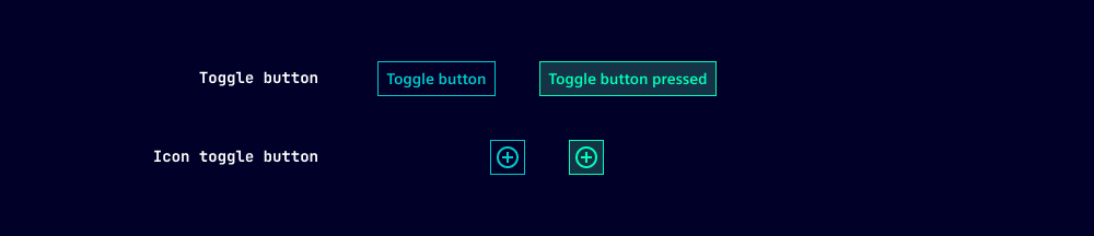
- Pressed: Toggle buttons can take a pressed (active) state. To improve accessibility, this state is set via the pressed option so it can be read by screen readers.
- The options type and color are not available for toggle buttons.
- For the primary variant, one of the options outline or ghost has to be set.
Behavior in context
- Button groups: We often place toggle buttons in button groups. Typically, only one button within the group is pressed while the others take the default state.
States
Toggle buttons have five states: Default, hover, active, disabled, loading and focused. All states are also available for pressed toggled buttons.
Dos and Don'ts
- Do use toggle buttons when users can switch between more than two exclusive options
- Do use toggle buttons when two opposing options don't follow the on/off metaphor
Related patterns
Development
Examples
Toggle button primary
Toggle button primary outline
Toggle button primary ghost
Toggle button secondary
Toggle button secondary outline
Toggle button secondary ghost
Icon Toggle button secondary outline
Icon Toggle button secondary ghost
Icon Toggle Button secondary
Icon Toggle button primary outline
Icon Toggle Button primary ghost
API (ix-toggle-button)
Properties
Name
Description and specifications
disabled
Disable the button
Attribute:
disabledType:
booleanDefault:
falseghost
Button with no background or outline
Attribute:
ghostType:
booleanDefault:
falseicon
Icon name
Attribute:
iconType:
string | undefinedloading
Loading button
Attribute:
loadingType:
booleanDefault:
falseoutline
Outline button
Attribute:
outlineType:
booleanDefault:
falsepressed
Show button as pressed
Attribute:
pressedType:
booleanDefault:
falsevariant
Button variant.
Important: Variant 'primary' can only be combined with either outline or ghost.
Attribute:
variantType:
"danger" | "primary" | "secondary"Default:
'secondary'Events
Name
Description and specifications
pressedChange
Pressed change event
Detail:
booleanAPI (ix-icon-toggle-button)
Properties
Name
Description and specifications
disabled
Disable the button
Attribute:
disabledType:
booleanDefault:
falseghost
Button with no background or outline
Attribute:
ghostType:
booleanDefault:
falseicon
Icon name
Attribute:
iconType:
string | undefinedloading
Loading button
Attribute:
loadingType:
booleanDefault:
falseoutline
Outline button
Attribute:
outlineType:
booleanDefault:
falsepressed
Show button as pressed
Attribute:
pressedType:
booleanDefault:
falsesize
Size of icon in button
Attribute:
sizeType:
"12" | "16" | "24"Default:
'24'variant
Button variant.
Important: Variant 'primary' can only be combined with either outline or ghost.
Attribute:
variantType:
"danger" | "primary" | "secondary"Default:
'secondary'Events
Name
Description and specifications
pressedChange
Pressed change event
Detail:
boolean