Application
Since 2.1.0Guidelines Development
Guidelines
Application is a technical and infrastructural component without a direct visual appearance. It lays out the top level app elements like header, navigation menu and content. Furthermore, it controls the breakpoint handling and the theming of an application.
Application switch
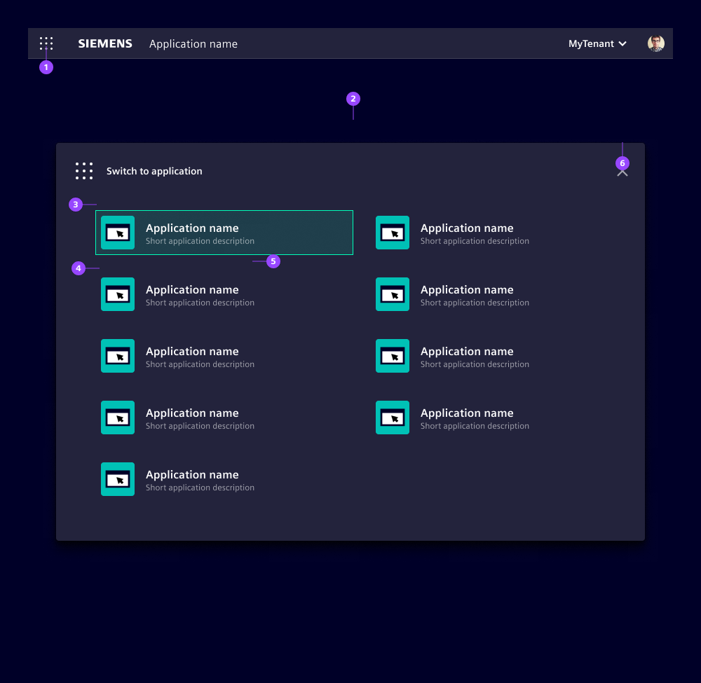
- Application switch button opens the modal
- Application switch modal with a list of applications
- Current application
- Link to another application with icon, name and optional description
- Indicator "open in a new browser tab"
- Close icon
With the application switch, users can navigate across applications. The interaction control – the application switch button (1) – is in the application header. Clicking the button opens a modal (2) with a list of available applications your users can switch to. This list is technically defined in the application component and its content depends on your product strategy. Our lists typically contain applications belonging to a software suite, applications with a similar scope or applications a user has purchased.
Clicking the current application closes the modal. Clicking another application closes the modal and opens the target application in the same or in a new browser tab, depending on the defined target option. Switching between browser tabs is much faster than loading the applications each time in the same browser tab, however, switching between multiple browser tabs could confuse users.
We typically avoid opening the same application in multiple browser tabs. Instead, we recommend switching to the browser tab where the application is already open. Nonetheless, be aware this does not work under all circumstances and some browsers cannot support this feature.
Options
- forceBreakpoint: Forces a specific breakpoint "lg", "md" or "sm". This can be used to force a specific application behavior that ignores the current browser viewport width.
Behavior
The application component automatically adapts, by default, to three breakpoints and changes the application layout accordingly:
- "lg" for large screens (min-width 62em)
- "md" for medium screens (min-width 48em)
- "sm" for small screens (min-width 36em)
Development
The application component acts as a centralized hub for configuring aspects of your web-application, such as screen breakpoints, theming and app switch configuration. By consolidating these configuration points, it simplifies the management of application-wide settings and ensures a consistent user interface across different scenarios.
The component itself is designed with modularity in mind. It can be seamlessly integrated with other components such as application-header, menu, content and more. This modular approach allows you to mix and match components based on your specific application requirements, providing flexibility and customization options.
It's important to note that the application component focuses solely on layouting and does not dictate visual design.
Examples
Basic
The code snippet below shows an example of a combination of different components, like ix-application-header or ix-content.
Breakpoints
Application switch
The navigation to another application is implemented via window.open (https://developer.mozilla.org/en-US/docs/Web/API/Window/open). Therefore you can control if the navigation should happen inside the current browser context target: '_self' or inside a new tab target: '_blank' (more information about target can be found here)
  {
    id: 'demo-app-2',
    name: 'Calculator App',
    description: 'Example description for Calculator App',
    iconSrc: '...url to some icon',

    url: '...target url',
    target: '_self', // Define the navigation context (e.g current browser context or new tab)
  }
API
Props
undefined | { currentAppId: string; apps: { id: string; name: string; description: string; url: string; target: AppSwitchConfigurationTarget; iconSrc: string; }[]; i18nAppSwitch?: string | undefined; i18nLoadingApps?: string | undefined; }("sm" | "md" | "lg")[]['sm', 'md', 'lg']force-breakpoint"lg" | "md" | "sm" | undefinedtheme"classic" | "classic-dark" | "classic-light" | string & Record<never, never> | undefinedtheme-system-appearancebooleanfalseEvents
No events available for this component.