Basics
Siemens Industrial Experience provides a theme for the popular chart library ECharts. This lets you seamlessly integrate ECharts into the Siemens Industrial Experience design system.
ECharts is a third-party library distributed under Apache License 2.0.
Attributes
| Name | Description |
|---|---|
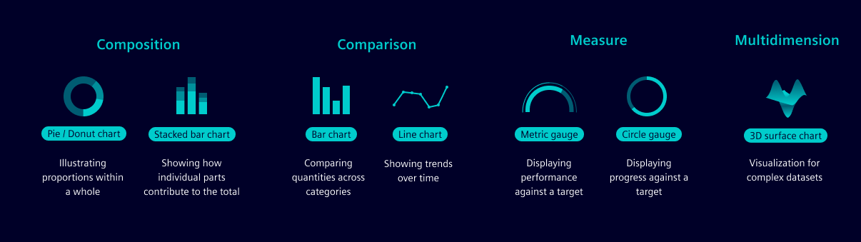
| Axes | Axes are used to display the data in a chart. They are the horizontal and vertical lines that form the chart's grid. Axes are labeled to indicate what data they represent. |
| Scale | Scales are used to map data values to a visual representation. The scale type is determined by the type of data being visualized. |
| Labels | Labels are used to describe the dimensions represented, often including units of measurement, e.g. “Distance traveled (m)”. |
| Grid lines | Grid lines help to visually align data points within the chart. |
| Legend | Legends explain the symbols, colors or patterns used in the chart to represent different data sets. You can toggle the visibility of the data series by clicking on the date in the legend. |
| Tooltip | Tooltips provide more details about data while hovering over the area. |
Installation
To install the Siemens Industrial Experience ECharts theme, follow the steps below:
npm install --save @siemens/ix-echarts
- Import the
registerThemefunction from our module. - Invoke this function, passing in your
echartsinstance as an argument. You do not need to provide theechartsinstance if it's provided globally in yourwindowobject when using vanilla Javascript. - Once this is done, you’ll be able to utilize the
brand-dark,brand-light,classic-darkandclassic-lightthemes for your chart.
import { registerTheme } from '@siemens/ix-echarts';

registerTheme(echarts);
For Angular, make sure to correctly add NgxEcharts in your module file.
Colors
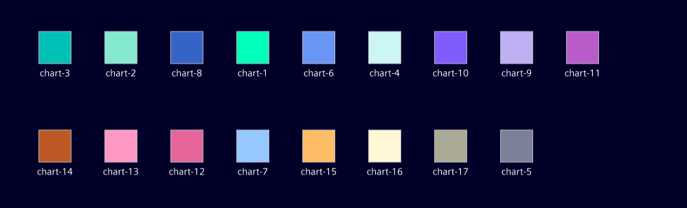
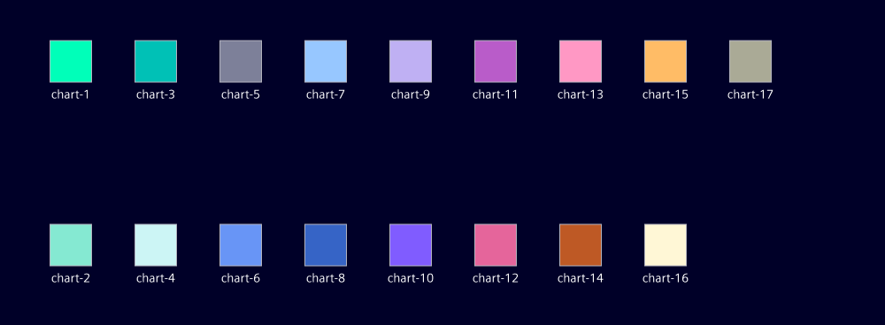
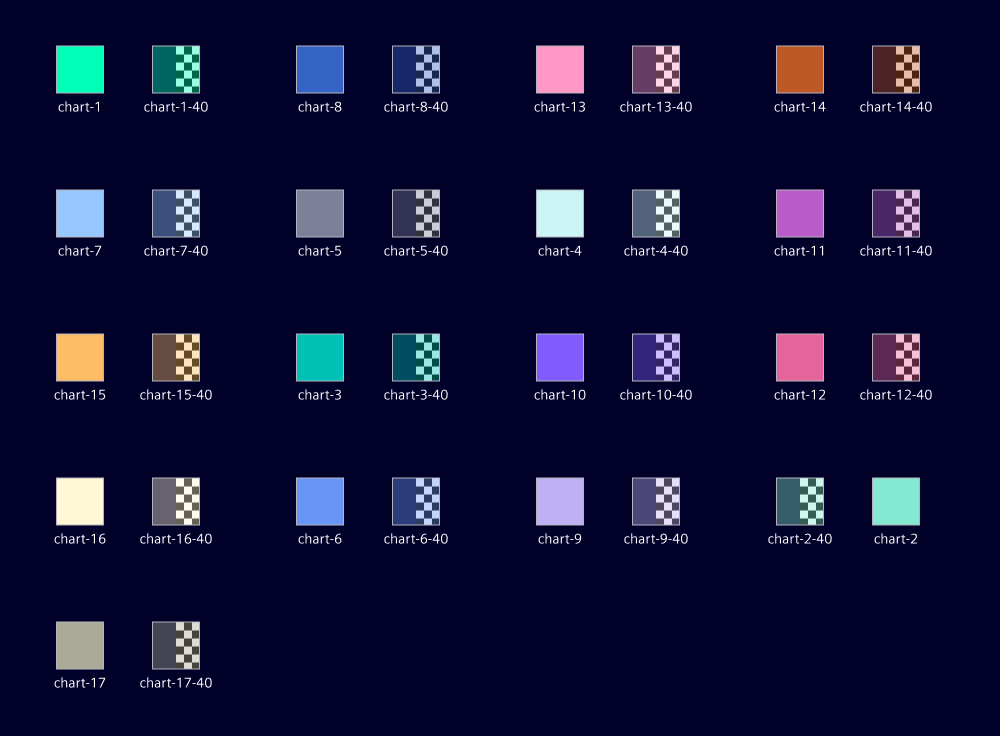
The Siemens Industrial Experience ECharts theme provides a set of colors that are used to style the charts. These colors are optimized for accessibility and readability.
Categorical data For easily distinguishable data series where each category is distinct but not ordered, we recommend the following color sequence. Example: Different product types or regions.
Sequential data For ordered data, we recommend using every second color, e.g. chart-1, chart-3, chart-5, etc. Example: monthly data.
Comparative data For comparing data within a category, we recommend using the matching -40 color with 40% opacity. Example: last year and current year.
Loading indicators
A loading indicator provides users with visual feedback that the chart is being processed and will be displayed shortly. The loading indicator should be displayed when the chart is loading data or rendering, to visually indicate that the chart is not ready yet.
Empty states
An empty state occurs when a user first opens an application, no data is available, or the user has filtered out all data. The empty state should be visually distinct from the loading state and should provide a clear message to the user. This message should explain why the empty state is being displayed and provide guidance on how to proceed.
Failure and error messages
A failure occurs when no data can be displayed within the chart. This can happen for various reasons, such as connection failure and missing data. Error messages have the following elements to help users understand and resolve any issues:
- State problem: What happened? Add a clear reason for the error, e.g. “No data available”
- Explain cause: Why did the error appear? A clear and concise message explaining why the error happened, e.g. "Connection failure"
- Give solution: What can the user do to proceed?
Add clear instructions for the user regarding what to do next to resolve the error, e.g. “Try again”
For more detailed information and examples, see the UX writing style guide.
Missing data points
Indicate missing data with a special visual marker (like a different color or shape) to highlight the gaps without connecting them.