Mobile experience
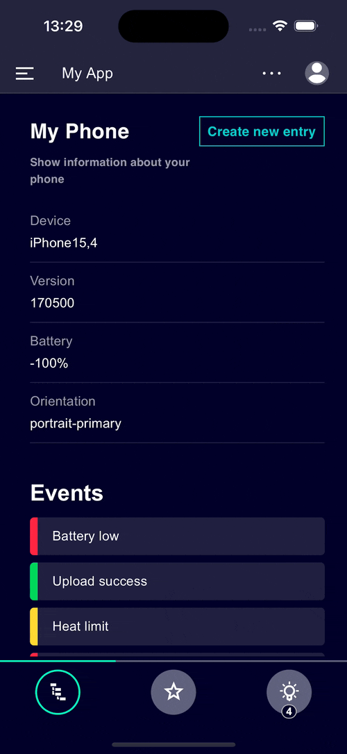
Use Siemens Industrial Experience to create mobile applications jointly with web technology based approaches easily. With the help of our design system you are able to swiftly build the user interface of your mobile web app or hybrid app. Check out our hybrid example application using Ionic, React and Siemens Industrial Experience on the left. Regardless of the technology there are aspects to take into consideration when you optimize applications for mobile devices:
|
Mobile app development
There are different ways to create applications for mobile devices:
- Web apps are accessed through a web browser and are platform-independent.
- Native apps are tailored for a particular platform like iOS or Android and usually need to be developed in a specific way for every target platform separately.
- Hybrid apps are based on web technologies while targeting multiple platforms using a single codebase.
Optimize your web application for mobile devices without any significant technological changes to provide a seamless User Experience across devices and screen sizes (read more about responsive and adaptive design here).
Hybrid app development
Since mobile web apps have some limitations as shown above, we recommend hybrid apps to combine the advantages of web and native apps.
Hybrid apps are built using web technologies but run inside a native container providing access to device APIs, allowing native features of the device's operating system and hardware to be used. A variety of frameworks for building hybrid mobile applications are available today. Some provide User Interface components for a closer integration with the different operating systems designs.
The table below shows the differences of the three approaches at a glance:
| (Mobile) web app | Native app | Hybrid app | |
|---|---|---|---|
| Performance | Medium / high | Best possible | Medium / high |
| Look & Feel | Individual | Platform native | Platform native / individual |
| Development effort | Low | High | Medium |
| Hardware features | Limited | Best possible | Extensive (depending on plugin availability) |
| Packaging, distribution | Browser only | Installation, App stores | Installation, App stores |
| Offline capability | Not supported | Supported | Supported |
| Siemens Industrial Experience Components | Supported | Not supported | Supported |
Cf. ionic.io - What is Hybrid Mobile App Development?
To learn more about how this works and how to implement it yourself keep on reading.
Using Ionic
Developers have many options when choosing a framework for implementing mobile applications. In this example, we use Ionic and React to implement a hybrid mobile application that can be deployed on your mobile device.
Theming Ionic
In the first step, we're going to create a theme mapping between Siemens Industrial Experience and Ionic Framework.
Ionic uses CSS custom properties (variables), just like Siemens Industrial Experience does. This makes is easy to map between the two theming systems.
Here is an example of a default theme mapping: Repository Link.
Define safe areas
Most devices nowadays do not have a rectangular display, but often feature rounded corners or characteristics like a display cut-out ("notch").
To adapt our application to this, we need to set environment variables called safe-area-inset. This helps the ix-application to layout the frame of your application correctly.
--ix-safe-area-inset-top: env(safe-area-inset-top);
--ix-safe-area-inset-right: env(safe-area-inset-right);
--ix-safe-area-inset-bottom: env(safe-area-inset-bottom);
--ix-safe-area-inset-left: env(safe-area-inset-left);
Additionally, some variables specific to your hardware need to be set. In our example, we use an iPhone with a notch at the top. Depending on the display orientation, it's required to adjust the safe-areas of some components (e.g. ix-menu).
body[data-screen-orientation='landscape-primary'] {
  /*
  * If the device is in landscape-primary orientation,
  * we need to adjust the safe areas for the menu.
  * The data-screen-orientation attribute is added by the main.ts file
  */
  --ix-application-menu-safe-area-left: var(--ix-safe-area-inset-left);
}
The CSS selector body[data-screen-orientation='landscape-primary'] is not provided via the ionic framework.
A suitable way to add it to the app is the main.ts file of your project. There are two options:
- Capacitor plugin:
@capacitor/screen-orientation - Browser api:
ScreenOrientation
import { ScreenOrientation } from '@capacitor/screen-orientation';

async function screenOrientation() {
  const { type } = await ScreenOrientation.orientation();
  window.document.body.setAttribute('data-screen-orientation', type);

  ScreenOrientation.addListener('screenOrientationChange', ({ type }) => {
    window.document.body.setAttribute('data-screen-orientation', type);
  });
}

screenOrientation();

root.render(
  <React.StrictMode>
    <App />
  </React.StrictMode>
);
At this point, the application frame should respect all areas of your device which are not part of the app.
Use the defined variables to ensure that the pages of your application displaying content also respect the previously defined areas as well.
.my-content-space {
  margin-top: var(--ix-safe-area-inset-top);
}
Application frame layout
By default, the Application Frame provides three default layouts (sm, md, lg) that are automatically applied depending on the size of the screen.
If you intend to implement an app for both phones and tablets (e.g. iPhone and iPad), it may be necessary to configure the layouts which the application frame can pick from.
For apps targeting phones and tablets, typically the sm and md layouts are suitable.
const Application = () => {
  return (
    <IonApp>
      ...
      <IxApplication breakpoints={breakpoints}>...</IxApplication>
      ...
    </IonApp>
  );
};
As mentioned above, in some cases it is beneficial to adapt the layouts (breakpoints) depending on the hardware. For example, the layout md will be applied for an iPhone in landscape orientation and iPad in portrait orientation.
Ionic provides utility functions that help to decide which layout to choose.
const ipad = [`sm`, 'md', 'lg'];
const iphone = [`sm`];

let breakpoints = isPlatform('ipad') ? ipad : iphone;

const Application = () => {
  return (
    <IonApp>
      ...
      <IxApplication breakpoints={breakpoints}>...</IxApplication>
      ...
    </IonApp>
  );
};