Icons
Guidelines Development
Guidelines
Icons
The following section is about in-app icons, used in the actual application UI and UI elements. It is not about application icons, that usually appear on a launch pad, home screen, desktop, task bar or the like.
Usage
Icons are graphical representations of terms, functions, objects etc.. Ideally, they are used together with a descriptive text to make it easier for users to learn their meaning. A standalone icon, without textual description, has to be paired with a tooltip that describes the meaning of the icon. Make sure a description can be read out by screen readers.
Icon library
The Siemens Industrial Experience design system comes with an extensive set of icons made for the industrial context. Since it is almost impossible to cover every thinkable icon usecase, it is also possible to integrate external icons to complement the icon set.
Designing new icons
Before you start designing your specific icon set for your application, consider the following:
-
Make sure the icons you need are not already in the library
-
Maybe the icon already exists under a slightly different name or it might be planned for a future release so please double check or ask us when in doubt
-
Consider using more generic icons than creating multiple very specific new ones (e.g.: Use the generic "add" icon instead of creating an "add-wireless-device" icon)
-
Do not create alternatives to existing icons just for the sake of your own look
-
Ask other designers within your company about the existence of an icon, to prevent creation of duplicates
-
Finally: Entrust a professional designer with the task of designing an icon
Technical requirements
Icons in our design system are monochromatic. They will be colored during runtime, depending on the context they are being used in. For more technical requirements see the "Code" tab above.
Formal requirements
New icons should follow the app icon guidelines below for a consistent look & feel across applications. For Siemens applications it is mandatory to follow these guidelines.
Icon design guidelines
These guidelines extend the basic guidelines on Siemens brandville.
1. Icon grid size
- The basic icon grid size is 24✕24
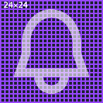
2. In-app icon design grid
-
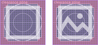
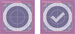
Use the design grid component “Icon Design Grid” from the “Assets” library as background for creating new icons
-
The design grid helps to limit the icon boundaries to achieve an evenly optical weight of different icon shapes
-
The clearance zone (red area) should not be touched by the icon (for exceptions see below)
-
The lines represent the boundaries of key shapes or just mark the center
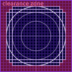
-
Use the portrait key shape for vertically oriented shapes
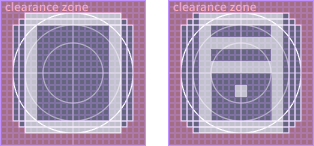
-
Use the landscape key shape for horizontally oriented shapes
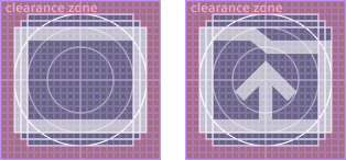
-
Use the square key shape for square icons
-
Use the circle key shape for round icons
Exceptions to the clearance zone
-
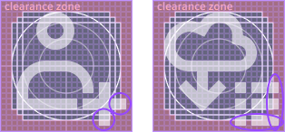
Icons with attributes: Icons can be enhanced with attributes. These attributes are allowed to touch the clearance zone but should keep at least 1px space to the outer boundary
-
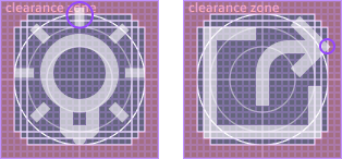
Optical fixes: Shapes are allowed to touch the clearance zone to equalize visual effects with pointed shapes or single strokes
3. Light weight icons
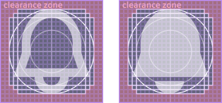
- Prefer strokes and outlines over filled shapes
- Please provide a filled variant of the icon as well, where possible and potentially useful. It can be used in situations when more visual weight is required. The filled variant gets the name suffix “-filled”.
4. Simple and geometric
- Keep icons as simple as possible
- Avoid complex symbols or symbol combinations whenever possible
- Create icons from geometric shapes
- Prefer sharp corners and straight lines
- Use rounded corners and endings only to support the characteristics of the represented object

5. Stroke widths
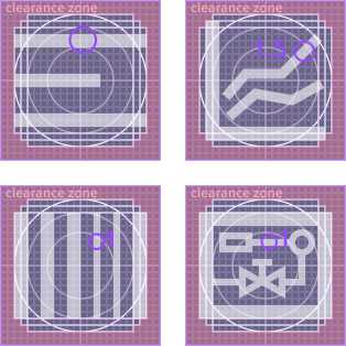
- Default stroke width is 2px
- In case icon readability can't be guaranteed otherwise, stroke widths of 1.5px or even 1x are also allowed. Before doing that please make sure all rules from section 4 are followed.
6. Gaps
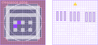
- Anti-aliasing effects can lead to blurry borders and edges
- Use 2px gaps to visually separate two shapes from each other
- Avoid unsafe patterns of alternating between set pixel and no pixel. In the worst case such shapes cannot be visually distinguished anymore.
7. Strikethrough, cuts and cutouts
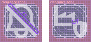
- A diagonal strikethrough is used to symbolize the opposite of an icon or an unavailability (e.g. show & hide, switch off alarm)
- A diagonal strikethrough starts from top left and ends at the bottom right (refers to the crossbar of letter “N” for “No”), followed by a 2px space above right
- Use at least 1px space for cuts or cutouts (be aware of “unsafe patterns”, see 6.)
8. The technical finish
Prepare your icon for integration
- The icon size (including clearance zone) must be 24x24
- The icon must not contain strokes (convert all strokes to outlines)
- Combine all icon parts to one single shape by using boolean operations
- Name the remaining shape “Vector”, otherwise color overrides will not work properly in Figma
- Make sure the shape is set to “Scale” in the “Constraints” settings in Figma, otherwise the resizing will not work properly
Integrate in Figma
- Create a component from your icon
- Use a short, descriptive and unique name - also consider adding a project or application suffix to the icon name to prevent naming collisions with other external icons
- "Publish" the document with your icon(s) and it will be available as library in your document assets
- Activate your library in the design document
Export for development
- Create an instance of your icon (this can be done in the same document the icon is stored in)
- Resize this instance to 512×512 (target size for development integration)
- Check if the scaling works properly (check scaling settings, if not)
- Export the instance as SVG
- Check the SVG code and remove any title attributes (
<title> ... </title>) to make sure no unintentional tooltips appear on the icon - Make sure the name of the SVG file matches the icon name to avoid confusion
- Hand the SVG over to your development
Development
Usage
Angular
<ix-icon name="star" size="16"></ix-icon>
<ix-icon name="star" size="24"></ix-icon>
<ix-icon name="star" size="32"></ix-icon>
React
<IxIcon name="star" size="16"></IxIcon>
<IxIcon name="star" size="24"></IxIcon>
<IxIcon name="star" size="32"></IxIcon>
Web components
<ix-icon name="star" size="16"></ix-icon>
<ix-icon name="star" size="24"></ix-icon>
<ix-icon name="star" size="32"></ix-icon>
Vue
<IxIcon name="star" size="16"></IxIcon>
<IxIcon name="star" size="24"></IxIcon>
<IxIcon name="star" size="32"></IxIcon>
Integrate external icons
Technical requirements
- Supported icon format is SVG
- Each icon is a single SVG file, Sprites are not supported yet
- The icon has a size of 512✕512 (width, height and viewBox)
- All color information within the SVG will be ignored
- Remove any title attributes (
<title> ... </title>) to make sure no unintentional tooltips appear on the icon - For visual and formal requirements see guidelines tab above
  <ix-icon name="./assets/my-icon.svg"></ix-icon>
  <ix-icon name="https://my.example.cdn.address/assets/my-icon.svg"></ix-icon>
Internal SVG structure
The provided SVG icons are graphic resources whose code is mostly generated by design applications such as Figma, Sketch or Adobe Illustrator. The tools use different export routines, which can also change over time. We therefore cannot guarantee that the internal structure of an SVG will be preserved after updates – even if the icons remain visually the same.