Menu
Guidelines Development
Guidelines
The navigation menu is an essential part of your application. It offers a way to directly navigate to the main application parts and it can give your users access to legal and version information, and access to settings.
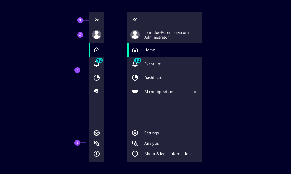
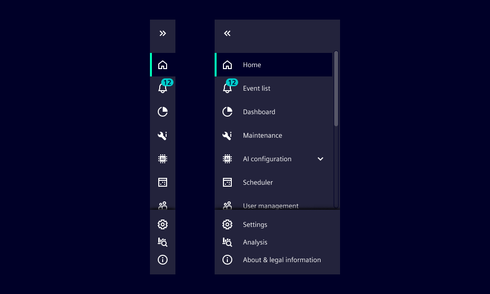
- Expand/collapse icon button: Expands and collapses the navigation menu.
- Avatar button: Shows the logged-in user and provides access to user-related actions (optional)
Please note: Only basic navigation and map navigation still use the avatar at this position. The new application frame uses the avatar inside the application header. - Navigation section: Navigates through the main parts of an application.
- Bottom section: Hosts infrastructural actions and additional content but does not navigate away from the selected main part.
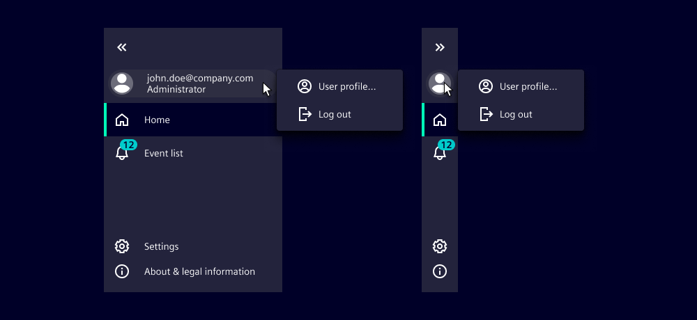
Avatar button
The avatar button is optional. It shows information about the logged-in user. When collapsed it shows only the avatar, and when expanded it shows additional user information. A dropdown menu with user-related actions appears when selecting (note the available actions are specific to each application). The log out item is available by default.
Please note: Only basic navigation and map navigation still use the avatar in the navigation menu. The new application frame uses the avatar inside the application header.
Avatar button options
- top: Defines the first line of the additional user information. We typically use this to show primary user information (first and last name or username), depending on the available information. Overflows are clipped with an ellipsis (...).
- bottom: Defines the second line of additional user information, used to show secondary information, for example user role. Overflows are clipped with an ellipsis (...).
- initials: Shows avatar with initials.
- image: Shows avatar with images.
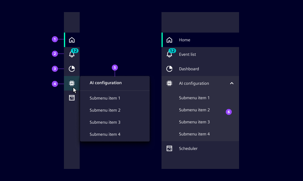
Menu item and menu category
Menu items represent the main parts of an application. They have an icon for quick visual identification. When the navigation menu is expanded, the full name of the item is visible.
Menu categories can host menu items as a second navigation level.
- Selected item
- Item with notification
- Unselected item
- Menu category, holds menu items as a second level navigation (on selection, the second level items appear)
- Second level navigation menu, appears when navigation menu is collapsed
- Second level navigation expanded inline, appears when navigation menu is expanded
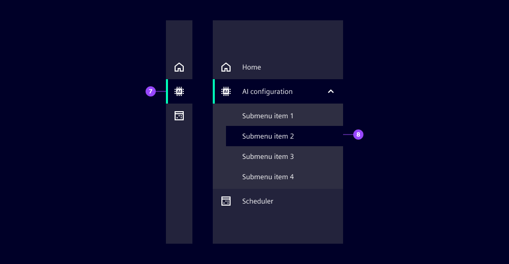
- Menu category appears selected if one of its children items is selected
- When second level menu items are visible, the currently selected item also appears selected
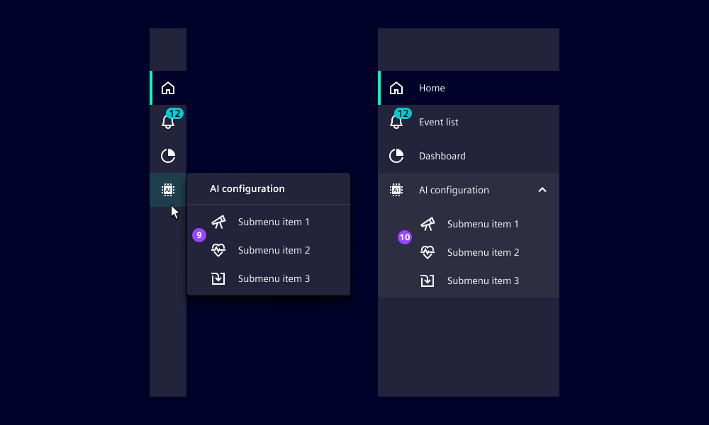
Second level items with icons in collapsed (9) and expanded (10) navigation menu
We usually don’t use icons on the second navigation level as in most cases it won’t add any value for users. But it is allowed to use icons if it helps users to better understand and recognize the items. Don’t mix items with and without icon within a category.
Options of menu items and menu category
- Notifications: Displays a number at the top right corner of the icon (2).
Bottom section
Items in this section do not navigate away from the current content. They either toggle states, e.g. light and dark mode, or open a layer over the current content. This means users do not lose their current workflow by interacting with these items.
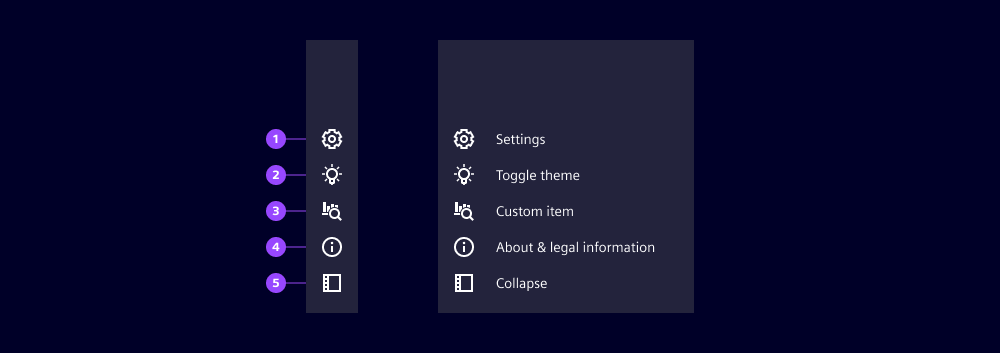
- Settings: Opens the settings overlay.
- Toggle theme: Toggles between light and dark themes.
- Custom item
- About & legal information: Opens the about & legal overlay to display legal information, release notes, license information, etc.
- Collapse/expand side panel: Only relevant for map navigation.
Navigation menu options
- enableSettings
default: true: Shows the settings icon (gear wheel) in the bottom section, it opens the settings overlay and the content can be freely defined. - enableToggleTheme
default: false: Shows the theme toggle icon, offers an easy and direct way to toggle between light and dark themes. We don’t typically use this when dedicated theme settings are available elsewhere, e.g. in the settings overlay. - enableMapExpand
default: false: Only relevant for map navigation, shows an icon that expands/collapses the side panel of the map navigation.
See the code tab for more information and other options available.
Behavior
- Navigation menu expands and collapses with a transition.
- The width of the collapse and expand state are fixed and cannot be configured.
- The number of menu items can overflow, this is recognizable by the shadow at the bottom and/or top.
Dos and Don’ts
- Do use icons in second-level navigation items when it helps users to better understand and recognize them
- Don’t mix menu items with and without icons within a second-level navigation category
- Don’t place non-navigational items in the navigation section
- Don’t place navigation items in the bottom section as items in the bottom section must not navigate away from the current context
Development
Examples
Basic
2nd navigation level
Since 2.0.0Avatar
Bottom tabs
Caution: Since the old implementation using the bottom property on menu items had some problems and will not work anymore, please use slot="bottom" instead.
API (ix-menu)
Properties
application-descriptionstring''application-namestring | undefinedenable-map-expandbooleanfalseenable-settingsbooleantrueenable-toggle-themebooleanfalseexpandbooleanfalsei-1-8n-collapsestring'Collapse'i-1-8n-expandstring' Expand'i-1-8n-expand-sidebarstring'Expand sidebar'i-1-8n-legalstring'About & legal information'i-1-8n-settingsstring'Settings'i-1-8n-toggle-themestring'Toggle theme'max-visible-menu-itemsnumber9pinnedbooleanfalseshow-aboutbooleanfalseshow-settingsbooleanfalsestart-expandedbooleanfalseEvents
booleanbooleanvoidAPI (ix-menu-item)
Props
activebooleanfalsebottombooleanfalsedisabledbooleanfalsehomebooleanfalseiconstring | undefinedlabelstring | undefinednotificationsnumber | undefinedtab-iconstring | undefinedEvents
No events available for this component.
API (ix-menu-category)
Properties
iconstring | undefinedlabelstring | undefinednotificationsnumber | undefinedEvents
No events available for this component.
API (ix-menu-avatar)
Properties
bottomstring | undefinedi-1-8n-logoutstring'Logout'imagestring | undefinedinitialsstring | undefinedshow-logout-buttonbooleantruetopstring | undefinedEvents
anyAPI (ix-menu-avatar-item)
Properties
iconstring | undefinedlabelstring | undefinedEvents
MouseEvent