Split button
Guidelines Development
Guidelines
Split buttons are button elements that allow users to either trigger an action with one click or select an action from a list of options. They consist of two parts: a button labeled with text and/or an icon on the left and a dropdown button labeled with an icon on the right. We typically use split buttons when a default action is available but more options need to be offered. Split buttons group similar or related actions.
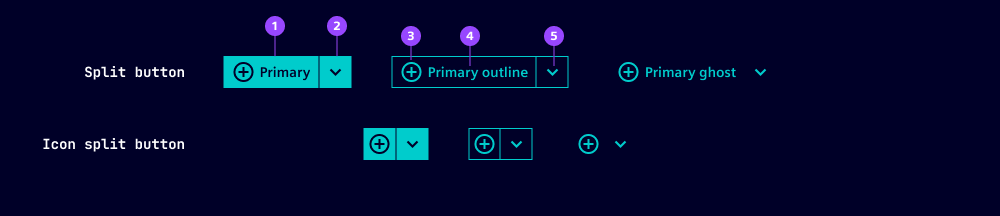
- Button
- Dropdown button
- Button icon
- Button label
- Dropdown button icon
All the variants, options and states of the ix button and the ix dropdown button components apply to the split button. We've listed additional or deviating specifications here.
Options
- Disabled: The disabled option can be applied to the complete component. There is no option to disable each part of the split button independently.
- Label: Set a label for the button component (left side). We typically use short labels that contain a verb.
- Placement: Define where the flyout appears which is triggered when the dropdown button is active. You can choose between different directions (top, bottom, left, right) and two options for alignment with the button (start, end). When there is not enough space for the chosen setting, the placement is corrected automatically.

- Bottom-end placement
- Bottom-start placement
- SplitIcon: We typically use a chevron icon on the dropdown button, but a custom icon can be set. A common alternative to the chevron is the "more-menu" icon.
- The options loading and type are not available for split buttons.
Behavior in context
- Interaction: When users press an option from the dropdown list, the action is triggered. Typically the label of the button on the left side stays static. Be aware that updating the left side with the last triggered action may lead to layout changes (e.g. button width) and requires updating the dropdown by adding the action that was removed from the button face.
States
Split buttons have five states: Default, hover, active, disabled and focused. States are applied to left and the right part of the split button independently except for the disabled state. The visual appearance and the behavior of the states is the same as the ix button and the ix dropdown button.
Dos and Don’ts
- Do use split buttons when there is a frequent or most-important action
- Don't use split buttons for unrelated actions
- Don't duplicate the default option in the dropdown
Related patterns
Development
Examples
With icon only
API (ix-split-button)
Properties
close-behavior"both" | "inside" | "outside" | boolean'both'disabledbooleanfalseghostbooleanfalseiconstring''labelstring | undefinedoutlinebooleanfalseplacement"bottom-end" | "bottom-start" | "left-end" | "left-start" | "right-end" | "right-start" | "top-end" | "top-start"'bottom-start'split-iconstring'context-menu'variant"danger" | "primary" | "secondary"'primary'Events
MouseEventAPI (ix-split-button-item)
Properties
iconstring | undefinedlabelstring | undefinedEvents
MouseEvent