Icon button
Guidelines Development
Guidelines
Icon buttons are button elements containing only an icon and no text. Due to their small size, icon buttons are often used in complex layouts. We only use icon buttons if a well-known icon is available or the meaning of the icon metaphor is clear from the context.
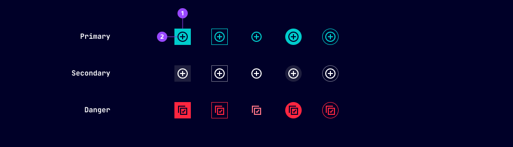
- Container
- Icon
All the variants, options and states of the button component apply to the icon button. We’ve listed additional or deviating specifications here.
Options
- Color: The color of the icon displayed on an icon button is adjustable. In our applications, we only adjust the icon color when we place icon buttons on backgrounds with a non-standard color to maintain a proper contrast between the elements.
- Oval: The shape of icon button containers can be adjusted from square to oval. The recommended shape of icon buttons depends on the shape of the parent component. We typically use square icon buttons within rectangular components or in a button cluster, and oval icon buttons within oval components.
- Size: Icon buttons can have three different sizes. We use the extra small size (12) within very small parent components, the small size (16) within any standard parent components (e.g. to clear the search input) and the default size (24) for standalone applications.
Dos and Don’ts
- Do use icons that have a clear meaning for the user, otherwise use text buttons
- Don’t use icon buttons in large numbers, instead use a toolbar
- Don’t stretch icon buttons to span a container’s width
Related patterns
Development
Examples
Basic
API (ix-icon-button)
Properties
Name
Description and specifications
a11yLabel
Since 2.1.0
Accessibility label for the icon button
Will be set as aria-label on the nested HTML button element
Attribute:
a11y-labelType:
string | undefinedcolor
Deprecated
since 2.1.0 use `icon-color`
Color of icon in button
Attribute:
colorType:
string | undefineddisabled
Disabled
Attribute:
disabledType:
booleanDefault:
falseghost
Button invisible
Attribute:
ghostType:
booleanDefault:
falseicon
Icon name
Attribute:
iconType:
string | undefinediconColor
Color of icon in button
Attribute:
icon-colorType:
string | undefinedloading
Since 2.0.0
Loading button
Attribute:
loadingType:
booleanDefault:
falseoutline
Button outline
Attribute:
outlineType:
booleanDefault:
falseoval
Button in oval shape
Attribute:
ovalType:
booleanDefault:
falsesize
Deprecated
Only size 32 will be removed in 3.0.0
Size of icon in button
Attribute:
sizeType:
"12" | "16" | "24" | "32"Default:
'24'type
Type of the button
Attribute:
typeType:
"button" | "submit"Default:
'button'variant
Since 2.3.0 - variant danger
Variant of button
Attribute:
variantType:
"danger" | "primary" | "secondary"Default:
'secondary'Events
No events available for this component.