Dropdown button
Since 1.3.0Guidelines Development
Guidelines
Dropdown buttons are button elements that allow users to select an action from a list of options by clicking on a button and revealing a dropdown. Clicking on one of the exposed options triggers the action. We typically use dropdown buttons when no default action is available. Dropdown buttons typically group similar or related actions.
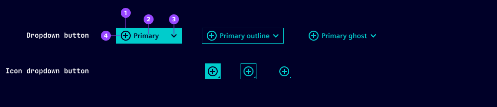
- Button container
- Button label
- Chevron
- Button icon
All the variants, options and states of the ix button component apply to the dropdown button. We've listed additional or deviating specifications here.
Options
- Label: Set a label for the dropdown button. We typically use short labels including verbs.
- Placement: Define where the dropdown appears when the button is active. Choose between different directions (top, bottom, left, right) and two options for alignment with the button (start, end). When there isn't enough space for the chosen placement, it's automatically corrected.
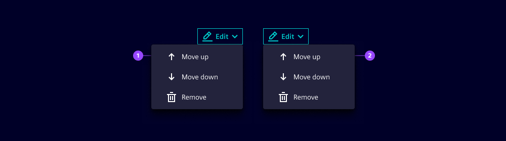
- Bottom-end placement
- Bottom-start placement
- For options of the dropdown triggered when pressing the button, please refer to our separate dropdown component guide.
- The options loading and type are not available for split buttons.
States
Dropdown buttons have five states: Default, hover, active, disabled and focused. In an active state, dropdown buttons show a dropdown with the available options. The visual appearance of the states is the same as the ix button component.
Dos and Don’ts
- Do use dropdown buttons when selecting an option triggers an action
- Don't use dropdown buttons when there is a frequent or most-important action (use a standard button or a split button instead)
Related patterns
Development
Examples
Basic
Icon
API
Properties
close-behavior"both" | "inside" | "outside" | boolean'both'disabledbooleanfalseghostbooleanfalseiconstring | undefinedlabelstring | undefinedoutlinebooleanfalseplacement"bottom-end" | "bottom-start" | "left-end" | "left-start" | "right-end" | "right-start" | "top-end" | "top-start" | undefinedvariant"danger" | "primary" | "secondary"'primary'Events
No events available for this component.