Field
Guidelines Development
Guidelines
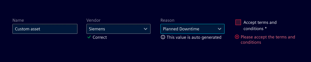
A field is a form element when user input is needed. It's typically used with other form elements in a fieldset.

- Label
- Form component
- Helper text
- Required indicator
- Counter (input and textarea field only)
Note: In this chapter, we describe the default field component. For details about custom fields, refer to the layouts chapter.
Options
- Label: Add a label for the field that provides context to your users.
- Required: The asterisk states whether user input is required on the field before submitting the form.
- Field: Use the appropriate field based on the type of input data, e.g. use text inputs for text-based data, checkboxes for selecting from a list of predefined options, or toggle switches for a binary choice.
- Helper text: Use to help users understand the field better. We typically use this when there are input restrictions or more information is required.
- Show text as tooltip: Display validation feedback either below the input field or as tooltip when the user hovers or focuses on the form field. Use a different text for the individual validation states that apply (see validation).
- Counter: Use a counter to show the number of characters entered into the field and the maximum number of characters allowed. We typically use it for text input or textarea fields.
Behavior in context
- Interaction: See validation.
- Behavior of a field as part of a form: See behavior.
- Text truncation: Labels, feedback and helper texts are not truncated but break into multiple lines if they exceed the field's width.
States
Interaction states: Default, hover, active, disabled, readonly, focus.
When a feedback tooltip is chosen over a message, the field shows a tooltip when in focus or hovered over in specific validation states.
Note: There are also several validation states (default, valid, info, warning, invalid) that are described in validation.
Dos and Don’ts
- Do use a label for every field
- Do use a counter for fields with a character limit
- Do use helper text to provide additional information or context about the field
- Don’t use helper text as a replacement for clear labels
- Don’t mix different variants of feedback text and tooltips
Related patterns
Development
All components which are tagged via form-ready are usable inside a form without requiring manual integration.
Label
Each form-ready component includes a label attribute that displays a label above the component.
<ix-select label="Demo"></ix-select>
The label attribute is optional and can be left empty to display no label.
Required indicator
To display an indicator whether a field is required, use the attribute required. The indicator is only displayed, when a label is set.
<ix-input label="Demo" required></ix-input>
Helper or feedback text
To display a helper or feedback text below your component please refer to validation.
Counter
To display a counter on inputs or textareas, use the attribute maxLength. If you prefer not to display a counter, programmatically apply a custom validation.
<ix-input max-length="128"></ix-input>