Layout grid
Guidelines Development
Guidelines
Grids are typically used to make layouts more cohesive and consistent. With layout grids, a two-dimensional layout system is available to create responsive layouts. Our layout grids are made of three elements: a grid, row(s) and column(s). The layout grid adapts to screen size and orientation.
Commonly, the layout grid is based on a 12 column layout. Columns are nested in rows and adapt in width according to the available space. Content is placed within columns. Column widths are set as percentage.
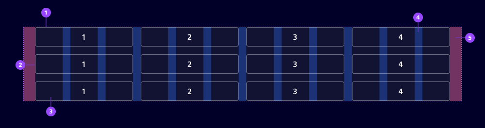
- Layout grid
- Row
- Column
- Gutter
- Margin
Options
Layout grid options
- The default number of columns in a grid is 12. It is possible to choose any number of columns between 2 and 12.
- Layout grids contain horizontal margins. For smaller viewports or when used within a component, the margin can be removed or reduced.
- As a general rule, a gutter of
1.5remis applied. The gutter can be decreased to allow for a narrower grouping of columns.
Column options
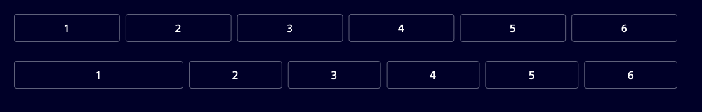
- The size of a column is defined by the available space and the number of columns. If no size is set, columns automatically have equal width. The size of a column can be adjusted so that it takes a higher percentage of the available space. The size property refers to the number of columns from the default of 12 per row.
Example: In a 12 column layout with 6 columns with equal width in place, each column takes a space of 1/6 (or 2 out of 12). When setting the size of the first column to 3 (corresponding to 3 out of 12), the remaining columns adjust their width to fit within the remaining space of 3/4 (or 9 out of 12).
- A column size
autois available. When set toauto, column width is defined by the width of its content. The remaining columns resize to fill the row. - Column size can be tailored to viewports. Three viewports are currently supported. The viewport size can't be adjusted at this point. When setting the size for one viewport, larger viewports are adjusted in the same way.
| Viewport name | Viewport size | Description |
|---|---|---|
| Small | 0-767 | set columns when min width is 0 |
| Medium | 768-1279 | set columns when min width is 768 |
| Large | 1280+ | set columns when min width is 1280 |
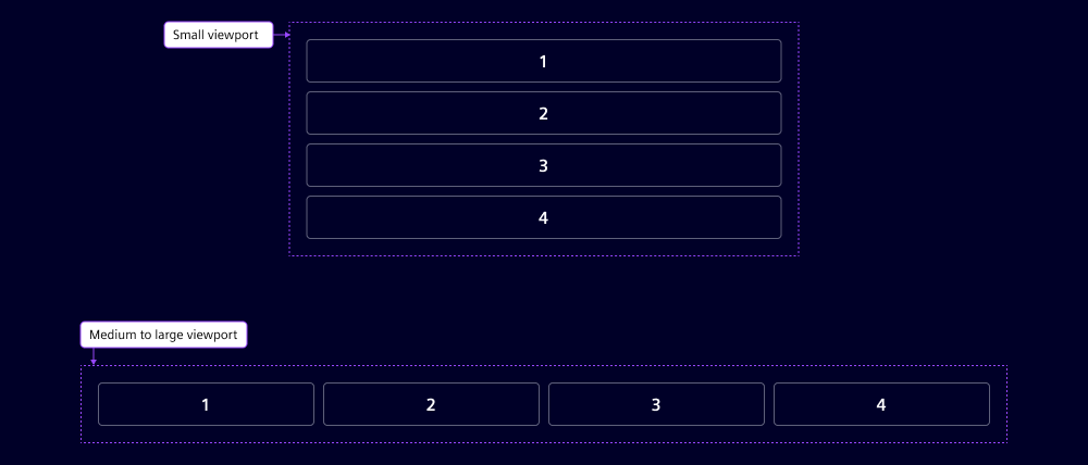
Example: Here is an example of a 12 column layout grid with 4 columns, each with equal width. The columns' size is set to 12 and for medium viewports and larger (size md) it is set to 3. On small viewports, the columns take the full width and stack vertically. For medium and large viewports, columns take equal width.
Behavior in context
Decreasing and increasing the viewport width influences the width of each column within a layout grid. When column width is decreased to the point that the minimum content width is reached for at least one column, the layout breaks into a second line.
Development
Examples
Basic
Size
Padding
API (ix-layout-grid)
Properties
columnsnumber12gap"12" | "16" | "24" | "8"'24'no-marginbooleanfalseEvents
No events available for this component.
API (ix-col)
Properties
size"1" | "10" | "11" | "12" | "2" | "3" | "4" | "5" | "6" | "7" | "8" | "9" | "auto" | undefinedsize-lg"1" | "10" | "11" | "12" | "2" | "3" | "4" | "5" | "6" | "7" | "8" | "9" | "auto" | undefinedsize-md"1" | "10" | "11" | "12" | "2" | "3" | "4" | "5" | "6" | "7" | "8" | "9" | "auto" | undefinedsize-sm"1" | "10" | "11" | "12" | "2" | "3" | "4" | "5" | "6" | "7" | "8" | "9" | "auto" | undefinedEvents
No events available for this component.