Date time input - Usage
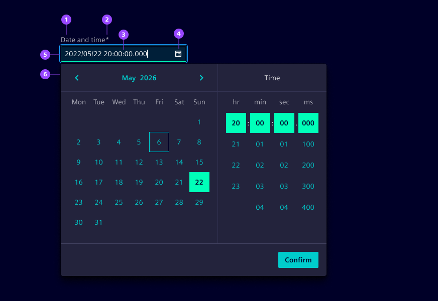
- Label
- Required field indicator
- Current date and time value
- Calendar icon button
- Input field
- Date time picker
- Month and year navigation
Options
- Label: See form field.
- Required: See form field.
- Helper text: See form field.
- Feedback text: See form field.
- Show text as tooltip: See form field.
- Placeholder: See form field. We typically use a placeholder to show an example date time format to assist users when the field is empty.
- Text alignment: See form field (by default at start).
- Error message: Feedback text when date or time is not parsable. We typically use this to inform users that the entered date time format is incorrect and guide them to enter a valid date and time.
- Format: Choose the date and time format, e.g.
yyyy/LL/ddandHH:mm:ss. - Min and max dates: Restrict the selectable date range by defining the earliest and latest dates users can choose.
- Date time picker appearance: See date time picker.
- Week start: Define which day the week starts on. By default, it will be defined based on the locale.
- Week numbers: Show calendar weeks on the left side of the calendar when needed for reference.
Behavior in context
- Interaction:
- Click opens date time pickers. Via keyboard focus followed by arrow down key also opens it.
- Use mouse or keyboard arrows to navigate to the desired date and adjust the time.
- Confirm closes the date time picker and applies the selection.
- Typing a valid date and time into input field closes the picker.
- Escape key closes the date time picker.
- Validation:
- Use feedback text for validation types valid, info, warning and invalid.
- Invalid feedback is automatically provided if the entered date or time is not parsable.
- Refer to the validation chapter for detailed guidelines.
- Overflow: The input field should be wide enough to display the full date and time without truncation.
- Alignment: Date time inputs are aligned to the left by default.
- Combined selection: Users select both a date and a time before confirming their choice. The selection is only finalized when the confirmation button is clicked.
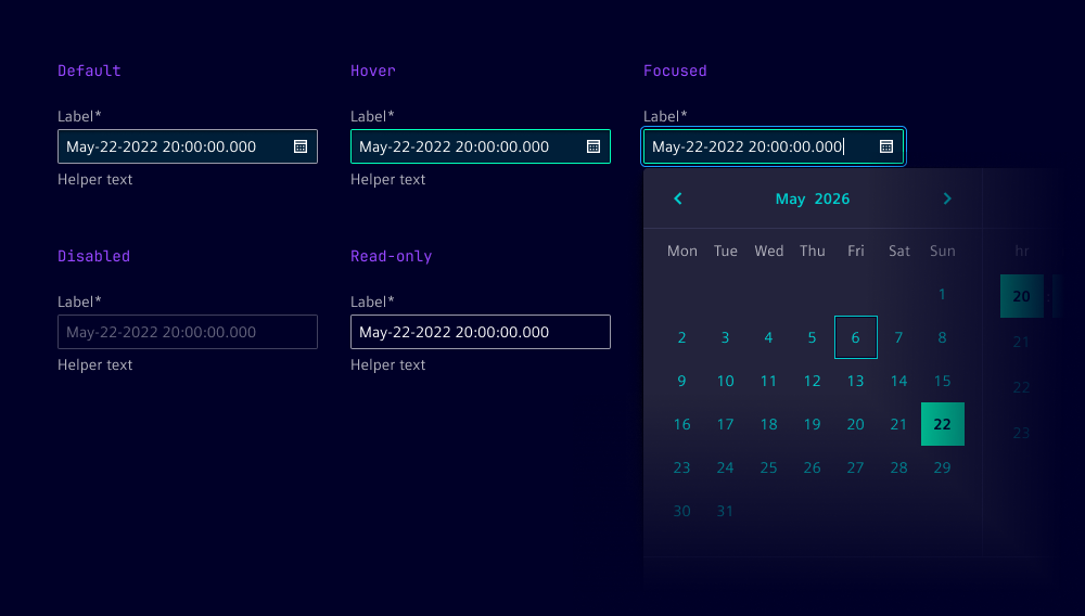
States
Date time input has five states: Default, hover, disabled, read-only and focused.
Dos and Don’ts
- Do use consistent date and time formats throughout the application to avoid confusion
- Do provide clear instructions on the expected format, such as "Enter the date time in yyyy/mm/dd HH:mm format"
- Do consider localization to adapt date and time formats to local conventions
- Do use separate inputs for start and end date times when defining time ranges
- Don't use date time inputs when only a date or only a time is needed (use date input or time input instead)