Time picker - Usage
Time pickers are primarily used within time inputs but can also be utilized standalone in applications where direct time selection is required.
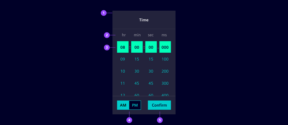
- Time picker container
- Time unit (column) headers
- Selected time
- AM/PM select (12-hour format only)
- Confirm button
Options
- Value: The selected time value.
- Format: Choose which time units to display, depending on your needs (hours, minutes, seconds, milliseconds). Additionally, define a 12- or 24-hour format. We recommend to use a 24-hour format for universal readability (read more in the UX writing guides).
- Columns: Hide hours, minutes, seconds and milliseconds columns when not needed.
- Intervals: Define an interval for every unit to restrict allowed values and provide a faster selection. For example 2 hours, 15 minutes, 30 seconds, 100 milliseconds.
- Header: Define a header text that conveys the context of the time selection. Hide it when there is already a related headline in your UI.
- Corners: By default, the time picker shows rounded corners to be consistent with the dropdown. Use straight, left or right corners to combine with other components.
- Standalone appearance: Shows a flat design without a shadow. We typically use it for inline placement.
Behavior in context
- Interaction: Users can navigate through the time picker using the keyboard. The following keys are supported:
- Tab: Navigate between areas of the time picker (header, body, footer).
- Arrow keys or scroll: Move through time options.
- Enter or click: Select the highlighted time.
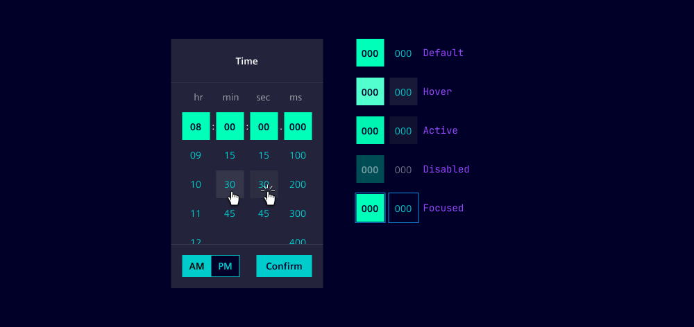
States
An individual time item of a time picker has five states: Default, hover, active, disabled and focused.
Dos and Don’ts
- Do use the time picker to ensure accurate time selection (we recommend to use time inputs for that reason)
- Do provide clear instructions and labels for users
- Do ensure the time picker is accessible via keyboard
- Don’t clutter the time picker with unnecessary options