Textarea - Usage
The textarea component is typically used in scenarios such as feedback forms, comment sections and message composition. Its ability to handle extensive text input makes it a versatile tool for collecting detailed user information.

- Label
- Required field indicator
- Placeholder
- Container
- Resize handle
- Helper or feedback text
- Counter
Options
- Label: See form field.
- Value: See form field.
- Required: See form field.
- Helper text: See form field.
- Feedback text: See form field.
- Show text as tooltip: See form field.
- Placeholder: See form field.
- Counter: See form field.
- Resize behavior: Determines how textareas can be resized (both directions, horizontally, vertically, or no resizing). Default size is 300px x 100px.
- Columns and width: Defines initial width by number of columns and/or width.
- Rows and height: Defines initial height by number of rows and/or height.
Behavior in context
- Interaction:
- Clicking in the container enables the editing of the field.
- Users can type, copy, paste and cut text within textareas.
- Optional: Users can resize textareas to fit their needs. For example, vertical resizing can be useful in feedback forms when the entry exceeds the default height.
- Validation:
- Minimum and maximum length defines number of characters allowed.
- See form validation.
- Overflow: Text within the textarea is not truncated; it supports scrolling for overflow content.
- Alignment: Text is always left-aligned in textareas.
- Sizing:
- Use columns and rows when you want to define the size of the textarea based on the number of characters (columns) and lines (rows) it can display. This is particularly useful for textareas where the content length is predictable, such as input fields with character limits.
- Use width and height when you need to specify the exact dimensions of the textarea in terms of pixels, rems or other units. This is ideal for ensuring consistent layout and design across different screen sizes and devices, especially in responsive designs.
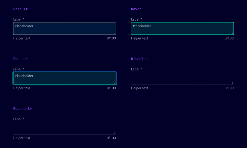
States
Textareas have five states: Default, hover, focused, read-only and disabled.
Dos and Don’ts
- Do ensure the textarea size matches the expected input, e.g. 5 to 10 rows for detailed feedback
- Do use the placeholder to give users an example of the expected input
- Do set minimum and maximum character limits to ensure appropriate input length
- Don’t use the textarea for short, single-line input like name or email address, use an input field instead