Time input - Usage
Time inputs are typically used in forms, filters and scheduling tools to ensure consistent and accurate time entries. Standardizing time inputs ensures data integrity and improves the user experience in applications requiring precise time information.
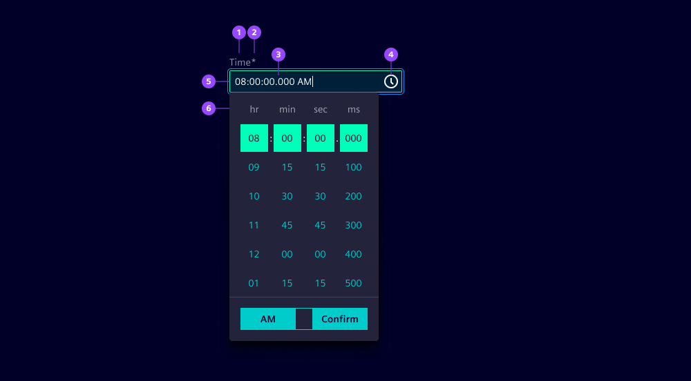
- Label
- Required field indicator
- Current value
- Clock icon button
- Input field
- Time picker
Options
- Label: See form field.
- Required: See form field.
- Helper text: See form field.
- Feedback text: See form field.
- Show text as tooltip: See form field.
- Placeholder: See form field. We typically use a placeholder to show an example time format to assist users when the field is empty.
- Text alignment: See form field (by default at start).
- Error message: Feedback text when time is not parsable. We typically use this to inform users that the entered time format is incorrect and guide them to enter a valid time.
- Format: Specify the time format to ensure that times are entered in a consistent and recognizable format. Default is
TTwhich is the localized 24-hour time with seconds (read more in the UX writing guidelines).- Columns: Show the respective columns in the time picker (see time picker).
- Intervals: Define intervals to restrict allowed values (see time picker).
- Time picker: See time picker
- Header: Hide the header when there is a label on the input, or if the context is conveyed in another way.
- Corners
- Standalone appearance
Behavior in context
- Interaction:
- Click or focus opens the time picker.
- Scroll via mouse or touch, or keyboard arrows navigates to the desired time.
- Confirm closes the time picker.
- Escape key closes the time picker.
- Validation:
- Use feedback text for validation types valid, info, warning and invalid.
- Invalid feedback is automatically provided if the entered time is not parsable.
- Refer to the validation chapter for detailed guidelines.
- Overflow: Input fields should be wide enough to display the full time without truncation.
- Alignment: Time inputs are always aligned to the left.
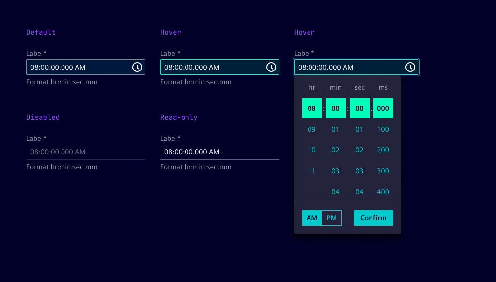
States
Time input has five states: Default, hover, disabled, read-only and focused.
Dos and Don’ts
- Do use consistent time formats throughout the application to avoid confusion
- Do add helper text to clarify the time format being used
- Do ensure the time picker is accessible via keyboard
- Do consider localization to adapt time formats to local conventions
- Don’t use the same input for start and end times, instead separate them