Checkbox - Usage
Checkboxes are commonly used when there are multiple options that can be selected or used to easily enable or disable a setting. They are often utilized in forms where users can choose multiple options, such as selecting items or categories that apply to a specific product or service.

- Checkbox
- Checkbox label
- Group label
- Group required indicator
- Group helper or feedback text
Options
- Checkbox:
- Label: See form field.
- Indeterminate: Indicates that only some items in a checkbox group are selected.
- Checkbox group:
- Label: Add a label to the group of checkboxes to provide context to your users. We typically use short and descriptive labels to summarize the options in the group.
- Helper text: See form field.
- Show text as tooltip: See form field.
Behavior in context
- Validation: See validation.
- Interaction: Clicking on the checkbox toggles the state between checked and unchecked.
- Grouping: Checkbox groups have only one label and helper text for the entire group. Grouped checkboxes are validated collectively, not individually.
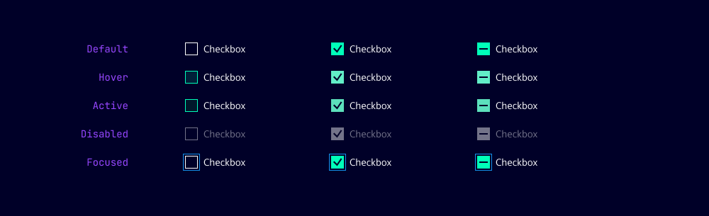
States
Dos and Don’ts
- Do use checkboxes when you have multiple options that can be selected
- Do group related checkboxes together to indicate their relationship
- Do use checkboxes in forms to allow users to select multiple options
- Don’t use a checkbox for binary choices (yes/no, true/false) - use a toggle switch instead
- Don’t use checkboxes for mutually exclusive options - use radio buttons instead
- Don’t use checkboxes for actions that have immediate consequences - use buttons or links instead