Date picker - Usage
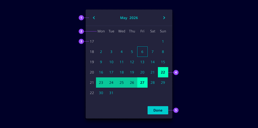
- Month and year navigation
- Weekday labels
- Week numbers
- Selected date or date range
- Confirm button
Options
- Value: Defines the selected date or date range.
- Single selection: By default, users select date ranges. Use single selection to allow selecting a single date.
- Format: Define the date format that determines how dates are displayed, e.g.
yyyy/LL/ddfor2024/06/15. - Week start: Define which day the week starts on. By default, it will be defined based on the locale.
- Week numbers: Show calendar weeks on the left side of the calendar when needed for reference.
- Min and max dates: Restrict the selectable date range by defining the earliest and latest dates users can choose.
- Corners: By default, date pickers show rounded corners to be consistent with the dropdown. Use straight, left or right corners to combine with other components.
Behavior in context
- Range selection: In range mode users select a start date and then an end date. The time period between both dates is visually highlighted to provide clear feedback.
- Month navigation: Users can navigate between months using the arrow buttons in the header or the dropdown menu to quickly jump to a specific month and year.
- Interaction: Users can navigate through the date picker using the keyboard. The following keys are supported:
- Tab: Navigate between areas of the date picker (header, body, footer).
- Arrow keys: Move through dates in the calendar.
- Enter or click: Select the highlighted date.
- Escape: Close date pickers when used in a dropdown. If header dropdown for month/year selection is open, it closes first.
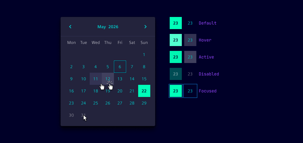
States
Individual calendar dates within a date picker have five states: Default, hover, active, disabled and focused. Dates outside the allowed range appear in a disabled state and cannot be selected.
Dos and Don’ts
- Do use date pickers to ensure accurate date selection
- Do provide clear labels when the date picker is used in a form context
- Do ensure the date picker is accessible via keyboard navigation
- Do use range selection for date periods like booking dates or report timeframes
- Do set min and max dates to prevent invalid date selections
- Don’t use date pickers for dates that are far in the past or future, use date inputs instead
- Don’t clutter the date picker interface with unnecessary options
- Don’t forget to handle empty or invalid date states in your validation logic