Date time picker - Usage
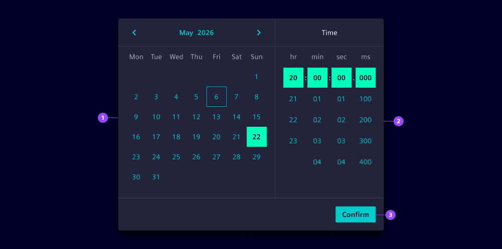
- Date picker
- Time picker
- Confirm button
Options
- Value: See date picker and time picker.
- Single selection: See date picker.
- Format: Choose the date and time format, e.g.
yyyy/LL/ddandHH:mm:ss. - Min and max dates: See date picker.
- Date picker appearance: See date picker.
- Week start: Define which day the week starts on. By default, it will be defined based on the locale.
- Week numbers: Show calendar weeks on the left side of the calendar when needed for reference.
- Time picker appearance: See time picker.
- Time reference: Show time reference input for AM/PM notation when using 12-hour time format.
- Header: Customize the header of the time picker.
- Corners: By default, date time pickers show rounded corners to be consistent with the dropdown. Use straight, left or right corners to combine with other components.
Behavior in context
- Combined selection: Users select both a date and a time before confirming their choice. The selection is only finalized when the confirmation button is clicked.
- Range selection: Range mode allows users to select a start and end date while using one shared time value for both. If start and end need different times, use two separate date time pickers instead.
- Month navigation: Users can navigate between months using the previous and next buttons in the header. This allows quick access to dates outside the current view.
- Interaction: Users can navigate through the date time picker using the keyboard. The following keys are supported:
- Tab: Navigate between areas of the picker (header, body, time input, footer).
- Arrow keys: Move through dates in the date picker and times in the time picker.
- Enter or click: Select the highlighted date or time.
- Escape: Close the date time picker when used in a dropdown. If the header dropdown for month/year selection is open, it closes first.
States
Individual calendar dates within a date time picker have five states: Default, hover, active, disabled and focused. Dates outside the allowed range appear in a disabled state and cannot be selected (see date picker and time picker for reference).
Dos and Don’ts
- Do use date time pickers when both date and time information are required
- Do ensure the date time picker is accessible via keyboard navigation
- Do use range selection for time periods like booking appointments or scheduling events
- Do set appropriate min and max dates to prevent invalid selections
- Don’t use date time pickers when only a date or only a time is needed (use date pickers or time pickers instead)
- Don’t forget to validate both date and time inputs in your form logic
- Don’t use date time pickers for dates that are far in the past or future without setting appropriate min and max constraints
- Don’t clutter the interface with unnecessary time precision when approximate times are sufficient