Toggle - Usage
A toggle is a user interface element that enables users to switch between two states, such as on/off or enable/disable. It consists of a switch that can be slid or clicked to change its state. They offer a visually clear representation of the current state and allow users to easily toggle between different settings. We typically use toggles in settings, preferences, and other areas where users need to switch between two states quickly and easily.

- Label
- Required indicator
- Toggle
- Toggle label
- Helper or feedback text
Options
- Label: See form field.
- Helper text: See form field.
- Feedback text: See form field.
Behavior in context
- Validation: See validation.
- Interaction: Clicking on the toggle switch changes its state from on to off or vice versa. The toggle visually reflects the current state.
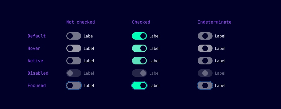
States
Dos and Don’ts
- Do use toggles for single features or options that need to be switched quickly and easily
- Do provide clear labels for toggles to indicate what they control
- Do use toggles consistently throughout the interface for similar actions or settings
- Don’t use toggles for complex multi-state options or settings
- Don’t use toggles for actions that require a confirmation or additional input
- Don’t use toggles for actions that are irreversible or have serious consequences