Release V5.0.0

Version 5 marks a step forward for the Industrial Experience Design System. This major release focuses on improving accessibility, removing outdated components and strengthening the connection between design tokens, Figma and code.
To upgrade to Version 5, start here:
- Review the migration guide for breaking changes and required updates.
- Expect the biggest changes to accessibility behavior, date and time inputs and status colors.
- Update both code and Figma assets if your team relies on shared component libraries.
Why upgrade to Version 5?
With Version 5, we took the opportunity to address topics that require breaking changes in areas where incremental updates were no longer enough.
Our goals were clear:
- Reduce legacy APIs and outdated approaches.
- Align components with modern web and accessibility standards.
- Strengthen the connection between design tokens, Figma and code.
Brand theme colors now follow a shared reference model
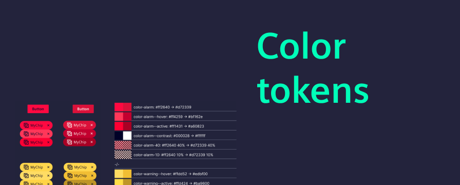
The color token basis is now aligned with the Siemens Design Language and built on strict reference token.
Teams now have a more consistent foundation across design systems and codebases.
- Color tokens are now strictly reference-based.
- Contrast is increased for status colors and between interaction states.
- Recognition of interaction state changes is increased for keyboard interactions.
Accessibility improvements for keyboard navigation
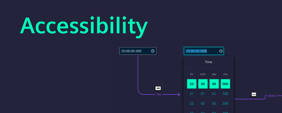
Keyboard navigation and focus handling have been improved across several complex components.
The update focused especially on interaction clarity in areas such as:
- Dropdowns
- Menus
- Tabs
- Composite form elements, e.g. range field
Date and time inputs are more capable
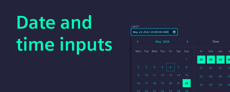
Version 5 adds new date and time input capabilities and improves consistency across existing flows, including:
- A new date-time input
- A dedicated range field concept
- Improved interaction consistency across date pickers
We've standardized date and time component interactions across all locales, making data entry more predictable for complex workflows. All components now feature robust integration with forms and validation. Architecturally, we've streamlined the implementation to support future enhancements.
Tabs now handle overflow with a More menu
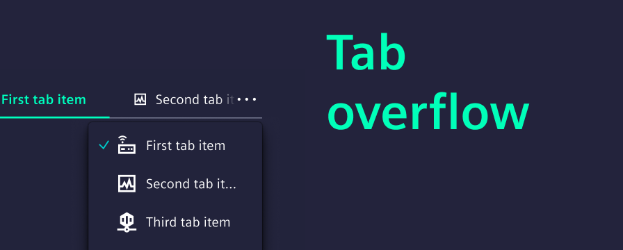
Tabs now handle overflow more reliably in responsive layouts.
- Tab overflow is handled more intelligently. A “More menu” keeps all tabs accessible, regardless of viewport size.
- Visual styling is aligned with updated layout conventions.
- A continuous border helps separate the content below the tabs.
- Updated visuals make the selected tab more distinctive.
Card components now use Figma native slots
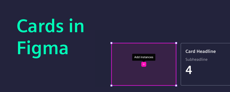
The card updates in Version 5 are focused on the Figma library and are not related to code changes. Native Figma slots make card composition more flexible and support more responsive behavior directly in the library.
That change required a breaking update in the Figma library:
- Older versions of card components are now deprecated.
- Reworked card components are now provided under the same existing names.
Additionally, we introduced a new property for switching between outline and filled variants. We have added an example directly in the library showing slot usage for responsive card behavior.
More improvements in Version 5
Beyond the bigger themes, Version 5 also includes:
- Non-blocking modal behavior improvements
- Architectural refactoring under the hood
- Bug fixes and performance improvements
- Updated component specifications in Figma
Together, these updates improve stability, consistency and future development speed even when they are less visible at first glance.