Forms field - Usage

- Label
- Form component
- Helper text
- Required indicator
- Counter (input and textarea field only)
Note: In this chapter, we describe the default field component. For details about custom fields, see the custom fields chapter.
Options
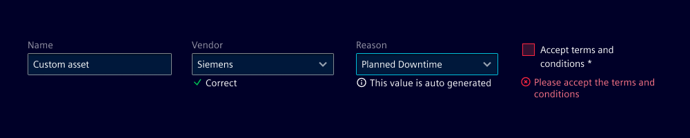
- Label: Add a label for the field that provides context to your users.
- Required: The asterisk states whether user input is required on the field before submitting the form.
- Field: Use the appropriate field based on the type of input data, e.g. use toggles for a binary choice.
- Helper text: Use to help users understand the field better. We typically use this when there are input restrictions or more information is required.
- Show text as tooltip: Display validation feedback either below the input field or as tooltip when the user hovers or focuses on the form field. Use a different text for the individual validation states that apply (see validation).
- Text alignment: Set individual fields to align at the start or the end so inputs line up visually, e.g. a form with several text input fields and a single number input.
- Counter: Use a counter to show the number of characters entered into the field and the maximum number of characters allowed. We typically use it for textarea fields.
Behavior in context
- Interaction: See validation.
- Behavior of a field as part of a form: See behavior.
- Text truncation: Labels, feedback and helper texts are not truncated but break into multiple lines if they exceed the field's width.
States
Interaction states: Default, hover, active, disabled, readonly, focus.
When a feedback tooltip is chosen over a message, the field shows a tooltip when in focus or hovered over in specific validation states.
Note: There are also several validation states (default, valid, info, warning, invalid) that are described in validation.
Dos and Don’ts
- Do use a label for every field
- Do use a counter for fields with a character limit
- Do use helper text to provide additional information or context about the field
- Don’t use helper text as a replacement for clear labels
- Don’t mix different variants of feedback text and tooltips