Forms layout - Usage
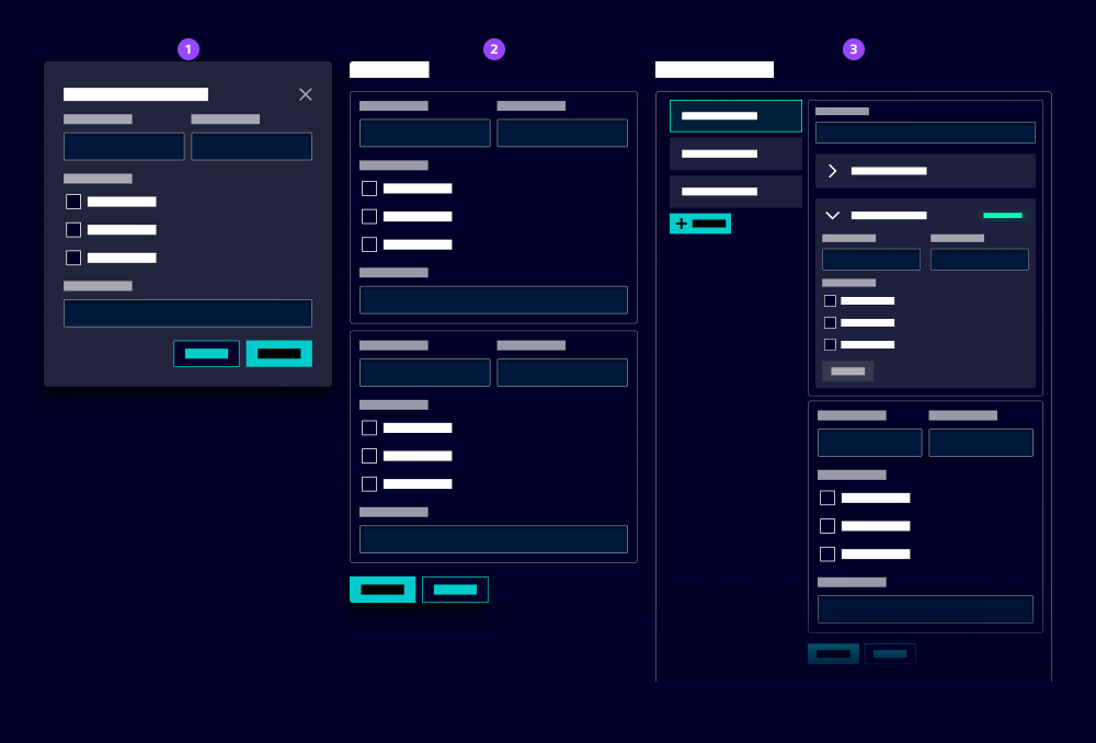
- Small form (modal)
- Medium form
- Big form (page)
Structuring a form
Effective ways to organize form elements enhance user comprehension and interaction within your forms:
- Single-column layout: Ideal for short forms with a few fields or small viewports.
- Multi-column layout: Suitable for long forms with multiple fields to save vertical space. Use a layout grid or flexbox to align fields.
- Tabbed layout: Use tabs to break up long forms into manageable sections. This helps users focus on one part of the form at a time.
- Stepped layout: Use our workflow pattern to guide users through multi-step forms.
- Fieldset: Group related fields together using fieldsets. This helps users understand the context of the information they are providing. Add a legend (title) to describe the field group.
- Section heading: Use section headings to break up long forms into manageable sections. This helps users focus on one part of the form at a time.
- Blind: Use a blind to hide optional fields and reveal them when the user selects a specific option.
Best practice
- Z and F shape pattern: Follow natural reading patterns, for example left to right, to guide users through the form. Consider a clear order of fields to ensure users don’t forget to fill in fields and improve data quality.
- Button alignment: Position primary action buttons, e.g. submit and cancel consistently. We recommend: - Bottom left: Short forms (up to 5 fields) - Bottom right: Long forms (more than 5 fields) - Bottom right and sticky: Long forms that are already filled in (e.g. edit) with a large number of fields
- Label alignment: By default, the label is positioned above its input field. Use a custom field component for long forms with a lot of fields to position the label on the left (which saves vertical space).
- Grouping fields: In some cases, it makes sense to combine multiple fields in one custom field with a single label that are connected contextually or through validation, e.g. entering the value and unit of an entity, selecting start and end date. It allows a clearer validation, e.g. the end date must be after the start date.
- Field width: Use a consistent width for input fields to create a harmonious layout. For example, use a width of 100% for full-width fields and 50% for two-column fields.
- Responsive behavior: Use layout grids or flexbox to create responsive forms that adapt to different screen sizes.