Upgrade to V4.0.0
TL;DR
- We upgraded to Angular 20.
- We renamed the button variants to better reflect their usage.
- Map and basic navigation have been removed in favor of the application component.
- Drawer has been deprecated in favor of panes.
- We made changes to the elevation principle which means teams need to check whether their components need an outline.
Updated dependencies
Angular 20
Important: Projects using @siemens/ix-angular must upgrade to Angular 20 or higher before updating to this version. Some APIs deprecated in previous Angular versions may have been removed; review the Angular 20 changelog for migration steps. Ensure all third-party Angular libraries are compatible with at least V20 to avoid runtime issues.
Renamed or removed icons
| ❌ Deprecated | ✅ Replace with |
|---|---|
cam | Replace with output-cam |
Deprecated and removed components
Removed basic navigation and map navigation
Use the ix-application with the following components to replace the basic and map navigation:
- Application header containing the previous
application name - Application menu
- Pane (inline) replacing the map navigation's left sidebar
- Pane (floating) or original overlay content replacing the map navigation's right overlay
Drawer
The drawer component has been deprecated and will be removed in the next major release. We recommend using panes instead, which provide similar functionality with improved performance and usability. Use this configuration for a similar experience:
<ix-pane
heading="Title"
variant="floating"
composition="right"
borderless="true"
size="320px"
close-on-click-outside="true"
hide-on-collapse
>
My content
</ix-pane>
Here is a comparison of the properties and events between the drawer and pane components:
| ❌ Drawer | ✅ Pane |
|---|---|
expanded | show |
width | size |
min-width | (not available) |
max-width | (not available) |
full-height | (not available) |
on-drawer-close | on-expanded-change |
on-open | on-expanded-change |
Additional changes you need to consider when migrating from drawers to panes:
- You may need to adjust your content layout accordingly since pane contents have a default padding of
16px. - You now need to define a title for the pane using the
headingproperty.
Component updates
ix-application
min-width: 0has been added to the content-area inix-applicationto prevent the flex container from growing beyond the screen width.- If you have implemented a workaround for this behavior, your application's layout might be affected by this change.
ix-application-header
- Changed height from
2.75rem(44px) to3rem(48px).
ix-button variants
Affected components: ix-button, ix-dropdown-button, ix-icon-button, ix-split-button, ix-toggle-button, ix-icon-toggle-button.
- Renamed variant
secondarytosubtle - Removed the property
outlinein favor of newsecondaryvariants - Removed the property
ghostin favor of newtertiaryvariants
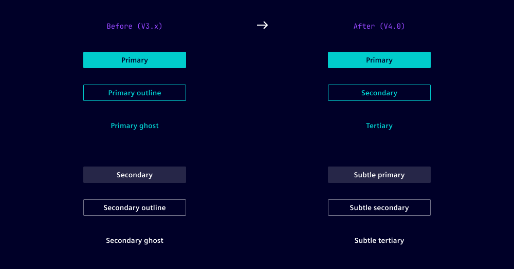
To take over the changes, use the migration helper or the tables below to rename all button variants. Start with renaming secondary to subtle-* variants to avoid unwanted overriding.
Enter your current button configuration to see the recommended new variant name.
Button migration overview
| ❌ Variant | ❌ Outline | ❌ Ghost | ✅ New variant |
|---|---|---|---|
secondary | false | false | subtle-primary |
secondary | true | false | subtle-secondary |
secondary | false | true | subtle-tertiary |
primary | false | false | primary |
primary | true | false | secondary |
primary | false | true | tertiary |
danger | false | false | danger-primary |
danger | true | false | danger-secondary |
danger | false | true | danger-tertiary |
For buttons without an explicitly set variant, the default is used. As defaults differ between the button components, the renaming should be component-specific.
Button without set variant
| ❌ Outline | ❌ Ghost | ✅ New variant |
|---|---|---|
false | false | primary |
true | false | secondary |
false | true | tertiary |
Dropdown button without set variant
| ❌ Outline | ❌ Ghost | ✅ New variant |
|---|---|---|
false | false | primary |
true | false | secondary |
false | true | tertiary |
Icon button without set variant
| ❌ Outline | ❌ Ghost | ✅ New variant |
|---|---|---|
false | false | subtle-primary |
true | false | subtle-secondary |
false | true | subtle-tertiary |
Split button without set variant
| ❌ Outline | ❌ Ghost | ✅ New variant |
|---|---|---|
false | false | primary |
true | false | secondary |
false | true | tertiary |
Toggle button and icon toggle button without set variant
| ❌ Outline | ❌ Ghost | ✅ New variant |
|---|---|---|
false | false | subtle-primary |
true | false | subtle-secondary |
false | true | subtle-tertiary |
We recommend to visually review your changes. Ensure that subtle-* variants are not mixed with the default variant.
ix-flip-tile
- Renamed
statetovariant. - Renamed
FlipTileStatetoFlipTileVariant.
ix-message-bar
- Renamed
dismissibletopersistentand changed default to false.
ix-pane
- Added
close-on-click-outsideproperty. - Added
aria-label-close-buttonproperty. - Added
aria-label-expand-buttonproperty. - Added
aria-label-collapse-buttonproperty.
ix-aggrid
We are updating to the latest AG Grid version and are providing a new brand-aligned iX theme.
Design
- Published a new 'AG Grid theme' library
- Deprecated AG Grid components from 'iX components' Figma library
Note: Manual replacement effort needed, there is no automated replacement possible.
| ❌ Deprecated | ✅ Replace with |
|---|---|
| AG Grid Building Blocks / Data Cell | Grid Cell |
| AG Grid Building Blocks / Header Cell | Grid Header |
| AG Grid Building Blocks / Header Row | not needed |
| AG Grid Building Blocks / Row | not needed |
| AG Grid component / AG Grid Column | - |
| AG Grid component / AG Grid Row | - |
| AG Grid component / AG Grid Table | iX AG Grid Table |
| AG Grid component / AG Grid Table Example | iX AG Grid Table Example |
Implementation
Prerequisites:
- Upgrade AG Grid to version 33 or higher.
Migration steps:
- Remove CSS imports of ix-aggrid.css
// ❌ Remove all occurrences of this line
@import '@siemens/ix-aggrid/dist/ix-aggrid/ix-aggrid.css';
- The
ag-theme-alpine-darkandag-theme-ixclasses don’t have to be applied anymore
<!-- ❌ Remove these classes -->
<div class="ag-theme-alpine-dark ag-theme-ix"></div>
- Configure the theme using the new theming API
import { getIxTheme, getIxThemeAsync } from '@siemens/ix-aggrid';
import * as agGrid from 'ag-grid-community';

// Get iX theme based on your AG Grid module
const ixTheme = getIxTheme(agGrid);
// Alternative: Use async import
const ixTheme = await getIxThemeAsync(() => import('ag-grid-community'));

// Option 1: Set the theme per grid instance
const gridOptions = {
  theme: ixTheme,
  // ... other options
};

// Option 2: Set the theme globally for all grids
// Note: Must be called before initializing any grid instance
agGrid.provideGlobalGridOptions({
  theme: ixTheme,
});
Global style updates
Updated elevation principle
With the updated elevation principle, some components require a visual outline if they are placed on color-2 or component-1. See more in the styles chapter on elevation.
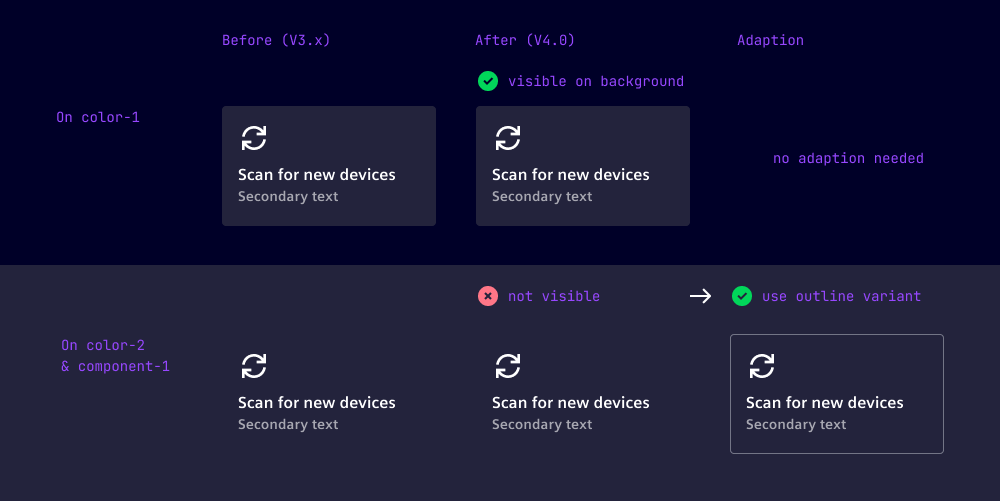
If you have used the filled variant of following components on color-2 or component-1, please change their variant to outline:
Questions ❓🙋♀️
If you’re using our Figma library, make sure to update to the latest published version. You can review all design-related changes in the Figma library’s release notes.
Check out the Breaking Changes guide and if you have further questions or migration problems contact us.