Application header - Usage
In its simplest version, application headers only show the company logo and the application name.
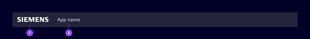
- Company logo
- Application name
The company logo (1) identifies the brand. For Siemens applications, the Siemens logo with the brand theme is the default combination. Contractual agreements may allow partner logos under certain conditions. The logo adapts its width automatically, height remains fixed. It is colored at runtime based on the selected theme if the following prerequisites are met:
- Logo is provided as SVG
- Color of SVG elements are set to
currentcolor
Without meeting these prerequisites, the logo appears without any color adaption.
The application name (2) shows the official name of the application. Its width adjusts dynamically but may be truncated if space is limited by other header elements.
Options
The app header component offers great flexibility through optional elements, but each addition should be considered carefully. Adding too many elements can reduce usability and introduce challenges, especially regarding responsiveness and overflow behavior. We recommend keeping the header clean and lean.
Avatar
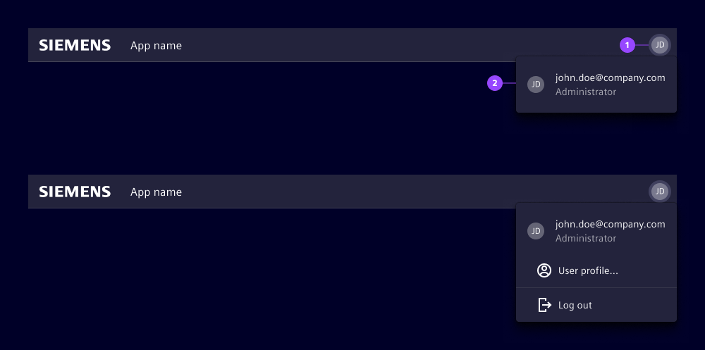
- User avatar
- Avatar dropdown
The avatar indicates the currently logged in user and provides access to user-related actions. Its position in the application header ensures visibility of security-relevant information across all breakpoints.
Clicking the avatar opens a dropdown with additional user information and actions such as log out or user profile. If the application does not support multiple users or user profiles, do not use the avatar.
For applications that allow usage without login, consider alternative approaches:
- Show a login button in the slot for additional elements and hide the avatar
- Display the avatar with a placeholder image and provide login-related information and actions in the dropdown
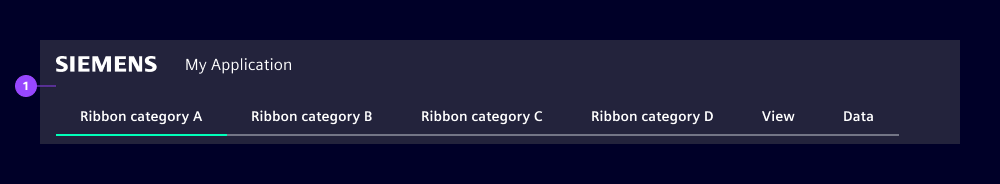
Application switch
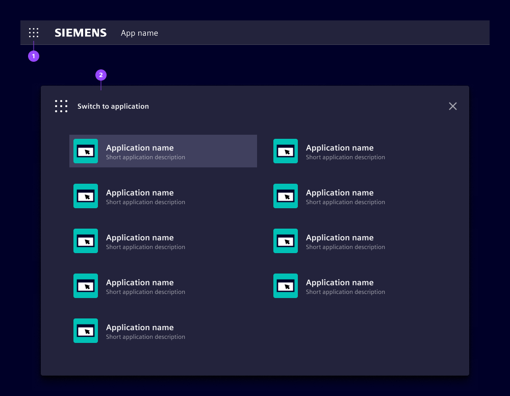
Use the application switch (see application) to launch and navigate between related applications. Clicking the application switch (1) opens a modal (2) with a list of available applications.
Application icon

The application icon (1) is a non-interactive visual element placed in the header to represent the application. It is displayed within a fixed size and uses a defined border radius. The standard web image formats are supported. The provided image is scaled if necessary while maintaining the aspect ratio.
An optional outline (2) can be added to visually separate the icon from the background when needed. It should only be used when contrast or clarity requires it.
Suffix for application name

The application name suffix (1) appears to the right of the application name. It provides additional information or context. For Siemens applications, we use it for contractually regulated additions in partner branding scenarios, e.g. "powered by Siemens".
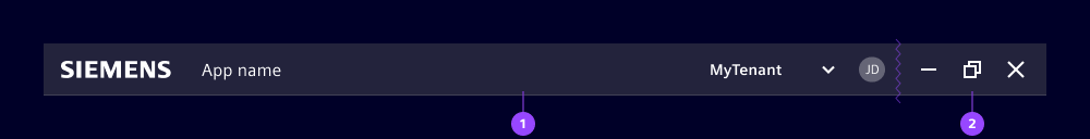
Slot for right-aligned content
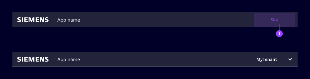
The slot (1) provides space for placing functions and information aligned to the right side of the application header. We use this slot for high-level information or actions impacting the application context, e.g. mode switching.
We typically use the slot for:
- Log in button, if the application runs without a logged-in user
- Changing the top-level data context like environment, workspace, or tenant
- Displaying important contextual information, e.g. local times in remote access scenarios
- Access to application-wide actions like global search
Overflow behavior is not handled automatically. At breakpoint sm, the slot collapses and its content becomes accessible via an overflow icon. See behavior for details.
Secondary slot for left-aligned content
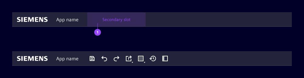
The secondary slot (1) allows the placement of functions aligned to the left side of the application header. We typically use the secondary slot for:
- Lean elements such as toolbars, which offer compact access to key actions and can be easily adapted for overflow behavior.
- While primary navigation tabs can also be placed here, they consume more space and are less flexible in responsive layouts.
Overflow behavior is not handled automatically. At breakpoint sm, the slot collapses and its content becomes accessible via an overflow icon. See behavior for details.
Borderless
The borderless option sets the existing bottom border (1) of the header to a transparent color. Using the same background color, this creates a visual connection between the header and the following element, making them appear as a unified block.
Window controls
If the applications runs in a desktop framework like Electron, we recommend the following approach to avoid an additional OS-specific window header above the application header:
- Place a container (2) beside the actual application header (1), while considering the OS specifics.
- Place the window controls inside and consider applying the OS specific style and behavior.
- Use same height, background and border properties for this container.
Framework header
If the application is hosted inside a framework that comes with its own header, you can omit the entire application header to avoid having two headers on top of each other. The framework’s header then provides the brand identity, the application name and other information.
Behavior
The header automatically adapts the breakpoints defined in the application layout.
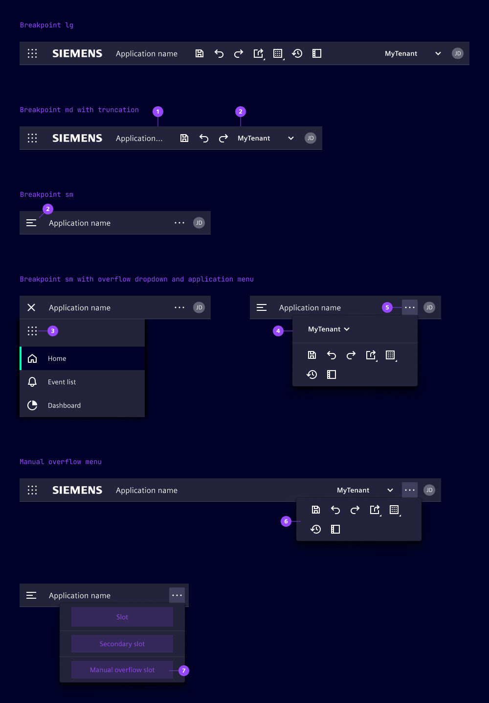
At breakpoints "lg" and "md" the application header remains unchanged, truncation applies to the application name (1). When its minimum width is, reached truncation is applied to the secondary slot.
At breakpoint "sm" the layout changes in the following way:
- The application menu is hidden and replaced by a menu icon (2) in the header, clicking it opens the menu.
- The company logo and a possibly used application name suffix is not shown.
- If the application switch (3) is used, it moves to the application menu.
- If slots are used, their elements move into dedicated sections in the overflow dropdown (4), accessible via the overflow icon (5).
- If the manual overflow slot is used, its content appears at lowest position within the overflow dropdown (7).
Manual overflow menu
- The overflow slot can be manually filled to trigger the overflow menu at any breakpoint.
- When content is placed in the manual overflow slot, the overflow button appears even at medium (md) and large (lg) viewports.
- This allows intentional placement of elements into the overflow menu (6), independent of automatic breakpoint behavior.
Dos and Don’ts
- Do align other slot usages for Siemens applications with our team to keep a consistent look and feel
- Do use the avatar dropdown for actions related to the current logged in user
- Do test layout behavior at all breakpoints to ensure content remains accessible
- Don’t overload the slots with too many elements to avoid losing clarity and hierarchy
- Don’t use the avatar if your application does not support user profiles
- Don’t rely on automatic overflow handling for complex layouts, instead reduce complexity