Application menu - Usage
The navigation menu is an essential part of your application. It offers a way to directly navigate to the main application parts and it can give your users access to legal and version information, and access to settings.
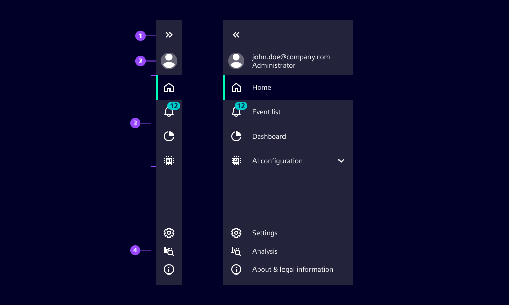
- Expand/collapse icon button
- Main navigation section
- Bottom section
- Selected item
- Item with notification
- Second level navigation menu
- Settings
- Toggle theme
- Custom item
- About & legal
Options
- Navigation menu:
- Enable settings: Show the settings item in the bottom section which opens the settings overlay.
- Enable toggle theme: Use the option to offer your users an easy and direct way to toggle between light and dark themes. We typically don’t use it when dedicated theme settings are available elsewhere e.g. in the settings overlay.
- Menu items and menu category:
- Notifications: Display a number at the top right corner of the icon.
- Icon: Define an icon for an item. We recommend to using icons in submenu items rarely since they often don’t add any value.
- Label: Define the name of the menu item or menu category which is visible when the navigation menu is expanded.
- Selected: Mark a menu item as selected which highlights it in the navigation menu.
- Tooltip text: By default, the tooltip will show the label of the menu item or menu category. Override it with custom text to give additional context if the label alone is not sufficient.
Behavior in context
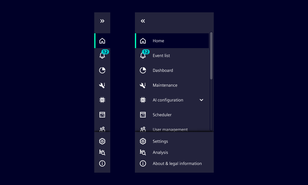
- Navigation menu expands and collapses with a transition.
- The width of the collapse and expand state are fixed and cannot be configured.
- The number of menu items can overflow with a vertical scroll, this is recognizable by the shadow at the bottom and/or top.
- On hover, a tooltip is shown that displays the label of the menu item or menu category by default.
- Items in the bottom section do not navigate away from the current content. They either toggle states, e.g. light and dark mode, or open a layer over the current content. This means users do not lose their current workflow by interacting with these items.
States
The application menu has two states: collapsed and expanded. The appearance of the states varies between screen sizes.
Dos and Don’ts
- Do use icons in second-level navigation items when it helps users to better understand and recognize them
- Do use a custom tooltip text if the label is so long that it gets truncated or needs additional context
- Don’t mix menu items with and without icons within a second-level navigation category
- Don’t place non-navigational items in the navigation section
- Don’t place navigation items in the bottom section as items in the bottom section must not navigate away from the current context