Settings - Usage
The settings component appears when users click on the "settings" icon (1). It overlays the current content and closing this overlay brings users back to the original content.
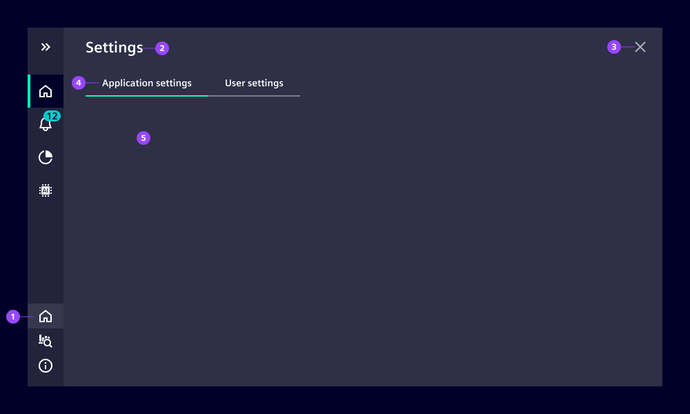
- (1) Settings icon: opens and closes the settings overlay
- (2) Content header: default string is "Settings" and can be replaced
- (3) Close button: closes overlay
- (4) Tabs (optional): navigates through multiple settings categories
- (5) Content
Behavior
The overlay opens on top of the application content. The overlay has a semi-transparent background with a background blur effect to emphasize the overlay character. Closing this overlay brings users back to previous content.
The overlay can be closed in three ways:
- Use the close button
- Click the settings icon again
- Click another navigation item