Card - Usage
Cards make it easy for users to quickly scan small chunks of information. We typically use cards to create dashboards or modular, flexible designs that adapt seamlessly to various screen sizes. Additionally, cards can be used to draw attention to important content and serve as an entry point to deeper levels of navigation or detailed views.
We offer three types of cards:
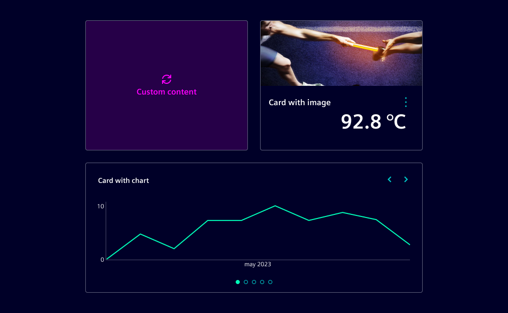
- Cards: Use flexibly to display various types of content, e.g. images, charts or key data.
- Action cards: Use to trigger key actions, similar to buttons.
- Push cards: Use to display notifications and additional content related to the notification value.
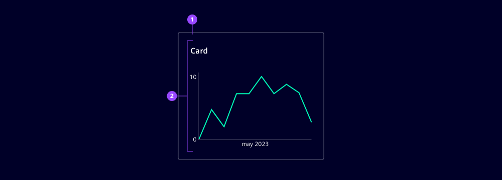
Card
- Card container
- Card content

Action card
- Icon
- Heading
- Subheading
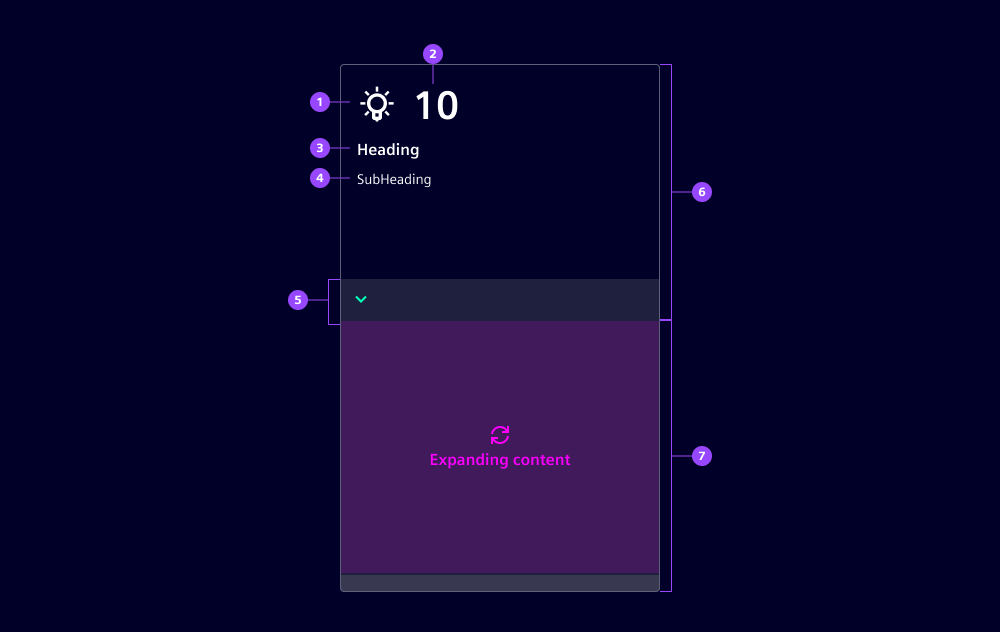
Push card
- Icon
- Notification
- Heading
- Subheading
- Expand area
- Expandable content
Variants
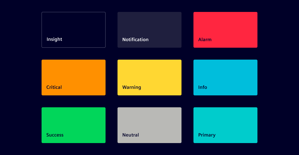
Cards are available in nine variants:
- Outline: Use as default for a balanced and subtle appearance.
- Filled
- Alarm
- Critical
- Warning
- Success
- Info
- Neutral
- Primary
Each variant emphasizes different aspects to guide the user's attention. These variants differ visually through the presence of an outline and a distinct container fill color, but they all follow the same interaction pattern.
Options
- Card:
- Selected: Use the selected state to indicate that the corresponding action is currently active.
- Content area: Cards can contain various types of content, e.g. images, charts, key data. It is positioned below the heading and subheading. We recommend a padding of
1rem.
- Action card & push card:
- Selected (action card only): Use the selected state in action cards to indicate that the corresponding action is currently active.
- Icon: Use icons that are widely recognized by users for the intended action.
- Notification (push card only): By default, push cards display a notification value at the top of the container. This value is logically related to the items displayed in the expanding content area.
- Heading: Display a heading in the top-left corner of the container.
- Subheading: Display a subheading below the heading to provide additional context.
- Expandable content (push card only): Push cards can include an expandable content area that reveals additional information when expanded. This area is positioned below the subheading and is hidden by default.
Behavior in context
- Interaction: As a general rule, the entire card container is interactive and clickable. If the card also contains interactive elements, the corresponding actions are triggered.
- Size:
- By default, cards have a fixed width and height. However, content overflow is not managed automatically, so the card size must be manually adjusted.
- Action cards have a default width and height which can be adjusted to fit nicely in layouts.
- Push cards have a fixed height and a default width. The width can be adjusted as needed.
- Placement: We typically group cards using grids or card lists and position them in the top-left of their container.
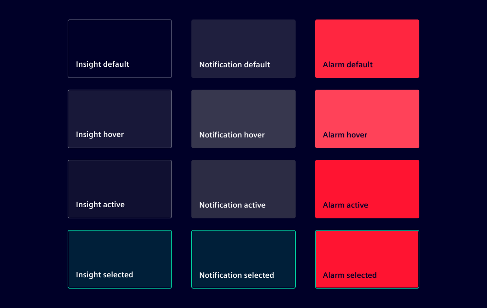
States
Cards have four states: Default, hover, active and focused.
Dos and Don’ts
- Do group cards in card lists or grids
- Do keep multiple cards equal in size
- Don’t nest cards inside each other
- Don’t use cards to collect user input