Custom modal - Usage
Custom modals present rich, contextual content, e.g. forms, complex workflows or nested interactions that require the user's focus.
Use custom modals when a task requires immediate attention and the user returns to the same place after closing the modal.
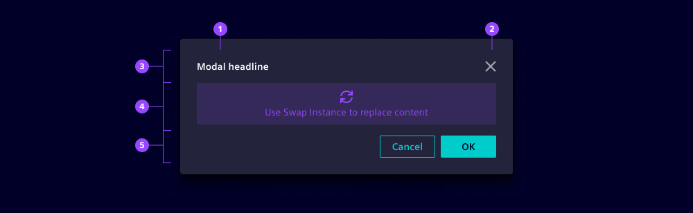
- Title
- Close button
- Modal header
- Modal content
- Modal footer
Options
- Centered: Center content by default; use top alignment for tall dialogs that expand during interaction.
- Size: Choose an appropriate size based on context and device:
- Fixed max-width (360-840px): Use as default for most layouts. Note that on narrower screens or viewports, the modal scales down and becomes proportionally narrower to fit the available space.
- Full width: Use for data-heavy interfaces on desktop, e.g. large datasets.
- Full screen: Since the modal container covers the whole application (including menu and header), use for immersive experiences or multi-step workflows. Note that users have no visual connection to the app which is why we recommend establishing it in the title or content.
- Backdrop: Use a backdrop to focus attention and prevent background interaction.
- Animation: By default, modals fade in. Disable for performance-sensitive contexts.
- Is non-blocking: Hides the backdrop. Use to allow interaction with the background content while the modal is open, e.g. to copy data from the page into the modal.
- Close on backdrop click: Enable clicking on the backdrop to close modals for informational messages. Disable for critical decisions that require confirmation.
- Before dismiss: Add follow-up actions when users try to close modals, e.g. add a confirmation prompt to avoid unintentional discarding of inputs when closing.
- Modal header:
- Title: Use a short, specific title that describes the task or decision.
- Icon and icon color: Repeat icons from the trigger to establish a connection (e.g. if a button with label and icon opens the modal then reuse the same label and icon). Use iX theme colors.
- Hide close: We recommend only hiding the close button for critical flows that require an explicit decision.
- Modal footer: Place one primary, one secondary and optionally one tertiary button on the right side to follow the Z-shape reading pattern in left-to-right languages.
Behavior in context
- Interaction:
- Modals are opened by the system (e.g. when another process finishes) or by users (e.g. when clicking buttons).
- Modals are closed:
- When clicking on close or on buttons in the footer (typically cancel or confirm).
- When pressing the Escape key.
- If enabled, when clicking outside the modal (on the backdrop).
- Focus moves into the modal when it opens and returns to the trigger when it closes.
- Overflow:
- The modal height increases with content until reaching screen height, then a scrollbar appears.
- We recommend implementing a sticky footer when content overflows.
- Avoid horizontal scrollbars by using a larger modal size and defining adaptive behaviors for different viewports.
- Placement: Vertically centered or top-aligned, horizontally centered.
- Responsiveness:
- Height: Depends on its content except for
full-screen. - Content: Needs to be built responsively to adapt with the container's width.
- Height: Depends on its content except for
States
Modals have two states: Closed and opened.
Dos and Don’ts
- Do provide at least one visible way to close the modal
- Do provide a clear primary action that describes the result
- Do ensure all controls are accessible by keyboard and screen‑reader
- Do preserve scroll position and page state when closing
- Do return users to the previous state when cancelling, not an unrelated page
- Don’t use modals if a decision should be made (use message modals instead)
- Don’t nest modals, e.g. to load more data, instead use spinners within modal contents)
- Don’t auto close modals for irreversible actions
- Don’t overload the modal with unrelated content