Elevation
Our design system achieves elevation through the application of background color layers, borders and selective shadows to achieve depth and clarity.
Important note: We changed the elevation approach starting with version 4.0 of our design system, so it is only partially applicable for v3.x (see migration guide for guidance).
Our approach to elevation is two-fold:
- Background color layers: Primarily achieved through a system of distinct
color-andcolor-component-tokens and additional border-colors. This defines the foundational stacking order for static content. - Selective drop shadows: Used as a separate visual cue for elements that float above the UI, demanding immediate attention or representing a temporary interaction.
When you use it intentionally, you can achieve:
- Clarity: Help users understand the relationship between different UI elements.
- Hierarchy: Guide the user's eye to the most important information or interactive elements.
- Focus: Draw attention to temporary or critical content, e.g. toasts.
- Consistency: Ensuring a predictable and intuitive user experience across all applications.
The layering model
This model outlines the primary elevation levels for static UI elements:
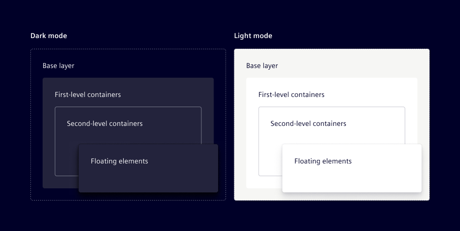
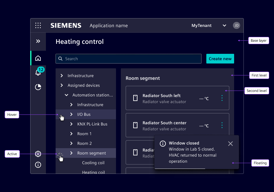
Base layer
- Purpose: Main page background for the entire user interface.
- Usage: Use
color-1for the main canvas of your application, large sections, or the default background of a page.
Visually separate large sections on the base layer by applying borders (e.g. color-soft-bdr or color-weak-bdr). When using our components, we recommend using the available outline variants.
First-level containers
- Purpose: Container elements that need to stand out from the main background.
- Usage: Apply
color-2orcomponent-1(which shares the same color value in the new theme introduced in v4.0) to components like cards, side panels, distinct content blocks, or primary interactive elements.
Second-level containers
- Purpose: Nested containers within a container, e.g. a sub-section inside a card.
- Usage: Maintain
color-2as the background, but visually separate these nested containers with borders (e.g.color-soft-bdrorcolor-weak-bdr). Alternatively, usecolor-component-2which is semi-transparent.
Floating elements
- Purpose: Elements that float above the main UI, demanding immediate attention or representing a temporary interaction.
- Usage: Use selective shadows (primarily
shadow-4, see shadow) to indicate physical overlap for components like dropdowns, tooltips, modals, and toasts.
We don’t use shadows that are part of the primary layout flow e.g. navigation elements or cards.
Other color- tokens
We recommend to stick to the color-1 and color-2 model for primary background layering. color-3 to color-8 are preserved for specific component use cases and should not be used.
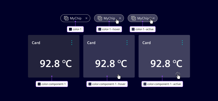
Interaction states (hover & active)
For interactive elements, additional --hover and --active color tokens are available. These are applied consistently across all elevation layers to indicate interaction states. Refer to the colors chapter for specific --hover and --active token names.