Icon usage
Clarity and contextual relevance
- Icons should be easily recognizable and understandable.
- Use icons that are contextually appropriate and convey the intended message.
- Avoid using icons that could be misinterpreted or confusing.
Examples
| home | Use for start pages | |
| search | Use for search inputs | |
| pen | Use for edit modes | |
| cogwheel | Use for general settings | |
| trashcan | Use for delete actions | |
| user | Use for user menus | |
| download | Use for downloading files | |
| upload | Use for uploading files |
Menu icons
We use distinct icons to signal different types of menus:
| app-menu | Use for application menu | |
| apps | Use for application switch | |
| context-menu | Use for item-specific actions, e.g. event list items | |
| more-menu | Use for additional options, e.g. in toolbars |
The drag-gripper icon is visually similar but isn't a menu icon and should be used for drag-and-drop interactions to reorder items.
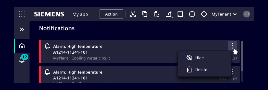
Example of menu icons
The illustration demonstrates the standard layout, featuring the apps icon in the application header and an open context menu for an event list item.
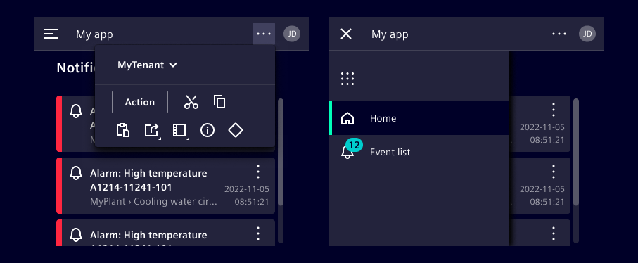
Upon resizing to a smaller screen, the layout adapts:
- The left navigation collapses into a menu icon in the application header.
- The app switch icon then relocates into the expandable menu.
- Actions previously visible in the application header move into a dropdown, indicated by the more menu icon.
Status icons
- We provide a set of standard icons to convey status.
- These icons follow a criticality hierarchy and should be used with the corresponding colors: alarm, critical, warning, success, and info.
- To ensure consistency across different applications, do not use these icons outside of their intended use cases.
Examples
| alarm | Use for hazardous states | |
| error | Use for error states | |
| warning-rhomb | Use for critical states | |
| warning | Use for warning states | |
| success | Use for success states | |
| info | Use for info states |
Icons within components
- Most of our components come with built-in icons or offer an optional icon slot.
- Ensure consistent use of components, either with or without icons, within the same context.

Standalone icons
- A standalone icon, without textual description, has to be paired with a tooltip that describes the meaning of the icon.
- Make sure a description can be read out by screen readers.