Progress indicator - Usage
Progress indicators inform users about the status of ongoing measurable processes, e.g. loading data, submitting forms or processing non-blocking operations (for indeterminate processes use spinners instead).
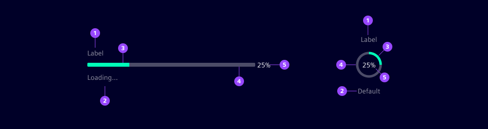
- Label
- Helper text
- Fill
- Track
- Content slot
The basic anatomy of progress indicators consists of a value indicator moving along a background track. The track represents the total expected length while the fill shows the current progress.
Variants
Progress indicator variants (types):
- Linear: Use for horizontal layouts or when the progress value should be more visible.
- Circular: Use for compact or centered layouts, e.g. when it’s replacing an icon.
Options
- Status: Use the status to reflect the outcome or current condition of a process:
- Default: Normal, ongoing process without special attention needed
- Success: Process completed successfully
- Info: Process ongoing with low-impact additional information, e.g. "Compressing files before upload"
- Warning: Process ongoing but needs attention, e.g. "Storage space is running low"
- Error: Process interrupted or failed, e.g. due to network connection problems
- Paused: Process temporarily stopped by the system or by the user, e.g. by pressing a button
- Alignment: By default, the label, control and helper text are left-aligned. Use the centered option to accommodate layouts with vertical reading patterns, e.g. low-width containers.
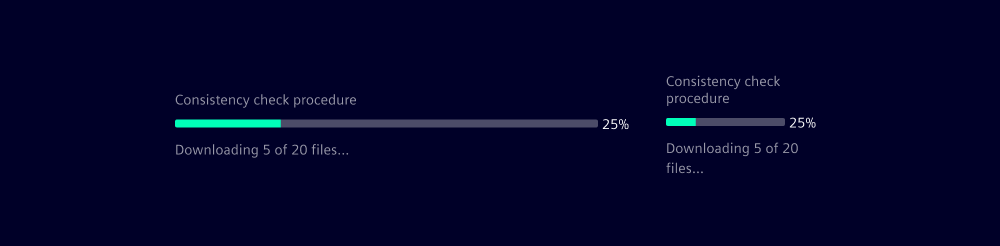
- Label: Add a label to describe the process being tracked, helping users understand what operation is in progress.
- Helper text: Use helper text to provide additional context, e.g. percentage completed, estimated time remaining or errors that happened during the process.
- Show text as tooltip: This option hides the helper text and displays it only when the user hovers or focuses the progress indicator.
- Size: Progress indicators are available in five predefined heights:
xs,sm,md,lgandxl. - Value, min and max: The progress range is customizable. By default, it spans from 0 to 100. Adjust the min and max values to suit your specific use case.
- Content slot: Use this slot to display additional content such as percentage values or custom elements like icons.
For more information about writing effective helper texts or labels, see our UX writing guidelines.
Behavior in context
- Resizing: The total width of progress indicators is
24remby default. Customize it to your context. - Text overflow: If the helper text or label are too long for the available horizontal space, it has a line-break.
- Slot: Slots in linear progress indicators have a min-width of
2.25remto accommodate using values from 0% to 100% without changing the width of the actual bar.
Dos and Don’ts
- Do use progress indicators consistently for similar processes
- Do use progress indicators for determinate processes where progress can be measured (otherwise use spinners)
- Do use linear progress indicators in horizontal layouts and circular indicators in compact spaces or centered layouts
- Do keep your slot content short, especially for the centered alignment (use helper texts and labels for lengthier content)
- Don't use progress indicators for operations shorter than one second
- Don't only indicate progress completion with the indicator without clear task messages, e.g. success toasts or displaying the loaded content