Pill - Usage
Pills typically contain a concise label and sometimes an icon. They are not clickable or closable, making them ideal for presenting static information succinctly within an application.

- Container
- Icon
- Label text
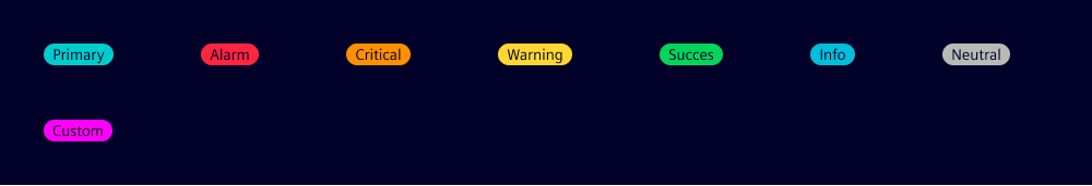
Variants
With our pill variants, you can apply different colors based on their purpose, importance or context. We use pill variants to show class, status and levels of importance. The custom variant is often used for pills that visualize a high number of different categories.
Pill variants:
- Primary: For high visual emphasis.
- State-related variants: Alarm, critical, warning, success, info and neutral.
- Custom: For a customized background and label color.
Options
- Align left: Position the pill content to the left side.
- Background: Use to set a custom background color when you require more flexibility in styling the pill. Only available for the custom pill variant.
- Color: Customize font and icon color for pill. This allows users to specify a unique font color in combination with a custom background color (only applicable when the variant is set to 'custom').
- Icon: Pills can include a close icon within the element which is positioned before the pill label.
- Outline: Use for lower visual emphasis.
- Width: Pill width can be set to a specific value, but content length normally determines pill width with a minimum width of '2rem'.
- Tooltip text: Provide a specific text to be displayed as the tooltip or set the attribute without a specific value to display the pill's text content.
Behavior
- Placement: We usually position pills inline with other elements to convey their status or category. We do not place pills within input and filter components as these already contain similar components. However, it’s possible to add components similar to pills to tabs and navigation menu items. These counter or notification components are provided as component options.
- Text truncation: When you set a width for pills, long labels are truncated to fit the available space.
States
Pills are read-only.
Dos and Don’ts
- Do use pills to communicate tags and categories
- Do use pills to indicate the status or characteristics of an item
- Don’t overuse pills as this leads to cluttered and overwhelming interfaces
- Don’t use different styles for pills with the same or similar use
- Don’t use pills if users can interact with the component (e.g. click, close) use chips instead