Message modal - usage
Message modals present short messages, confirmations or important alerts that require a decision or acknowledgment. Use them for confirmations, simple decisions and critical alerts that need user action before proceeding.

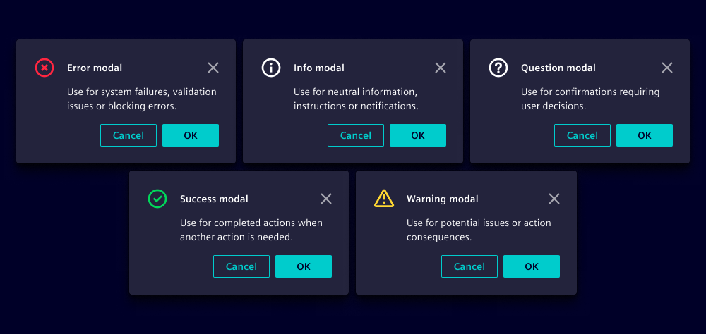
- Icon
- Title
- Close button
- Message
- Cancel action
- Confirm action
Variants
- Error: Use for system failures, validation issues or blocking errors.
- Info: Use for neutral information, instructions or notifications.
- Question: Use for confirmations requiring user decisions.
- Success: Use for completed actions when another action is needed, e.g. download backup or copy generated link.
- Warning: Use for potential issues or action consequences, e.g. overwrite files.
Options
- Title: Use a clear, outcome-oriented title (e.g. "Delete item", see writing guidelines).
- Message: Include if you need to provide additional information, e.g. consequences (see writing guidelines).
- Confirm action: Use precise action text, e.g. "Delete", "Confirm", or "Continue".
- Cancel action: Use "Cancel" or "Close". We recommend returning to the previous context the user was in.
- Close on backdrop click: Enable clicking on the backdrop to close modals for informational messages. Disable for critical decisions that require confirmation.
Note that the choice of button variant is independent from the modal variant, e.g.:
| Visual | Content and buttons |
|---|---|
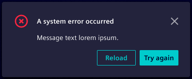 | Title: A system error occurred Variant: Error Buttons: Subtle primary button "Reload" and primary button "Try again" |
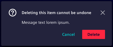 | Title: Deleting this item cannot be undone Variant: Question Buttons: Primary danger button "Delete" and primary ghost button "Cancel" |
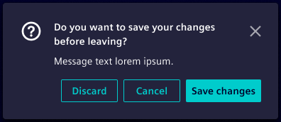 | Title: Do you want to save your changes before leaving? Variant: Question Buttons: Primary button "Save changes", secondary button "Cancel" and tertiary button "Discard" |
Since our web component offers a predefined cancel and confirm action use modals if you intend to adapt the button arrangement or variants.
Behavior in context
- Interaction: See custom modal behavior.
- Placement: Horizontally centered, vertically top-aligned.
States
Message modals have two states: Closed and opened.
Dos and Don’ts
- Do use action labels that describe the result (avoid Yes or No)
- Do communicate consequences clearly for destructive actions
- Do keep messages short and scannable
- Don’t use message modals for non-essential information, use toasts instead
- Don’t hide confirm actions behind ambiguous labels