Popover - Usage
Use popovers when users need extra context without leaving the current task or losing sight of the trigger. We recommend popovers for short, contextual content that helps users act, confirm or learn more in place.
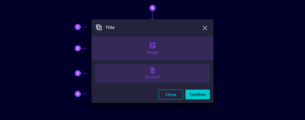
- Header with popover title
- Image
- Content
- Footer
- Spike as anchor indicator
Options
- Trigger: Use a clear trigger that signals additional context, e.g. an info icon, status chip or secondary action.
- Trigger mode: Use click for interactive content. Use hover only for lightweight, non-essential information.
- Placement: We typically use the default bottom placement because it follows the natural reading order.
- Close on click outside: Keep this enabled for temporary, dismissible information so users can return to the page quickly.
- Has spike: Use the spike when the trigger has a weak selected state or is a compact icon trigger. If the trigger already reads clearly as active, the spike is often unnecessary.
- Header: Use the header to establish context before users scan the body content.
- Title: Add a short title when users need to understand the topic before scanning the content. Keep titles specific and scannable.
- Header icon: An icon can be placed in the header to support quick recognition of the message context. Use it only when it adds meaning and avoid purely decorative icons.
- Additional header items slot: Add compact supporting items beside the title, e.g. a status pill, only when they help users interpret the message faster.
- Image: Use images sparingly and only when they clarify the message faster than text alone. In a small transient overlay, images should never be decorative, contain text, and always include meaningful alt text.
- Footer: Use the footer for actions.
- Actions: Add footer actions only when users need a next step, e.g. dismissing a hint or opening more details. We recommend limiting the footer to a maximum of three actions with clear priority, e.g. primary, secondary and tertiary.
- Alignment: Use horizontal footer actions by default. Switch to vertical only when labels are long or space is constrained.
- Start area: Use the leading side of the footer for supporting context, e.g. a helper label and keep primary actions grouped on the action side.
Behavior in context
- Interaction:
- Popovers open from a trigger and stay visually linked to it while the surrounding page remains visible.
- While the popover is open, users can still reference nearby content in the underlying layout without changing screens.
- If the content includes interactive elements, the popover remains dismissible so users can return to the trigger quickly.
- When a popover contains interactive elements, opening it moves focus from the trigger to the first interactive element in the popover.
- Closing the popover returns focus to the trigger so users can continue in the same flow.
- When a popover contains no interactive elements, focus remains on the trigger.
- Overflow:
- Popovers are rendered above surrounding elements and can cover nearby controls when the panel grows.
- If the available space around the trigger is limited, the panel size and placement affect how much context stays visible.
- For content that needs more space or sustained reading, a modal or dedicated page preserves readability.
- Placement:
- Popovers are anchored to the trigger element and positioned to keep that relationship clear.
- When there is not enough space near the viewport edge, the position can flip to keep the panel visible.
- Responsiveness:
- On smaller viewports, a popover can overlap a larger share of the interface around the trigger.
- If users need to compare information, read longer content, or complete multiple actions, a modal or dedicated page supports the flow better.
States
Popovers have two states: Closed and opened. When a popover is opened, it appears anchored to the trigger and is dismissible so users can return to the underlying context quickly.
Dos and Don’ts
- Do use popovers for contextual information, e.g. release highlights or guided hints
- Do use popovers when users need one lightweight action without leaving the current task
- Do use a short title and concise content so users can scan the message quickly
- Don’t use popovers for essential information that must be read before proceeding, use modals instead
- Don’t use popovers for selecting from a list of actions, use dropdowns instead
- Don’t allow multiple popovers to be open at the same time, close the current one before opening another