Badge - Usage
Badges are non-interactive visual aids for status, counters and notification cues. We recommend badges when users need a compact signal next to another element or a lightweight standalone status cue.

- Badge of type
labelas standalone - Badge of type
counter - Badge of type
dot - Badge of type
status icon - Anchor element
Badges work standalone or attached to an anchor that represents the related information. As a general rule, we use badges for dynamic status or notification information and chips when users need to interact with the item.
Types
Badge types define how the indicator appears:
- Counter (default): Use for notifications that need attention, with integers up to two digits (for larger values).
- Label: Use for a readable status, e.g. "Online" or "Offline" in a list.
- Dot: Use when only the presence of new information matters, e.g. for a compact notification that needs attention without a count.
- Status icon: Use for showing statuses or notifications that are recognizable by icon alone.
Variants
Semantic color variants communicate clear meanings:

- Primary: Highlight new features or exploratory information.
- Alarm: Show negative values, removals or high-urgency counts, e.g. critical equipment faults or imminent system failures.
- Critical: Emphasize severe conditions that require strong attention.
- Warning: Call attention to information that requires caution, e.g. pending actions.
- Info: Draw attention to new or updated information or informative numeric data.
- Success: Show positive values or additions, e.g. growth metrics.
- Neutral: Use for general-purpose information that doesn’t carry semantic meaning.
- Custom: Set an explicit background and badge color when you need a product-specific palette.
We recommend matching icons on label badges to the meaning of the chosen color. Prefer outlined styles when you need lower visual emphasis on busy surfaces.
Use standalone label badges to replace deprecated pills usages, e.g. compact statuses or categories.
Options
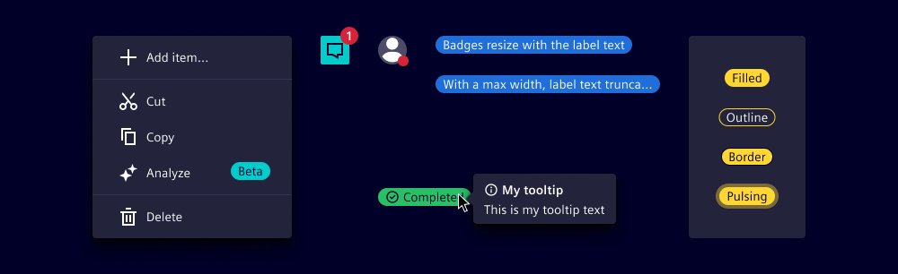
- Placement: Use inline (standalone) to show an entity’s status in a list. With an anchor, we typically use
top afterfor notifications that need attention andbottom afterfor status on individual elements, e.g. user presence. - Label: We usually show the full status name and use max-width to control lengthy labels. Keep labels short to avoid truncation.
- Outline: Intended for lower visual emphasis on standalone badges. On status icons, outline selects the outline glyph.
- Border: Add a high-contrast border on filled badges when the surface behind them is busy. Not applicable to outline badges.
- Offset: Keep the indicator close to the anchor without covering it fully and without leaving the parent's visual bounding box, e.g. round elements like avatars need larger negative offsets.
- Pulse animation: Use only for immediate, urgent attention. It loops until explicitly disabled. Note that
prefers-reduced-motionsettings might override this. - Custom colors: With the custom variant, set background and badge color together so contrast stays readable.
- Tooltip text: For standalone badges, provide a specific text to be displayed as the tooltip or set the attribute without a specific value to display the badge's text content (see writing guide).
Behavior in context

- Overflow:
- Label badges: If a max-width is applied, label is truncated.
- Counter badges: If more than 2 digits are entered, label shows "99+".
- Container and overlapping: An attached badge overlaps the anchor at its edge without extending the parent’s bounding box. This placement leaves the anchor recognizable and its critical content visible, e.g. the icon that identifies a notification button.
- Screen readers: Labels of standalone badges are read by screen readers. Attached badges are read as part of their anchor’s accessible name.
States
Badges are read-only. They don't have hover, active or disabled states, but standalone badges support text selection.
Dos and Don’ts
- Do provide an accessible name for dot and status icon badges by using
aria-labelon the anchor when attached, or on the badge when standalone - Do prefer dot or status icon badges over long labels in compact layouts
- Do keep badges synchronized with the underlying notification state, e.g. update or remove them when users read notifications
- Do include the badge meaning in the accessible name of its anchor
- Do announce meaningful dynamic updates while considering cognitive load on the user
- Do keep the badge inside the parent and leave enough of the anchor visible
- Don’t make badges interactive, use chips when users need to click or dismiss
- Don’t use color alone to convey meaning without supporting text or ARIA on the host or anchor
- Don’t rely on pulse animation for long-running or low-priority hints
- Don’t place essential primary content only in a badge